 A key economic objective of governments around the world is economic growth, where economic growth is taken to mean growth in Gross Domestic Product (GDP). This can be refined as growth in GDP per head or growth in Net National Income (NNY or NNI) – this takes account of depreciation and net flows of income to and from abroad. But is GDP (or NNY) an appropriate measure? There continues to be much debate about this and there is a lot of support for adopting an alternative measure – the Genuine Progress Indicator (GPI) as a target for economic policy.
GDP measures the market value of production and is the value added at each stage of production. If the value of a nation’s production is what you want to measure or target, then GDP is quite a good indicator. Its main drawbacks are that it uses market prices, which may be distorted, and that much of production in the informal sector is not included.

But if GDP growth is taken to be a proxy for development or growth in wellbeing of the residents of a country, then it has serious shortcomings. This is not to say that GDP gives no indication of progress. Generally, countries with higher GDP per head have a better standard of living, but it is not necessarily the case that, if Country A has higher production in the formal sector than Country B, its residents will be happier, more fulfilled and have fewer economic or other problems.
GDP, by focusing on production, ignores many environmental and social costs of that production. Valuable but not tradable resources, such as clean air, rivers and oceans, may be sacrificed for the sake of extra production and this is recorded as a gain in GDP.
Similarly, unless GDP is specifically weighted by income groups, which virtually never happens, it does not take into account income distribution. Much of the growth in production in both rich and poor countries in recent decades has gone to the richest people. Take the case of the USA. In 1944 the share of income going to the top 1% share was 11.3%, while the bottom 90% were receiving 67.5%.  Such levels remained roughly constant for the next three decades. But then things began to change.
Starting in the mid- to late 1970s, the uppermost tier’s income share began rising dramatically, while that of the bottom 90% started to fall. The top 1% took heavy hits from the dot-com crash and the Great Recession but recovered fairly quickly: [preliminary estimates for 2012 by Emmanuel Saez] have that group receiving nearly 22.5% of all pre-tax income, while the bottom 90%’s share is below 50% for the first time ever (49.6%, to be precise).
So what does GPI measure and why may it be a better target for policy-makers than GDP or NNY? The answer is that it includes a number of important items that affect the well-being of a country, such as resource depletion, social activity and income distribution, that are not measured in GDP.  So what would cause GPI to rise? According to The Guardian article below, examples would include:
Getting more energy from renewables; increased energy efficiency; reducing the income gap; putting more reliable, durable products on the market (have you heard of planned obsolescence?); volunteering more for your community; preserving wetlands, forests, and farmland; shorter commutes and transport routes. In fact, there are 26 ways the GPI can go up, all measured in dollars that boil down to a single number.
GPI is being increasingly adopted as a measure of progress. In the USA, it is officially used in Vermont and Maryland and is being considered in other states, such as Hawaii, Washington and Oregon.
And there are other alternatives. For example, since 1990, the United Nations Development Programme (UNDP) has published an annual Human Development Index (HDI) As Box 27.1 in Economics, 8th edition states:
HDI is the average of three indices based on three sets of variables: (i) life expectancy at birth, (ii) education (a weighted average of (a) the mean years that a 25-year-old person or older has spent in school and (b) the number of years of schooling that a 5-year-old child is expected to have over their lifetime) and (iii) real GNY per capita, measured in US dollars at purchasing-power parity exchange rates.
The following articles look at the suitability of GDP and GPI and whether, by targeting growth in GDP, governments are guilty of downplaying the importance of other economic and social objectives.
Beyond GDP: US states have adopted genuine progress indicators The Guardian, Marta Ceroni (23/9/14)
Forget the GDP. Some States Have Found a Better Way to Measure Our Progress. New Republic, Lew Daly and Sean McElwee (3/2/14)
Gross domestic problem Aljazeera, Sean McElwee (6/6/14)
Creating the Circular Economy, Part II Environmental Leader, David Dornfeld (17/9/14)
Development: Time to leave GDP behind Nature, Robert Costanza, Ida Kubiszewski, Enrico Giovannini, Hunter Lovins, Jacqueline McGlade, Kate E. Pickett, Kristín Vala Ragnarsdóttir, Debra Roberts, Roberto De Vogli and Richard Wilkinson (15/1/14)
The Problems With Using GPI Rather Than GDP Forbes, Tim Worstall (5/6/14)
Questions
- What does GDP measure?
- Does GDP of a country equate to the turnover of a firm?
- If growth in NNY is superior to growth in GDP as a measure of economic growth, why are GDP figures more generally used than NNY figures when assessing a country’s economic performance?
- How suitable is using GDP as a measure of a nation’s production?
- What does GPI measure?
- Is GPI superior to GDP as a measure of a nation’s level of development? Explain why or why not.
- Give some examples of where a growth in GDP might correspond to a decline in economic well-being.
- For what reasons could GPI measures be described as subjective?
- Would it be a good idea for a country to target growth in GPI/GDP? Explain your answer.
- In addition to real GNY per capita, the Human Development Index includes measures of education and life expectancy. For what other social objectives might education and life expectancy be useful proxies?
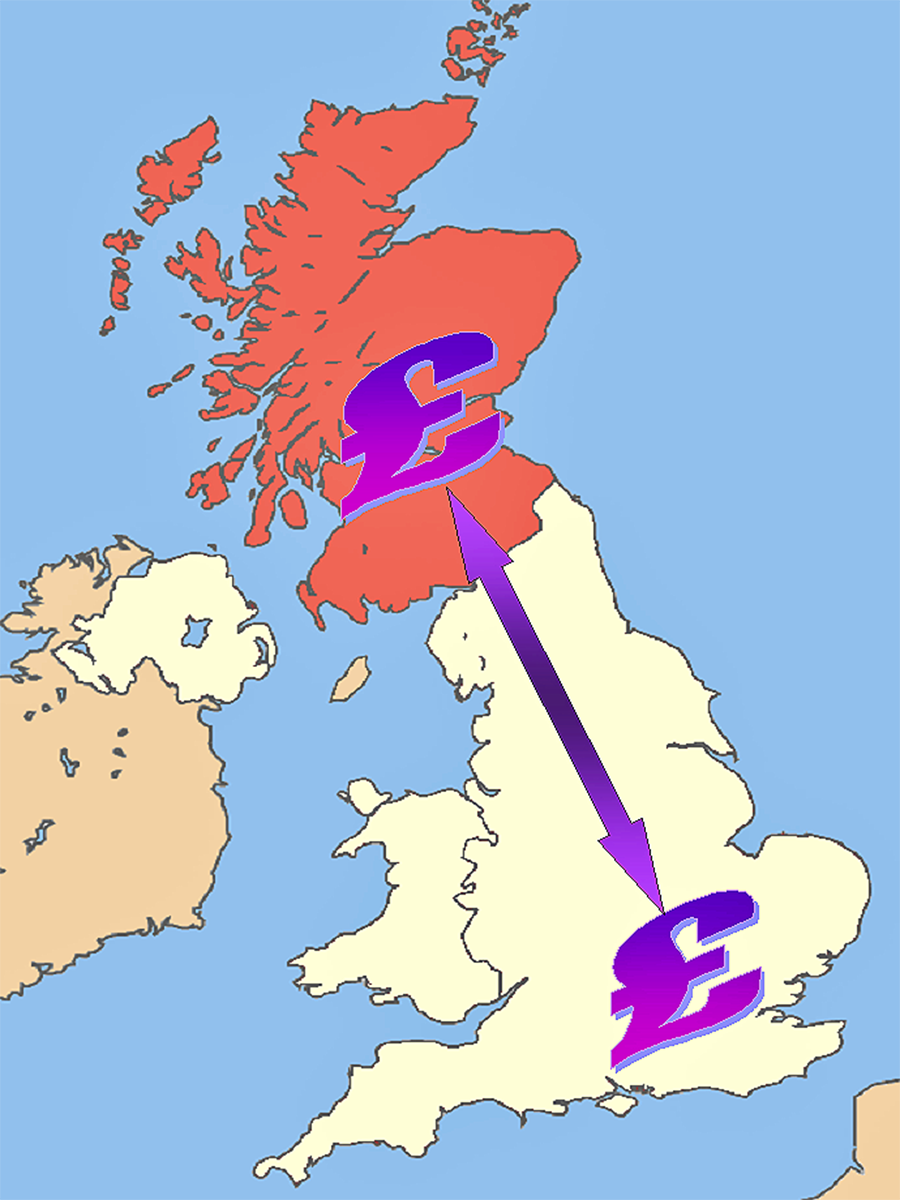
 Economic journalists, commentators and politicians have been examining the possible economic effects of a Yes vote in the Scottish independence referendum on 18 September. For an economist, there are two main categories of difficulty in examining the consequences. The first is the positive question of what precisely will be the consequences. The second is
  the normative question of whether the likely effects will be desirable or undesirable and how much so.
The first question is largely one of ‘known unknowns’. This rather strange term was used in 2002 by Donald Rumsfeld, US Secretary of Defense, in the context of intelligence about Iraq. The problem is a general one about forecasting the future. We may know the types of thing that are likely happen, but the magnitude of the outcome cannot be precisely known because there are so many unknowable things that can influence it.
Here are some known issues of Scottish independence, but with unknown consequences (at least in precisely quantifiable terms). The list is certainly not exhaustive and you could probably add more questions yourself to the list.
|
|
| • |
Will independence result in lower or higher economic growth in the short and long term? |
| • |
Will there be a currency union, with Scotland and the rest of the UK sharing the pound and a central bank? Or will Scotland merely use the pound outside a currency union? Would it prefer to have its own currency or join the euro over the longer term? |
| • |
What will happen to the sterling exchange rate with the dollar, the euro and various other countries? |
| • |
How will businesses react? Will independence encourage greater inward investment in Scotland or will there be a net capital outflow? And either way, what will be the magnitude of the effect? |
| • |
How will assets, such as oil, be shared between Scotland and the rest of the UK? And how will national debt be apportioned? |
| • |
How big will the transition costs be of moving to an independent Scotland? |
| • |
How will independence impact on Scottish trade (a) with countries outside the UK and (b) with the rest of the UK? |
| • |
What will happen about Scotland’s membership of the EU? Will other EU countries, such as Spain (because of its concerns about independence movements in Catalonia and the Basque country), attempt to block Scotland remaining in or rejoining the EU? |
| • |
What will happen to tax rates in Scotland, with the new Scottish government free to set its own tax rates? |
| • |
What will be the consequences for Scottish pensions and the Scottish pensions industry? |
| • |
What will happen to the distribution of income in Scotland? How might Scottish governments behave in terms of income redistribution and what will be its consequences on output and growth? |
Of course, just because the effects cannot be known with certainty, attempts are constantly being made to quantify the outcomes in the light of the best information available at the time. These are refined as circumstances change and newer data become available.
 But forecasts also depend on the assumptions made about the post-referendum decisions of politicians in Scotland, the rest of the UK and in major trading partner countries. It also depends on assumptions about the reactions of businesses. Not surprisingly, both sides of the debate make assumptions favourable to their own case.
Then there is the second category of question. Even if you could quantify the effects, just how desirable would they be? The issue here is one of the weightings given to the various costs and benefits. How would you weight distributional consequences, given that some people will gain or lose more than others? What social discount rate would you apply to future costs and benefits?
Then there are the normative and largely unquantifiable costs and benefits. How would you assess the desirability of political consequences, such as greater independence in decision-making or the break-up of a union dating back over 300 years? But these questions about nationhood are crucial issues for many of the voters.
Articles
Scottish Independence would have Broad Impact on UK Economy NBC News, Catherine Boyle (9/9/14)
Scottish independence: the economic implications The Guardian, Angela Monaghan (7/9/14)
Scottish vote: Experts warn of potential economic impact BBC News, Matthew Wall (9/9/14)
The economics of Scottish independence: A messy divorce The Economist (21/2/14)
Dispute over economic impact of Scottish independence Financial Times, Mure Dickie, Jonathan Guthrie and John Aglionby (28/5/14)
10 economic benefits for a wealthier independent Scotland Michael Gray (6/3/14)
Scottish independence, UK dependency New Economics Foundation (NEF), James Meadway (4/9/14)
Scottish Jobs and the World Economy Scottish Economy Watch, Brian Ashcroft (25/8/14)
Scottish yes vote: what happens to the pound in your pocket? Channel 4 News (9/9/14)
What price Scottish independence? BBC News, Robert Peston (12/9/14)
What price Scottish independence? BBC News, Robert Peston (7/9/14)
Economists can’t tell Scots how to vote BBC News, Robert Peston (16/9/14)
Books and Reports
The Economic Consequences of Scottish Independence Scottish Economic Society and Helmut Schmidt Universität, David Bell, David Eiser and Klaus B Beckmann (eds) (August 2014)
The potential implications of independence for businesses in Scotland Oxford Economics, Weir (April 2014)
Questions
- What is a currency union? What implications would there be for Scotland being in a currency union with the rest of the UK?
- If you could measure the effects of independence over the next ten years, would you treat £1m of benefits or costs occurring in ten years’ time the same as £1m of benefits and costs occurring next year? Explain.
- Is it inevitable that events occurring in the future will at best be known unknowns?
- If you make a statement that something will occur in the future and you turn out to be wrong, was your statement a positive one or a normative one?
- What would be the likely effects of Scottish independence on the current account of the balance of payments (a) for Scotland; (b) for the rest if the UK?
- How does inequality in Scotland compare with that in the rest of the UK and in other countries? Why might Scottish independence lead to a reduction in inequality? (See the chapter on inequality in the book above edited by David Bell, David Eiser and Klaus B Beckmann.)
- One of the problems in assessing the arguments for a Yes vote is uncertainty over what would happen if there was a majority voting No. What might happen in terms of further devolution in the case of a No vote?
- Why is there uncertainty over the amount of national debt that would exist in Scotland if it became independent?
 The ONS has just released its annual publication, The Effects of Taxes and Benefits on Household Income. The report gives data for the financial year 2012/13 and historical data from 1977 to 2012/13.
The publication looks at the distribution of income both before and after taxes and benefits. It divides the population into five and ten equal-sized groups by household income (quintiles and deciles) and shows the distribution of income between these groups. It also looks at distribution within specific categories of the population, such as non-retired and retired households and different types of household composition.
The data show that the richest fifth of households had an average pre-tax-and-benefit income of £81,284 in 2012/13, 14.7 times greater than average of £5536 for the poorest fifth. The richest tenth had an average pre-tax-and-benefit income of £104,940, 27.1 times greater than the average of £3875 for the poorest tenth.
 After the receipt of cash benefits, these gaps narrow to 6.6 and 11.0 times respectively. When the effect of direct taxes are included (giving ‘disposable income’), the gaps narrow further to 5.6 and 9.3 times respectively. However, when indirect taxes are also included, the gaps widen again to 6.9 and 13.6 times.
This shows that although direct taxes are progressive between bottom and top quintiles and deciles, indirect taxes are so regressive that the overall effect of taxes is regressive. In fact, the richest fifth paid 35.1% of their income in tax, whereas the poorest fifth paid 37.4%.
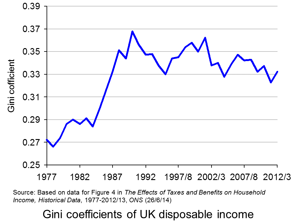
 Taking the period from 1977 to 2012/13, inequality of disposable income (i.e. income after direct taxes and cash benefits) increased from 1977 to 1988, especially during the second two Thatcher governments (1983 to 1990) (see chart opposite). But then in the first part of the 1990s inequality fell, only to rise again in the late 1990s and early 2000s. However, with the Labour government giving greater cash benefits for the poor, inequality reduced once more, only to widen again in the boom running up to the banking crisis of 2007/8. But then, with recession taking hold, the incomes of many top earners fell and automatic stabilisers helped protect the incomes of the poor. Inequality consequently fell. But with the capping of benefit increases and a rise in incomes of many top earners as the economy recovers, so inequality is beginning to rise once more – in 2012/13, the Gini coefficient rose to 0.332 from 0.323 the previous year.
As far as income after cash benefits and both direct and indirect taxes is concerned, the average income of the richest quintile relative to that of the poorest quintile rose from 7.2 in 2002/3 to 7.6 in 2007/8 and then fell to 6.9 in 2012/13.
Other headlines in the report include:
Since the start of the economic downturn in 2007/08, the average disposable income has decreased for the richest fifth of households but increased for the poorest fifth.
Cash benefits made up over half (56.4%) of the gross income of the poorest fifth of households, compared with 3.2% of the richest fifth, in 2012/13.
The average disposable income in 2012/13 was unchanged from 2011/12, but it remains lower than at the start of the economic downturn, with equivalised disposable income falling by £1200 since 2007/08 in real terms. The fall in income has been largest for the richest fifth of households (5.2%). In contrast, after accounting for inflation and household composition, the average income for the poorest fifth has grown over this period (3.5%).
This is clearly a mixed picture in terms of whether the UK is becoming more or less equal. Politicians will, no doubt, ‘cherry pick’ the data that suit their political position. In general, the government will present a good news story and the opposition a bad news one. As economists, it is hoped that you can take a dispassionate look at the data and attempt to relate the figures to policies and events.
Report
The Effects of Taxes and Benefits on Household Income, 2012/13 ONS (26/6/14)
Data
Reference tables in The Effects of Taxes and Benefits on Household Income, 2012/13 ONS (26/6/14)
The Effects of Taxes and Benefits on Household Income, Historical Data, 1977-2012/13 ONS (26/6/14)
Rates of Income Tax: 1990-91 to 2014-15 HMRC
Articles
Inequality is on the up again – Osborne’s boast is over New Statesman, George Eaton (26/6/14)
Disposable incomes rise for richest fifth households only Money.com, Lucinda Beeman (26/6/14)
Half of families receive more from the state than they pay in taxes but income equality widens as rich get richer Mail Online, Matt Chorley (26/6/14)
Rich getting richer as everyone else is getting poorer, Government’s own figures reveal Mirror, Mark Ellis (26/6/14)
The Richest Households Got Richer Last Year, While Everyone Else Got Poorer The Economic Voice (27/6/14)
Questions
- Define the following terms: original income, gross income, disposable income, post-tax income, final income.
- How does the receipt of benefits in kind vary across the quintile groups? Explain.
- What are meant by the Lorenz curve and the Gini coefficient and how is the Gini coefficient measured? Is it a good way of measuring inequality?
- Paint a picture of how income distribution has changed over the past 35 years.
- Can changes in tax be a means of helping the poorest in society?
- What types of income tax cuts are progressive and what are regressive?
- Why are taxes in the UK regressive?
- Why has the fall in income been largest for the richest fifth of households since 2007/8? Does this mean that, as the economy recovers, the richest fifth of households are likely to experience the fastest increase in disposable incomes?
 GDP is still the most frequently used indicator of a country’s development. When governments target economic growth as a key goal, it is growth in GDP to which they are referring. And they often make the assumption that growth in GDP is a proxy for growth in well-being. But is it time to leave GDP behind as the main indicator of national economic success? This is the question posed in the first of the linked articles below, from the prestigious science journal Nature.
As the article states:
Robert F. Kennedy once said that a country’s gross domestic product (GDP) measures “everything except that which makes life worthwhile”. The metric was developed in the 1930s and 1940s amid the upheaval of the Great Depression and global war. Even before the United Nations began requiring countries to collect data to report national GDP, Simon Kuznets, the metric’s chief architect, had warned against equating its growth with well-being.
GDP measures mainly market transactions. It ignores social costs, environmental impacts and income inequality. If a business used GDP-style accounting, it would aim to maximize gross revenue — even at the expense of profitability, efficiency, sustainability or flexibility. That is hardly smart or sustainable (think Enron). Yet since the end of the Second World War, promoting GDP growth has remained the primary national policy goal in almost every country
So what could replace GDP, or be considered alongside GDP? Should we try to measure happiness? After all, behavioural scientists are getting much better at  understanding and measuring the psychology of human well-being (see the blog posts Money can’t buy me love and Happiness economics).
Or should we focus primarily on long-term issues of the sustainability of development? Or should we focus more on the distribution of income or well-being in a world that is becoming increasingly unequal?
Or should measures of well-being involve weighted composite indices involving things such as life-expectancy, education, housing, democratic engagement, leisure time, social mobility, etc. And, if so, how should the weightings of the different indicators be determined? The United Nations Development Programme (UNDP) produces annual Human Development Reports, where countries are ranked according to a Human Development Index. As the UNDP site states:
The breakthrough for the HDI was the creation of a single statistic which was to serve as a frame of reference for both social and economic development. The HDI sets a minimum and a maximum for each dimension, called goalposts, and then shows where each country stands in relation to these goalposts, expressed as a value between 0 and 1.
HDI is a composite of three sets of indicators: education, life expectancy and income (see). The UNDP since 2010 has also produced an Inequality-adjusted HDI (IHDI).
The IHDI will be equal to the HDI value when there is no inequality, but falls below the HDI value as inequality rises. The difference between the HDI and the IHDI represents the ‘loss’ in potential human development due to inequality and can be expressed as a percentage.
You can now build your own HDI for each country on the UNDP site by selecting from the following indicators: health, education, income, inequality, poverty and gender.
The Nature article considers a number of measures of progress and considers their relative merits. The other articles also look at measuring national progress and well-being and at the relationship between income per head and happiness. It is clear that focusing on GDP alone provides too simplistic an approach to measuring development.
Development: Time to leave GDP behind Nature, Robert Costanza, Ida Kubiszewski, Enrico Giovannini, Hunter Lovins, Jacqueline McGlade, Kate E. Pickett, Kristín Vala Ragnarsdóttir, Debra Roberts, Roberto De Vogli and Richard Wilkinson (15/1/14)
The happiness agenda makes for miserable policy The Conversation, Daniel Sage (9/1/14)
Economic view: No matter what the politicians say, GDP is a distorted guide to economic performance and a bad way to measure prosperity Independent, Guy Hands (28/1/14)
Buy buy love The Economist (22/6/13)
Experts confirm that money does buy happiness – but only up to £22,100 Independent, Jamie Merrill (28/11/13)
Can Money Buy Happiness? Scientific American, Sonja Lyubomirsky (10/8/10)
Money can buy happiness The Economist (2/5/13)
Money can buy happiness Hacker News, pyduan (13/1/14)
Can ‘happiness economics’ provide a new framework for development? The Guardian, Christian Kroll (3/9/13)
The 10 Things Economics Can Tell Us About Happiness The Atlantic, Derek Thompson (31/5/12)
Financial crisis hits happiness levels BBC News (3/11/13)
Happiness study finds that UK is passing point of peak life satisfaction The Guardian, Larry Elliott (27/11/13)
How GDP became the figure everyone wanted to watch BBC News, Peter Day (16/4/14)
Economic development can only buy happiness up to a ‘sweet spot’ of $36,000 GDP per person Science Daily (27/11/13)
Questions
- What does GDP measure?
- How suitable a measure of economic progress is growth in GDP?
- How can GDP be adjusted to make it a more suitable measure of economic progress?
- What are the advantages of using composite indicators of well-being?
- What difficulties are there in measuring well-being using composite indicators?
- Assuming there were no measurement problems, what indicators would you include in devising the optimum composite indicator of well-being?
- Can money buy happiness?
- Why do life satisfaction levels peak at around $36,000 (adjusted for Purchasing Power Parity (PPP))?
 According to the Sunday Times Rich List, the combined wealth of Britain’s 1000 richest people grew by nearly 4.7% last year to £414 billion (after growing by 18% in 2010).
This is in stark contrast to average households, who saw their real incomes decline by 1.9% in 2011. As the Guardian article below says:
The Rich Listers are not merely the 1%, but the 0.01%, and this fanfared celebration of their assets feels like a celebration of things that nobody feels like celebrating: bankers’ bonuses, complex corporate tax-avoidance structures, the stifling grip of aristocratic family wealth.
So why are the rich getting richer and what are the implications for society and the economy? Watch and read the following webcasts and articles and then see if you can answer the questions below.
Webcasts
 Rich List shows how super-wealthy have dodged recession (or) Channel 4 News (29/4/12)
 Sunday Times Rich List: Wealthy getting richer BBC News, Ben Thompson (29/4/12)
Articles
Britain’s richest see fortunes rise to record high Reuters, Tim Castle (29/4/12)
Sunday Times Rich List shows rich recover wealth twice as fast Myfinances.co.uk, Ben Salisbury (29/4/12)
Sunday Times Rich List suggests UK’s wealthiest defy recession BBC News (28/4/12)
Sunday Times Rich List 2012: Wealth of richest grows to record levels The Telegraph, Patrick Sawer (28/4/12)
The Not-So-Rich-Any-More List Guardian, Oliver Burkeman and Patrick Kingsley (27/4/12)
Sunday Times Rich List ITV News (29/4/12)
Data
Distribution of Personal Wealth HMRC
The effects of taxes and benefits on household income ONS (19/5/11)
Household Quarterly Release 2011 Q4 – Real household actual income and expenditure per head ONS
Questions
- Distinguish between stocks and flows. Which of the following are stocks and which are flows: income, wealth, savings, saving, expenditure, possessions?
- If the combined wealth of the 1000 wealthiest people increased in 2011, does this imply that their incomes rose? Explain.
- Why have the super rich got richer, while average incomes in the country have fallen?
- What are the costs and benefits to society (other than the super rich) of the super rich becoming richer?
- Distinguish between the income and substitution effects of an increase in income of the wealthy. Which is likely to be larger and why?
 A key economic objective of governments around the world is economic growth, where economic growth is taken to mean growth in Gross Domestic Product (GDP). This can be refined as growth in GDP per head or growth in Net National Income (NNY or NNI) – this takes account of depreciation and net flows of income to and from abroad. But is GDP (or NNY) an appropriate measure? There continues to be much debate about this and there is a lot of support for adopting an alternative measure – the Genuine Progress Indicator (GPI) as a target for economic policy.
 Such levels remained roughly constant for the next three decades. But then things began to change.
 So what would cause GPI to rise? According to The Guardian article below, examples would include:

