Bubbles
 Speculation in markets can lead to wild swings in prices as exuberance drives up prices and
pessimism leads to price crashes. When the rise in price exceeds underlying fundamentals, such as profit, the result is a bubble. And bubbles burst.
There have been many examples of bubbles throughout history. One of the most famous is that of tulips in the 17th century. As Box 2.4 in Essential Economics for Business (6th edition) explains:
Between November 1636 and February 1637, there was a 20-fold increase in the price of tulip bulbs, such that a skilled worker’s annual salary would not even cover the price of one bulb. Some were even worth more than a luxury home! But, only three months later, their price had fallen by 99 per cent. Some traders refused to pay the high price and others began to sell their tulips. Prices began falling. This dampened demand (as tulips were seen to be a poor investment) and encouraged more people to sell their tulips. Soon the price was in freefall, with everyone selling. The bubble had burst .
Another example was the South Sea Bubble of 1720. Here, shares in the South Sea Company, given a monopoly by the British government to trade with South America, increased by 900% before collapsing through a lack of trade.
Another, more recent, example is that of Poseidon. This was an Australian nickel mining company which announced in September 1969 that it had discovered a large seam of nickel at Mount Windarra, WA. What followed was a bubble. The share price rose from $0.80 in mid-1969 to a peak of $280 in February 1970 and then crashed to just a few dollars.
Other examples are the Dotcom bubble of the 1990s, the US housing bubble of the mid-2000s and BitCoin, which has seen more than one bubble.
Bubbles always burst eventually. If you buy at a low price and sell at the peak, you can make a lot of money. But many will get their fingers burnt. Those who come late into the market may pay a high price and, if they are slow to sell, can then make a large loss.
GameStop shares – an unlikely candidate for a bubble
 The most recent example of a bubble is GameStop. This is a chain of shops in the USA selling games, consoles and other electronic items. During the pandemic it has struggled, as games consumers have turned to online sellers of consoles and online games. It has been forced to close a number of stores. In July 2020, its share price was around $4. With the general recovery in stock markets, this drifted upwards to just under $20 by 12 January 2021.
Then the bubble began.
Hedge fund shorting
Believing that the GameStop shares were now overvalued and likely to fall, many hedge funds started shorting the shares. Shorting (or ‘short selling’) is where investors borrow shares for a fee and immediately sell them on at the current price, agreeing to return them to the lender on a specified day in the near future (the ‘expiration date’). But as the investors have sold the shares they borrowed, they must now buy them at the current price on or before the expiration date so they can return them to the lenders. If the price falls between the two dates, the investors will gain. For example, if you borrow shares and immediately sell them at a current price of £5 and then by the expiration date the price has fallen to $2 and you buy them back at that price to return them to the lender, you make a £3 profit.
But this is a risky strategy. If the price rises between the two dates, investors will lose – as events were to prove.
The swarm of small investors
 Enter the ‘armchair investor’. During lockdown, small-scale amateur investing in shares has become a popular activity, with people seeking to make easy gains from the comfort of their own homes. This has been facilitated by online trading platforms such as Robinhood and Trading212. These are easy and cheap, or even free, to use.
What is more, many users of these sites were also collaborating on social media platforms, such as Reddit. They were encouraging each other to buy shares in GameStop and some other companies. In fact, many of these small investors were seeing it as a battle with large-scale institutional investors, such as hedge funds – a David vs. Goliath battle.
With swarms of small investors buying GameStop, its share price surged. From $20 on 12 January, it doubled in price within two days and had reached $77 by 25 January. The frenzy on Reddit then really gathered pace. The share price peaked at $468 early on 28 January. It then fell to $126 less than two hours later, only to rise again to $354 at the beginning of the next day.
Many large investors who had shorted GameStop shares made big losses. Analytics firm Ortex estimated that hedge funds lost a total of $12.5 billion in January. Many small investors, however, who bought early and sold at the peak made huge gains. Other small investors who got the timing wrong made large losses.
And it was not just GameStop. Social media were buzzing with suggestions about buying shares in other poorly performing companies that large-scale institutional investors were shorting. Another target was silver and silver mines. At one point, silver prices rose by more than 10% on 1 February. However, money invested in silver is huge relative to GameStop and hence small investors were unlikely to shift prices by anything like as much as GameStop shares.
Amidst this turmoil, the US Securities and Exchange Commission (SEC) issued a statement on 29 January. It warned that it was working closely with other regulators and the US stock exchange ‘to ensure that regulated entities uphold their obligations to protect investors and to identify and pursue potential wrongdoing’. It remains to be seen, however, what it can do to curb the concerted activities of small investors. Perhaps, only the experience of bubbles bursting and the severe losses that can result will make small investors think twice about backing failing companies. Some Davids may beat Goliath; others will be defeated.
Articles
- GameStop: The competing forces trading blows over lowly gaming retaile
Sky News (30/1/21)
- Tempted to join the GameStop ‘angry mob’? Lessons on bubbles, market abuse and stock picking from the investment experts… including perma-bear Albert Edwards
This is Money, Tanya Jefferies (29/1/21)
- A year ago on Reddit I suggested investing in GameStop. But I never expected this
The Guardian, Desmund Delaney (29/1/21)
- The real lesson of the GameStop story is the power of the swarm
The Guardian, Brett Scott (30/1/21)
- GameStop: What is it and why is it trending?
BBC News, Kirsty Grant (29/1/21)
- GameStop: Global watchdogs sound alarm as shares frenzy grows
BBC News (30/1/21)
- The GameStop affair is like tulip mania on steroids
The Guardian, Dan Davies (29/1/21)
- GameStop news: Short sellers lose $19bn as Omar says billionaires who pressured apps should go to jail
Independent, Andy Gregory, Graig Graziosi and Justin Vallejo (30/1/21)
- Robinhood tightens GameStop trading curbs again as SEC weighs in
Financial Times, Michael Mackenzie, Colby Smith, Kiran Stacey and Miles Kruppa (29/1/21)
- SEC Issues Vague Threats Against Everyone Involved in the GameStop Stock Saga
Gizmodo, Andrew Couts (29/1/21)
- SEC warns it is monitoring trade after GameStop surge
RTE News (29/1/21)
- GameStop short-squeeze losses at $12.5 billion YTD – Ortex data
Reuters (1/2/21)
- GameStop: I’m one of the WallStreetBets ‘degenerates’ – here’s why retail trading craze is just getting started
The Conversation, Mohammad Rajjaque (3/2/21)
- What the GameStop games really mean
Shares Magazine, Russ Mould (4/2/21)
Data
Questions
- Distinguish between stabilising and destabilising speculation.
- Use a demand and supply diagram to illustrate destabilising speculation.
- Explain how short selling contributed to the financial crisis of 2007/8 (see Box 2.7 in Economics (10th edition) or Box 3.4 in Essentials of Economics (8th edition)).
- Why won’t shares such as GameStop go on rising rapidly in price for ever? What limits the rise?
- Find out some other shares that have been trending among small investors. Why were these specific shares targeted?
- How has quantitative easing impacted on stock markets? What might be the effect of a winding down of QE or even the use of quantitative tightening?
 Each week, BBC Radio 4 broadcasts readings from a book serialised in five 15-minute episodes. In the week beginning 18 January 2021, the readings were from English Pastoral: An Inheritance by James Rebanks, a farmer from the Cumbrian fells. His farm is relatively small, covering 185 acres.
He has attempted to make it much more sustainable and less intensive, reintroducing traditional Herdwick sheep, having a mixture of cows and sheep rather than just sheep, a greater sub-division of fields, and more natural scrubland, peatbogs and trees. As a result, soil quality has improved and there has been an explosion of biodiversity, with an abundance of wild flowers and insects.
Apart from being an autobiography of his time as a farmer and his attempt to move towards more traditional methods, the book examines broader issues of agricultural sustainability. It looks at the pressures of consumers wanting cheap food, the market power of supermarkets and wholesalers, the cost pressures on farmers pushing them towards monoculture to achieve economies of scale, and the role of the agrichemicals industry promoting fertilisers, feeds and pesticides which bring short-term financial gains to farmers, but which cause longer-term damage to the land and to biodiversity.
Rebanks has gained quite a lot of media attention after the publication of his first book, The Shepherd’s Life, including being one of the guests on Desert Island Discs and the subject of an episode of The Food Programme.
Listen to the Food Programme podcast and try answering the questions, which are all based on the podcast in the order of the points made in the interview.
Podcast
Reviews
Questions
- What are the incentives of an unregulated market for food that result in monoculture and a loss of biodiversity?
- To what extent are consumers responsible for changes in farming methods?
- Have the changes helped the urban poor?
- How is the monopsony power of supermarkets and food wholesalers impacting on food production and the pattern of agriculture?
- There are various (private) economies of scale in food production, but these often involve substantial external costs and long-term private costs too. How does this impact on land use?
- What are some of the limits of technology in increasing crop, meat and dairy yields?
- Will more recent changes in the pattern of food consumption help to increase mixed farming and biodiversity?
- Is it ‘rational’ for many farmers to continue with intensive farming with high levels of artificial fertilisers and pesticides?
- Is diversity in farming across farms within a local area a public good? If so, how could such diversity be achieved?
- How can farmers be encouraged to think and act holistically?
- Is there a trade-off between food output and biodiversity?
- What are the dangers in the UK reaching an agricultural trade deal with the USA?
- What are the benefits and costs of encouraging local food markets?
 In its latest Commodity Special Feature (pages 43 to 53 of the October 2020 World Economic Outlook), the IMF examines the future of oil and other commodity prices. With the collapse in oil demand during the early stages of the coronavirus pandemic, oil prices plummeted. Brent crude fell from around $60 per barrel in late January to below $20 in April.
However, oil prices then rose somewhat and have typically been between $40 and $45 per barrel since June 2020 – still more than 35% lower than at the beginning of the year (see chart below: click here for a PowerPoint). This rise was caused by a slight recovery in demand but largely by supply reductions. These were the result partly of limits agreed by OPEC+ (OPEC, Russia and some other non-OPEC oil producing countries) and partly of reduced drilling in the USA and the closure of many shale oil wells which the lower prices had made unprofitable.
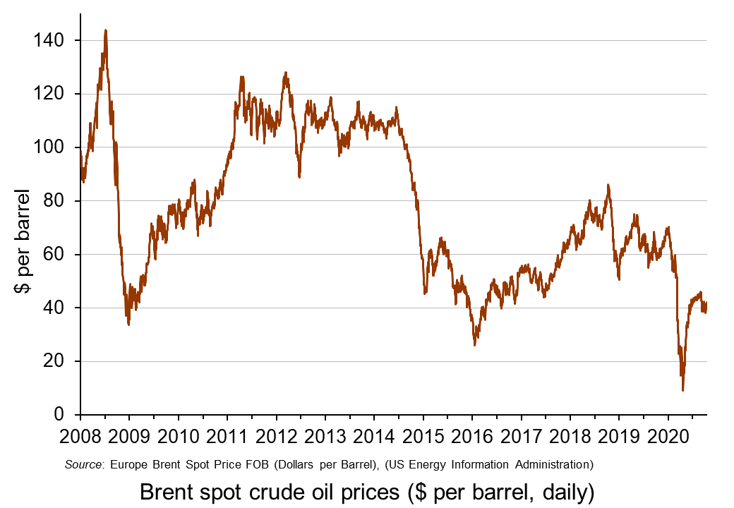 The IMF considers the future for oil prices and concludes that prices will remain subdued. It forecasts that petroleum spot prices will average $47 per barrel in 2021, up only slightly from the $42 average it predicts for 2020.
On the supply side it predicts that ‘stronger oil production growth in several non-OPEC+ countries, a faster normalization of Libya’s oil production, and a breakdown of the OPEC+ agreement’ will push up supply and push down prices. Even if the OPEC+ agreement holds, the members are set to ease their production cut by nearly 25% at the start of 2021. This rise in supply will be offset to some extent by possibly ‘excessive cuts in oil and gas upstream investments and further bankruptcies in the energy sector’.
On the demand side, the speed of the recovery from the pandemic will be a major determinant. If the second wave is long-lasting and deep, with a vaccine available to all still some way off, oil demand could remain subdued for many months. This will be compounded by the accelerating shift to renewable energy and electric vehicles and by government policies to reduce CO2 emissions.
Report
Articles
Oil price data
Questions
- Describe a scenario in which oil prices rebound significantly over the coming months. Illustrate your answer with a supply and demand diagram.
- Describe a scenario in which oil prices fall over the coming months. Again, illustrate your answer with a supply and demand diagram.
- How are the price elasticities of demand and supply relevant to the size of any oil price change?
- Project forward 10 years and predict whether oil prices will be higher or lower than now. What are the major determinants of supply and demand in your prediction?
- What are oil futures? What determines oil future prices?
- How does speculation affect oil prices?
 The latest UK house price index reveals that annual house price growth in the UK slowed to just 1.2 per cent in May. This is the lowest rate of growth since January 2013. This is being driven, in part, by the London market where annual house price inflation rates have now been negative for 15 consecutive months. In May the annual rate of house price inflation in London fell to -4.4 per cent, it lowest since August 2009 as the financial crisis was unfolding. However, closer inspection of the figures show that while many other parts of the country continue to experience positive rates of annual house price inflation, once general inflation is accounted for, there is widespread evidence of widespread real house price deflation.
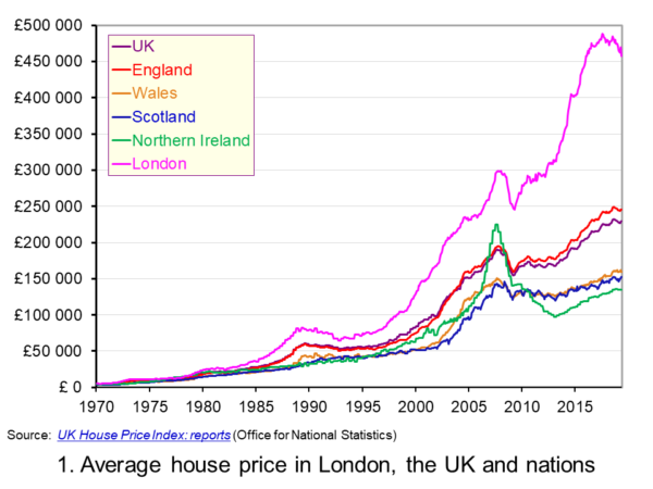 The average UK house price in May 2019 was £229,000. As Chart 1 shows, this masks considerable differences across the UK. In England the average price was £246,000 (an annual increase of 1.0 per cent), in Scotland it was £153,000 (an increase of 2.8 per cent), in Wales £159,000 (an increase of 3.0 per cent) and in Northern Ireland it was £137,000 (an increase of 2.1 per cent). (Click here to download a PowerPoint copy of the chart.)
The London market distorts considerably the English house price figures. In London the average house price in May 2019 was £457,000 (an annual decrease of 4.4 per cent). House prices were lowest in the North East region of England at £128,000. The North East was the only other English region alongside London to witness a negative rate of annual house price inflation, with house prices falling in the year to May 2019 by 0.7 per cent.
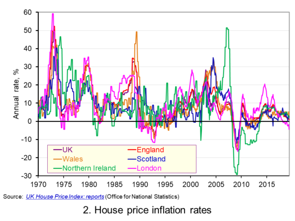 Chart 2 allows us to see more readily the rates of house price growth. It plots the annual rates of house price inflation across London, the UK and its nations. What is readily apparent is the volatility of house price growth. This is evidence of frequent imbalances between the flows of property on to the market to sell (instructions to sell) and the number of people looking to buy (instructions to buy). An increase in instructions to buy relative to those to sell puts upwards pressure on prices whereas an increase in the relative number of instructions to sell puts downward pressure on prices. (Click here to download a PowerPoint copy of the chart.)
Despite the volatility in house prices, the longer-term trend in house prices is positive. The average annual rate of growth in house prices between January 1970 and May 2019 in the UK is 9.1 per cent. For England the figure is 9.4 per cent, for Wales 8.8 per cent, for Scotland 8.5 per cent and for Northern Ireland 8.3 per cent. In London the average rate of growth is 10.4 per cent per annum.
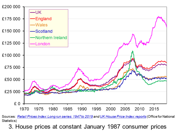 As Chart 3 illustrates, the longer-term growth in actual house prices cannot be fully explained by the growth in consumer prices. It shows house price values as if consumer prices, as measured by the Retail Prices Index (RPI), were fixed at their January 1987 levels. We see real increases in house prices or, expressed differently, in house prices relative to consumer prices. In real terms, UK house prices were 3.6 times higher in May 2019 compared to January 1970. For England the figure is 4.1 times, for Wales 3.1 times, for Scotland 2.9 times and for Northern Ireland 2.1 times. In London inflation-adjusted house prices were 5.7 times higher. (Click here to download a PowerPoint copy of the chart.)
The volatility in house prices continues to be evident when adjusted for changes in consumer prices. The UK’s annual rate of real house price inflation was as high as 40 per in January 1973, yet, on the other hand, in June 1975 inflation-adjusted house prices were 16 per cent lower than a year earlier. Over the period from January 1970 to May 2019, the average annual rate of real house price inflation was 3.2 per cent. Hence house prices have, on average, grown at an annual rate of consumer price inflation plus 3.2 per cent.
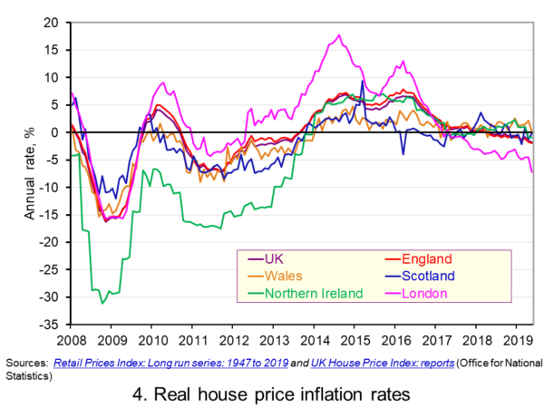 Chart 4 shows annual rates of real house price inflation since 2008 and, hence, from around the time the financial crisis began to unfold. The period is characterised by acute volatility and with real house prices across the UK falling at an annual rate of 16 per cent in 2009 and by as much 29 per cent in Northern Ireland. (Click here to download a PowerPoint copy of the chart.)
The UK saw a rebound in nominal and real house price growth in the period from 2013, driven by a strong surge in prices in London and the South East, and supported by government initiatives such as Help to Buy designed to help people afford to buy property. But house price growth then began to ease from early/mid 2016. Some of the easing may be partly due to any excessive fizz ebbing from the market, especially in London, and the impact on the demand for buy-to-let investments resulting from reductions in tax relief on interest payments on buy-to-let mortgages.
However, the housing market is notoriously sensitive to uncertainty, which is not surprising when you think of the size of the investment people are making when they enter the market. The uncertainty surrounding Brexit and the UK’s future trading relationships will have been a drag on demand and hence on house prices.
Chart 4 shows that by May 2019 all the UK nations were experiencing negative rates of real house price inflation, despite still experiencing positive rates of nominal house price inflation. In Wales the real annual house price inflation rate was -0.1 per cent, in Scotland -0.2 per cent, in Northern Ireland -0.9 per cent and in England -2.0 per cent. Meanwhile in London, where annual house price deflation has been evident for 15 consecutive months, real house prices in May 2019 were falling at an annual rate of 7.2 per cent.
Going forward the OBR’s Fiscal Risks Report predicts that, in the event of a no-deal, no-transition exit of the UK from the European Union, nominal UK house prices would fall by almost 10 per cent between the start of 2019 and mid-2021. This forecast is driven by the assumption that the UK would enter a year-long recession from the final quarter of 2019. It argues that property transactions and prices ‘move disproportionately’ during recessions. (See John’s blog The costs of a no-deal Brexit for a fuller discussion of the economics of a no-deal Brexit). The danger therefore is that the housing market becomes characterised by both nominal and real house price falls.
Articles
Questions
- Explain the difference between a rise in the rate of house price inflation a rise in the level of house prices.
- Explain the difference between nominal and real house prices.
- If nominal house prices rise can real house price fall? Explain your answer.
- What do you understand by the terms instructions to buy and instructions to sell?
- What factors are likely to affect the levels of instructions to buy and instructions to sell?
- How does the balance between instructions to buy and instructions to sell affect house prices?
- How can we differentiate between different housing markets? Illustrate your answer with examples.
 The latest UK house price index continues to show an easing in the rate of house price inflation. In the year to January 2019 the average UK house price rose by 1.7 per cent, the lowest rate since June 2013 when it was 1.5 per cent. This is significantly below the recent peak in house price inflation when in May 2016 house prices were growing at 8.2 per cent year-on-year. In this blog we consider how recent patterns in UK house prices compare with those over the past 50 years and also how the growth of house prices compares to that in consumer prices.
The UK and its nations
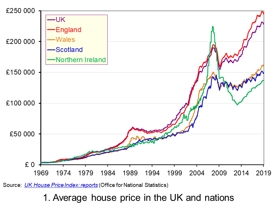 The average UK house price in January 2019 was £228,000. As Chart 1 shows, this masks considerable differences across the UK. In England the average price was £245,000 (an annual increase of 1.5 per cent), while in Scotland it was £149,000 (an increase of 1.3 per cent), Wales £160,000 (an increase of 4.6 per cent) and £137,000 in Northern Ireland (an increase of 5.5 per cent). (Click here to download a PowerPoint copy of the chart.)
Within England there too are considerable differences in house prices, with London massively distorting the English average. In January 2019 the average house price in inner London was recorded at £568,000, a fall of 1.9 per cent on January 2018. In Outer London the average price was £426,000, a fall of 0.2 per cent. Across London as a whole the average price was £472,000, a fall of 1.6 per cent. House prices were lowest in the North East at £125,000, having experienced an annual increase of 0.9 per cent.
The Midlands can be used as a reference point for English house prices outside of the capital. In January 2019 the average house price in the West Midlands was £195,000 while in the East Midlands it was £193,000. While the annual rate of house price inflation in London is now negative, the annual rate of increase in the Midlands was the highest in England. In the West Midlands the annual increase was 4 per cent while in the East Midlands it was 4.4 per cent. These rates of increase are currently on par with those across Wales.
Long-term UK house price trends
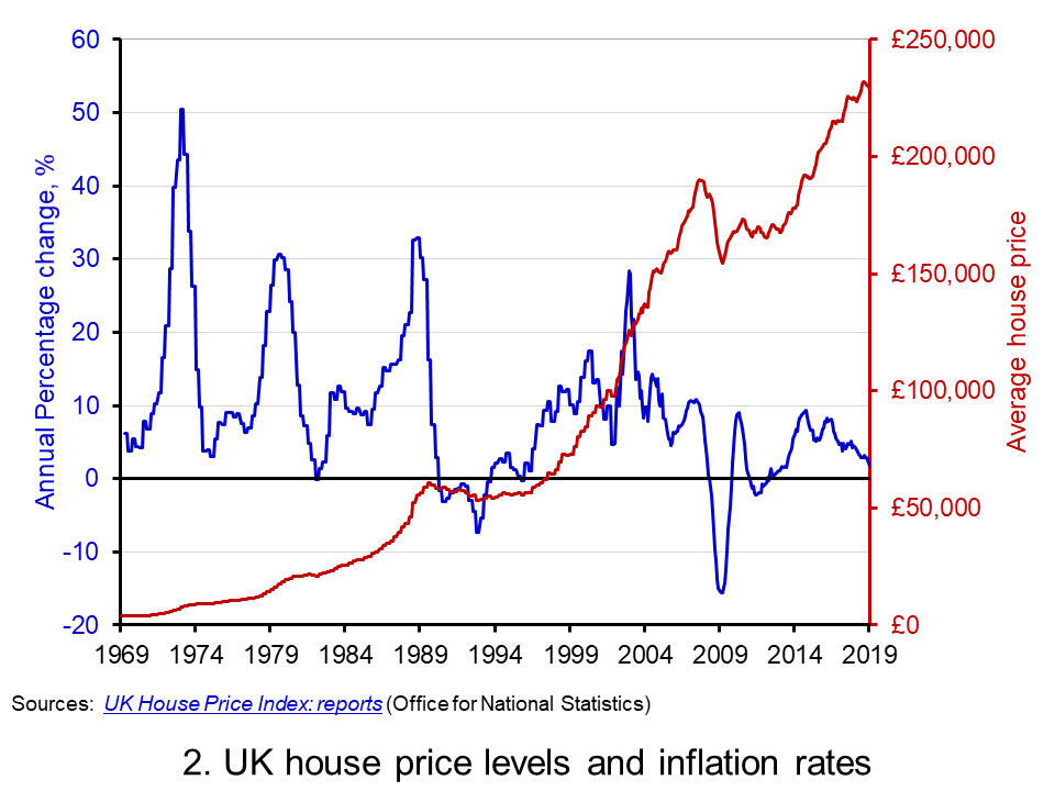 Chart 2 shows the average house price for the UK since 1969 alongside the annual rate of house price inflation, i.e. the annual percentage change in the level of house prices. The average UK house price in January 1969 was £3,750. By January 2019, as we have seen, it had risen to around £228,000. This is an increase of nearly 6,000 per cent. Over this period, the average annual rate of house price inflation was 9 per cent. However, if we measure it to the end of 2007 it was 11 per cent. (Click here to download a PowerPoint copy of the chart.)
The significant effect of the financial crisis on UK house prices is evident from Charts 1 and 2. In February 2009 house prices nationally were 16 per cent lower than a year earlier. Furthermore, it was not until August 2014 that the average UK house rose above the level of September 2007. Indeed, some parts of the UK, such as Northern Ireland and the North East of England, remain below their pre-financial crisis level even today.
Nominal and real UK house prices
But how do house price patterns compare to those in consumer prices? In other words, what has happened to inflation-adjusted or real house prices? One index of general prices is the Retail Prices Index (RPI). This index measures the cost of a representative basket of consumer goods and services. Since January 1969 the RPI has increased by nearly 1,600 per cent. While substantial in its own right, it does mean that house prices have increased considerably more rapidly than consumer prices.
If we eliminate the increase in consumer prices from the actual (nominal) house price figures what is left is the increase in house prices relative to consumer prices. To do this we estimate house prices as if consumer prices had remained at their January 1987 level. This creates a series of average UK house prices at constant January 1987 consumer prices.
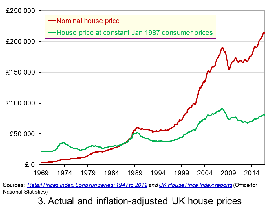 Chart 3 shows the average nominal and real UK house price since 1969. It shows that in real terms the average UK house price increased by around 266 per cent between January 1969 and January 2019. Therefore, the average real UK house price was 3.7 times more expensive in 2019 compared with 1969. This is important because it means that general price inflation cannot explain all the long-term growth seen in average house prices. (Click here to download a PowerPoint copy of the chart.)
Real UK house price cycles
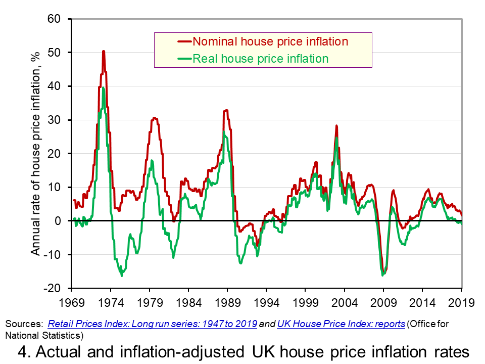 Chart 4 shows that annual rates of nominal and real house price inflation. As we saw earlier, the average nominal house price inflation rate since 1969 has been 9 per cent. The average real rate of increase in house prices has been 3.1 per cent per annum. In other words, house prices have on average each each year increased by the annual rate of RPI inflation plus 3.1 percentage points. (Click here to download a PowerPoint copy of the chart.)
Chart 4 shows how, in addition to the long-term relative increase in house prices, there are also cycles in the relative price of houses. This is evidence of a volatility in house prices that cannot be explained by general prices. This volatility reflects frequent imbalances between the demand and supply of housing, i.e. between instructions to buy and sell property. Increasing levels of housing demand (instructions to buy) relative to housing supply (instructions to supply) will put upward pressure on house prices and vice versa.
In January 2019 the annual real house price inflation across the UK was -0.9 per cent. While the rate was slightly lower in Scotland at -1.2 per cent, the biggest drag on UK house price inflation was the London market where the real house price inflation rate was -4.0 per cent. In contrast, January saw annual real house price inflation rates of 2 per cent in Wales, 2.3 per cent in Northern Ireland and 1.8 per cent in the East Midlands.
Inflation-adjusted inflation rates in London have been negative consistently since June 2017. From their July 2016 peak, following the result of the referendum on UK membership of the EU, to January 2019 inflation-adjusted house prices fell by 7.6 per cent. This reflects, in part, the fact that the London housing market, like that of other European capitals, is a more international market than other parts of the country. Therefore, the current patterns in UK house prices are rather distinctive in that the easing is being led by London and southern England.
Articles
Questions
- What is meant by the annual rate of house price inflation?
- How is a rise in the rate of house price inflation different from a rise in the level of house prices?
- What factors are likely to determine housing demand (instructions to buy)?
- What factors are likely to affect housing supply (instructions to sell)?
- Explain the difference between nominal and real house prices.
- What does a decrease in real house prices mean? Can this occur even if actual house prices have risen?
- How might we explain the recent differences between house price inflation rates in London relative to other parts of the UK, like the Midlands and Wales?
- Why were house prices so affected by the financial crisis?
- Assume that you asked to measure the affordability of housing. What data might you collect?
 Speculation in markets can lead to wild swings in prices as exuberance drives up prices and
 The most recent example of a bubble is GameStop. This is a chain of shops in the USA selling games, consoles and other electronic items. During the pandemic it has struggled, as games consumers have turned to online sellers of consoles and online games. It has been forced to close a number of stores. In July 2020, its share price was around $4. With the general recovery in stock markets, this drifted upwards to just under $20 by 12 January 2021.
  Enter the ‘armchair investor’. During lockdown, small-scale amateur investing in shares has become a popular activity, with people seeking to make easy gains from the comfort of their own homes. This has been facilitated by online trading platforms such as Robinhood and Trading212. These are easy and cheap, or even free, to use.
  Each week, BBC Radio 4 broadcasts readings from a book serialised in five 15-minute episodes. In the week beginning 18 January 2021,
 In its latest
  The IMF considers the future for oil prices and concludes that prices will remain subdued. It forecasts that petroleum spot prices will average $47 per barrel in 2021, up only slightly from the $42 average it predicts for 2020.
 The latest
  The average UK house price in May 2019 was £229,000. As Chart 1 shows, this masks considerable differences across the UK. In England the average price was £246,000 (an annual increase of 1.0 per cent), in Scotland it was £153,000 (an increase of 2.8 per cent), in Wales £159,000 (an increase of 3.0 per cent) and in Northern Ireland it was £137,000 (an increase of 2.1 per cent). (Click
  Chart 2 allows us to see more readily the rates of house price growth. It plots the annual rates of house price inflation across London, the UK and its nations. What is readily apparent is the volatility of house price growth. This is evidence of frequent imbalances between the flows of property on to the market to sell (instructions to sell) and the number of people looking to buy (instructions to buy). An increase in instructions to buy relative to those to sell puts upwards pressure on prices whereas an increase in the relative number of instructions to sell puts downward pressure on prices. (Click
  As Chart 3 illustrates, the longer-term growth in actual house prices cannot be fully explained by the growth in consumer prices. It shows house price values as if consumer prices, as measured by the Retail Prices Index (RPI), were fixed at their January 1987 levels. We see real increases in house prices or, expressed differently, in house prices relative to consumer prices. In real terms, UK house prices were 3.6 times higher in May 2019 compared to January 1970. For England the figure is 4.1 times, for Wales 3.1 times, for Scotland 2.9 times and for Northern Ireland 2.1 times. In London inflation-adjusted house prices were 5.7 times higher. (Click
  Chart 4 shows annual rates of real house price inflation since 2008 and, hence, from around the time the financial crisis began to unfold. The period is characterised by acute volatility and with real house prices across the UK falling at an annual rate of 16 per cent in 2009 and by as much 29 per cent in Northern Ireland. (Click
  The average UK house price in January 2019 was £228,000. As Chart 1 shows, this masks considerable differences across the UK. In England the average price was £245,000 (an annual increase of 1.5 per cent), while in Scotland it was £149,000 (an increase of 1.3 per cent), Wales £160,000 (an increase of 4.6 per cent) and £137,000 in Northern Ireland (an increase of 5.5 per cent). (Click
  Chart 2 shows the average house price for the UK since 1969 alongside the annual rate of house price inflation, i.e. the annual percentage change in the level of house prices. The average UK house price in January 1969 was £3,750. By January 2019, as we have seen, it had risen to around £228,000. This is an increase of nearly 6,000 per cent. Over this period, the average annual rate of house price inflation was 9 per cent. However, if we measure it to the end of 2007 it was 11 per cent. (Click
  Chart 3 shows the average nominal and real UK house price since 1969. It shows that in real terms the average UK house price increased by around 266 per cent between January 1969 and January 2019. Therefore, the average real UK house price was 3.7 times more expensive in 2019 compared with 1969. This is important because it means that general price inflation cannot explain all the long-term growth seen in average house prices. (Click
  Chart 4 shows that annual rates of nominal and real house price inflation. As we saw earlier, the average nominal house price inflation rate since 1969 has been 9 per cent. The average real rate of increase in house prices has been 3.1 per cent per annum. In other words, house prices have on average each each year increased by the annual rate of RPI inflation plus 3.1 percentage points. (Click