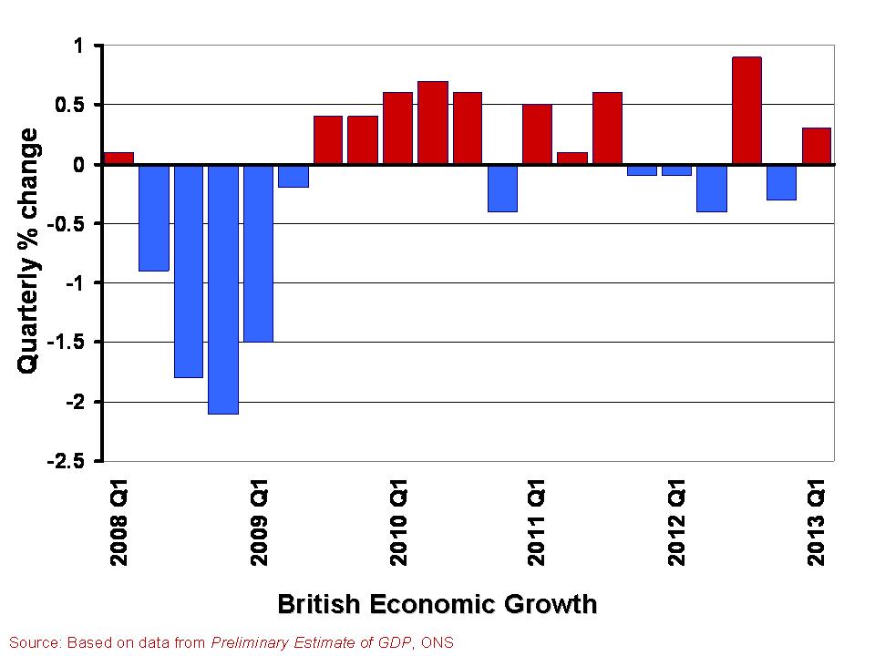
 In The global economy we note the mixed picture contained within the latest British growth numbers. With the first estimate of growth for Q1 of 2013 pointing to an increase in real GDP of 0.3 per cent, the UK economy appears to have missed the ignominy of a triple dip recession. However, the overall economy remains fragile with different sectors of the economy performing quite differently.
A patchy picture is perhaps the fairest assessment. This helps to explain the quite different perceptions amongst economists, business people, journalists and the wider public about the current state of the economy. Here we consider in a little more detail the growth numbers for the UK from the latest preliminary GDP estimates. (Click here for a PowerPoint of the chart).
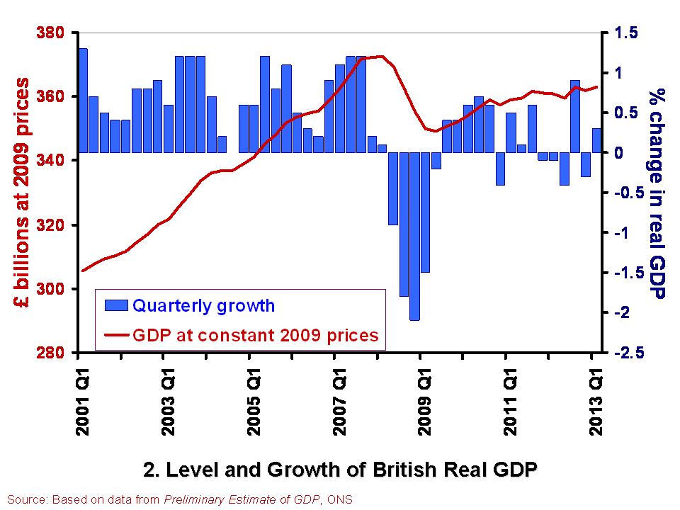 The British economy is thought to have grown by 0.3 per cent in the first quarter of 2013. This follows a contraction of 0.3 per cent in the final quarter of 2012. Compared with the first quarter of 2012, the output of the British economy was 0.6 per cent higher. However, as Chart 2 helps to show, the British economy has some way to go before it returns to the levels seen prior to the financial crisis. Real GDP peaked in the first quarter of 2008 when GDP at 2009 prices was estimated at £372.7 billion. In the first quarter of 2013, GDP at constant 2009 prices is estimated at £362.9 billion. This means that the economy is still 2.6 per cent smaller than its 2008-peak. Click here for a PowerPoint of the chart.
The patchy nature of British growth is illustrated nicely by the contrasting rates of growth across the different industrial sectors in the first quarter of the year. While service sector output rose by 0.6 per cent, output across the production industries rose by only 0.2 per cent and agricultural output declined by 3.7 per cent. Within the production industries, mining and quarrying output rose by 3.2 per cent, but manufacturing output shrunk by 0.3 per cent and construction output shrunk by 2.5 per cent.
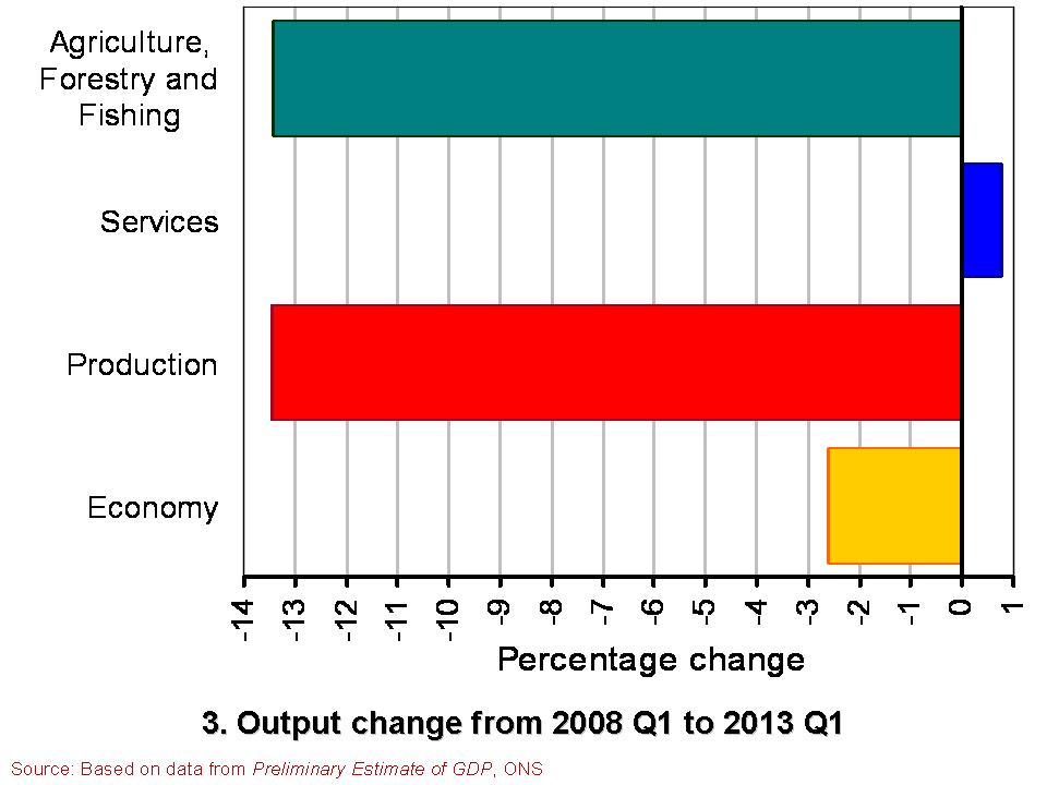 Chart 3 compares the output of agriculture, the production industries and the service sector between the first quarter of 2008 and the first quarter of 2013. (Click here for a PowerPoint of the Chart). It shows the dramatically different experience of the service sector compared with agriculture and the production industries. While output in the service sector is now 0.8 per cent higher, output across agriculture and the production industries is almost 13.5 per cent lower. Within the production industries, output in mining and quarrying is 38 per cent lower, in the construction sector 19 per cent lower and 10 per cent lower in manufacturing. It is perhaps not surprising then that we get such different messages about the state of the economy. The devil really is in the detail.
Data
Preliminary Estimate of GDP – Time Series Dataset Q1 2013 Office for National Statistics
Statistical Bulletin: Gross Domestic Product Preliminary Estimate Q1 2013 Office for National Statistics
Articles
UK avoids triple-dip recession with better-than-expected 0.3% GDP growth Guardian, Heather Stewart (25/4/13)
UK economy shows 0.3% growth Financial Times, Claire Jones (25/4/13)
UK avoids triple-dip recession with 0.3pc GDP growth Telegraph, Szu Ping Chan (25/4/13)
Osborne claims UK economy is ‘healing’ Financial Times, George Parker and Claire Jones (25/4/13)
UK narrowly escapes triple-dip recession as GDP figures show 0.3% growth in first three months of year Independent, Ben Chu (25/4/13)
UK economy avoids triple-dip recession BBC News (25/4/13)
Questions
- What is the difference between nominal and real GDP? Which of these helps to track changes in economic output?
- How would we identify a recession in either of the first two charts?
- What is a double-dip recession? What is a triple-dip recession?
- The UK economy in Q1 2013 was 2.6 per cent smaller than in Q1 2008. What factors do you think help explain why after 5 years UK real GDP is still lower?
- Why if output in the production and agricultural sectors is 13.5 per cent lower in Q1 2013 compared to Q1 2008 is the economy’s total output only 2.6 per cent lower?
- Economic growth rates fluctuate quite significantly. Can economic theory help to explain why this is the case?
In the Perils of snow and stamp duty blog here on the Sloman Economics News site we noted two particular influences that may have contributed to February’s reported fall in UK house prices: the end of the stamp duty holiday and the poor winter weather. Here we ponder a little more on the recent relationship between the economic and house prices cycles and, more generally, on the significance and causes of the recent imbalances between housing demand and supply.
What is particularly interesting about February’s house price fall (the Halifax put the fall at 1½% and the Nationwide at 1%) is that it is happening just after the economy reportedly grew by 0.3% in the last quarter of last year. But, then again, the house price fall is a reversal of an upward trend that started back in the summer of 2009 when the economy was still contracting! One’s gut reaction might be that cycles in house prices and economic growth ought to coincide. One reason for this is that the growth in income of the household sector will reflect the phase of the business cycle that the economy is in. For instance, during the slowdown or recessionary phase, like the period during 2008/9, the household sector’s income is likely to be shrinking and this will impact on housing demand. The magnitude of the effect on demand will depend on the sensitivity of housing demand to changing incomes – something that economists refer to as the income elasticity of demand.
We can, despite what might appear to be the recent puzzling behaviour of UK house prices, apply the concepts of demand and supply to gain some insight into what has been driving house prices. One way of thinking about the concepts of housing demand and supply is to relate them respectively to the number of ‘instructions to buy’ and the number of ‘instructions to sell’ on an estate agent’s book. We can then try and think of factors which might influence, in a given period, the number of instructions to buy and sell.
One possible explanation of the house price growth of last year is that despite the household sector’s shrinking income there were in fact a number of relatively cash-rich households out there, partly because the lowering of interest rates meant that the debt-servicing costs on variable rate mortgages fell. This left some households with more discretionary income to spend or to use to increase their housing investment by trading-up between one housing market and another. The key point here is if there is not a similar increase in the number of instructions to sell then the imbalance between the flow of instructions to buy and instructions to sell results in upward pressure in prices. In those markets where the imbalance between demand and supply is greatest price pressures are most acute. This appears to have been especially true last year in particular markets in the south of England.
So what of February’s fall? Well, again we have to think about the balance between instructions to buy and sell. What appears to have happened is that the demand pressures that built up in some markets lessened. And, as we consider elsewhere on this site, it is perhaps even the case that the wonderful British weather ‘played a hand’ by discouraging some households from looking to buy and adding to our estate agents’ lists of instructions to buy.
Articles
UK housing recovery running out of steam CITY A.M., Jessica Mead (5/3/10)
UK house prices ‘lose momentum’, say Nationwide BBC News (26/2/10)
UK house prices see first fall since June, says Halifax BBC News (4/3/10)
Fears grow of double dip for UK housing market The Independent, Sean O’Grady (5/3/10)
Data
Halifax House Price Data Lloyds Banking Group
House Prices: Data Download Nationwide Building Society
Questions
- What do economists mean by the income elasticity of demand? How income elastic do you think owner-occupied housing demand is likely to be?
- How important do you think current house prices are likely to be in affecting the number of instructions to buy and instructions to sell in the current period?
- How important do you think expectations of future house prices are in affecting the number of instructions to buy and sell in the current period?
- What role might financial institutions, like banks and building societies, play in affecting UK house price growth in 2010? How might their influence compare with that in the period 2008/9?
- Rather than economic growth affecting house prices, is it possible that house price growth could affect economic growth?
 In The global economy we note the mixed picture contained within the latest British growth numbers. With the first estimate of growth for Q1 of 2013 pointing to an increase in real GDP of 0.3 per cent, the UK economy appears to have missed the ignominy of a triple dip recession. However, the overall economy remains fragile with different sectors of the economy performing quite differently.
 The British economy is thought to have grown by 0.3 per cent in the first quarter of 2013. This follows a contraction of 0.3 per cent in the final quarter of 2012. Compared with the first quarter of 2012, the output of the British economy was 0.6 per cent higher. However, as Chart 2 helps to show, the British economy has some way to go before it returns to the levels seen prior to the financial crisis. Real GDP peaked in the first quarter of 2008 when GDP at 2009 prices was estimated at £372.7 billion. In the first quarter of 2013, GDP at constant 2009 prices is estimated at £362.9 billion. This means that the economy is still 2.6 per cent smaller than its 2008-peak. Click here for a PowerPoint of the chart.
 Chart 3 compares the output of agriculture, the production industries and the service sector between the first quarter of 2008 and the first quarter of 2013. (Click here for a PowerPoint of the Chart). It shows the dramatically different experience of the service sector compared with agriculture and the production industries. While output in the service sector is now 0.8 per cent higher, output across agriculture and the production industries is almost 13.5 per cent lower. Within the production industries, output in mining and quarrying is 38 per cent lower, in the construction sector 19 per cent lower and 10 per cent lower in manufacturing. It is perhaps not surprising then that we get such different messages about the state of the economy. The devil really is in the detail.