 The coronavirus pandemic and the climate emergency have highlighted the weaknesses of free-market capitalism.
Governments around the world have intervened massively to provide economic support to people and businesses affected by the pandemic through grants and furlough schemes. They have also stressed the importance of collective responsibility in abiding by lockdowns, social distancing and receiving vaccinations.
The pandemic has also highlighted the huge inequalities around the world. The rich countries have been able to offer much more support to their people than poor countries and they have had much greater access to vaccines. Inequality has also been growing within many countries as rich people have gained from rising asset prices, while many people find themselves stuck in low-paid jobs, suffering from poor educational opportunities and low economic and social mobility.
The increased use of working from home and online shopping has accelerated the rise of big tech companies, such as Amazon and Google. Their command of the market makes it difficult for small companies to compete – and competition is vital if capitalism is to benefit societies. There have been growing calls for increased regulation of powerful companies and measures to stimulate competition. The problem has been recognised by governments, central banks and international agencies, such as the IMF and the OECD.
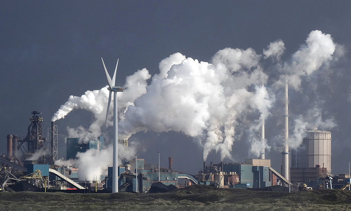 At the same time as the world has been grappling with the pandemic, global warming has contributed to extreme heat and wildfires in various parts of the world, such as western North America, the eastern Mediterranean and Siberia, and major flooding in areas such as western Europe and China. Governments again have intervened by providing support to people whose property and livelihoods have been affected. Also there is a growing urgency to tackle global warming, with some movement, albeit often limited, in implementing policies to achieve net zero carbon emissions by some specified point in the future. Expectations are rising for concerted action to be agreed at the international COP26 climate meeting in Glasgow in November this year.
An evolving capitalism
So are we seeing a new variant of capitalism, with a greater recognition of social responsibility and greater government intervention?
 Western governments seem more committed to spending on socially desirable projects, such as transport, communications and green energy infrastructure, education, science and health. They are beginning to pursue more active industrial and regional policies. They are also taking measures to tax multinationals (see the blog The G7 agrees on measures to stop corporate tax avoidance). Many governments are publicly recognising the need to tackle inequality and to ‘level up’ society. Active fiscal policy, a central plank of Keynesian economics, has now come back into fashion, with a greater willingness to fund expenditure by borrowing and, over the longer term, to use higher taxes to fund increased government expenditure.
But there is also a growing movement among capitalists themselves to move away from profits being their sole objective. A more inclusive ‘stakeholder capitalism’ is being advocated by many companies, where they take into account the interests of a range of stakeholders, from customers, to workers, to local communities, to society in general and to the environment. For example, the Council for Inclusive Capitalism, which is a joint initiative of the Vatican and several world business and public-sector leaders, seeks to make ‘the world fairer, more inclusive, and sustainable’.
If there is to be a true transformation of capitalism from the low-tax free-market capitalism of neoclassical economists and libertarian policymakers to a more interventionist mixed market capitalism, where capitalists pursue a broader set of objectives, then words have to be matched by action. Talk is easy; long-term plans are easy; taking action now is what matters.
Articles and videos
- Why the next stage of capitalism is coming
BBC Future, Matthew Wilburn King (27/5/21)
- During the pandemic, a new variant of capitalism has emerged
The Guardian, Larry Elliott (30/7/21)
- When it comes to social and environmental justice, words don’t cut it
GreenBiz, C J Clouse (28/4/21)
 Introducing the Council for Inclusive Capitalism with the Vatican
Inclusive Capitalism (7/12/20)
- The State and Direction of Inclusive Capitalism
Saïd Business School, Ford Foundation and Deloitte Social Impact practice, Richard Barker, Mary Johnstone-Louis, Colin Mayer, Pradeep Prabhala, Noah Rimland Flower, Theodore Roosevelt Malloch, Tony Siesfeld and Peter Tufano (2018)
- Rising Market Power—A Threat to the Recovery?
IMF Blog, Kristalina Georgieva, Federico J Díez, Romain Duval and Daniel Schwarz (15/3/21)
- The Pandemic Alone Can’t Transform Capitalism
Jacobin, Ramaa Vasudevan (30/7/21)
- Down to earth: How entrepreneurs can collaborate to rejuvenate capitalism
EU-Startups, Luca Sabia (4/8/21)
Questions
- How similar is the economic response of Western governments to the pandemic to their response to the financial crisis of 2007–8?
- What do you understand by ‘inclusive capitalism’? How can stakeholders hold companies to account?
- What indicators are there of market power? Why have these been on the rise?
- How can entrepreneurs contribute to ‘closing the inequality gap for a more sustainable and inclusive form of society’?
- What can be done to hold governments to account for meeting various social and environmental objectives? How successful is this likely to be?
- Can inequality be tackled without redistributing income and wealth from the rich to the poor?
 In a series of five podcasts, broadcast on BBC Radio 4 in the first week of January 2021, Amol Rajan and guests examine different aspects of inequality and consider the concept of fairness.
As the notes to the programme state:
The pandemic brought renewed focus on how we value those who have kept shelves stacked, transport running and the old and sick cared for. So is now the time to bring about a fundamental shift in how our society and economy work?
The first podcast, linked below, examines the distribution of wealth in the UK and how it has changed over time. It looks at how rising property and share prices and a lightly taxed inheritance system have widened inequality of wealth.
It also examines rising inequality of incomes, a problem made worse by rising wealth inequality, the move to zero-hour contracts, gig working and short-term contracts, the lack of social mobility, austerity following the financial crisis of 2007–9 and the lockdowns and restrictions to contain the coronavirus pandemic, with layoffs, people put on furlough and more and more having to turn to food banks.
Is this rising inequality fair? Should fairness be considered entirely in monetary terms, or should it be considered more broadly in social terms? These are issues discussed by the guests. They also look at what policies can be pursued. If the pay of health and care workers, for example, don’t reflect their value to our society, what can be done to increase their pay? If wealth is very unequally distributed, should it be redistributed and how?
The questions below are based directly on the issues covered in the podcast in the order they are discussed.
Podcast
Questions
- In what ways has Covid-19 been the great ‘unequaliser’?
- What scarring/hysteresis effects are there likely to be from the pandemic?
- To what extent is it true that ‘the more your job benefits other people, the less you get paid’?
- How has the pandemic affected inter-generational inequality?
- How have changes in house prices skewed wealth in the UK over the past decade?
- How have changes in the pension system contributed to inter-generational inequality?
- How has quantitative easing affected the distribution of wealth?
- Why is care work so poorly paid and how can the problem be addressed?
- How desirable is the pursuit of wealth?
- How would you set about defining ‘fairness’?
- Is a mix of taxation and benefits the best means of tackling economic unfairness?
- How would you set about deciding an optimum rate of inheritance tax?
- How do you account for the growth of in-work poverty?
- In what ways could wealth be taxed? What are the advantages and disadvantages of such taxes?
The UK rail industry was privatised by the Conservative government in the mid-1990s. As Case Study 14.8 on the Economics 10th edition website states:
 The management of rail infrastructure, such as track, signalling and stations, was to be separated from the responsibility for running trains. There would be 25 passenger train operating companies (TOCs), each having a franchise lasting between seven and fifteen years. These companies would have few assets, being forced to rent track and lease stations from the infrastructure owner (Railtrack), and to lease trains and rolling stock from three new rolling-stock companies. …In practice, the 25 franchises were operated by just 11 companies (with one, National Express, having nine of the franchises).
In 1996, at the start of the franchise era, the train operating companies were largely private-sector companies such as National Express, Stagecoach, Virgin Rail and Prism Rail. By 2020, most of the franchises were operated by a foreign state-owned business or a joint venture with a foreign state-owned firm.
As a result of poor performance (see above case study), Railtrack was effectively renationalised in 2002 as Network Rail – a not-for-profit company, wholly dependent upon the UK Treasury for any shortfall in its funds.
TOCs had mixed success. Some performed so poorly that their franchise contracts had to be temporarily taken over by a state-owned operator. For example, in June 2003 the Strategic Rail Authority withdrew the operating licence of the French company Connex South Eastern. The franchise was temporarily taken over by the publicly-owned South Eastern Trains from November 2003 until March 2006 before being returned to a private operator.
Perhaps the most troubled franchise has been the East Coast Main Line between London and Scotland. It was renationalised in 2009, reprivatised in 2015 and renationalised in 2018.
The effect of the coronavirus pandemic
 The spread of the coronavirus and the accompanying lockdowns and social distancing saw a plummeting of rail travel. Passenger numbers fell to just 10% of pre-pandemic levels. In March 2020, the UK Government introduced Emergency Measures Agreements (EMAs), which temporarily replaced rail franchise agreements. TOCs were paid a 2% fee (based on pre-Covid costs) to run trains and losses were borne by the government.
When the EMAs ran out on the 20 September, they were replaced by Emergency Recovery Measures Agreements (ERMAs), set to last until no later than April 2022. Under these measures, the fees paid to TOCs were reduced to a maximum of 1.5%. These consist partly of a fixed fee (again based on pre-Covid costs) and partly on a performance payment, depending on punctuality, passenger satisfaction and financial performance. As with the EMAs, the new arrangements involve virtually no risk for the TOCs (except for the size of the performance-related fee). Costs and revenue will be passed to the Department for Transport, which will bear any losses.
TOCs were required to run a virtually full service to allow reduced passenger numbers to observe social distancing. Despite journeys still being only 30% of pre-pandemic levels, social distancing on trains meant that many trains were sold out.
 The ERMAs also contain provisions for the replacement of franchises when they come to an end. The precise nature of these will be spelt out in a White Paper, which will respond to the recommendations of the Williams Review of the railways. This review was set up in 2018 in the aftermath of difficulties with various franchises and a chaotic nationwide timetable change. The review’s findings were originally scheduled to be published in Autumn 2019, but were then put back because of the general election and the disruptions caused by the pandemic. The government hopes that it will be published before the end of 2020.
It is expected that the review will recommend replacing the franchise system with something similar to the currents ERMAs. TOCs awarded a contract will be paid a performance-related fee and revenues will go to the government, which will bear the costs. While this is not quite renationalisation, it is not the previous franchise system where TOCs bore the risks. It is in effect a contract system where private companies are paid to deliver a public service.
The CrossCountry franchise
 The first test of this new approach to contracting with TOCs came this month. Arriva’s franchise for running CrossCountry trains ran out and was replaced by a three-year contract to run the services, which span
 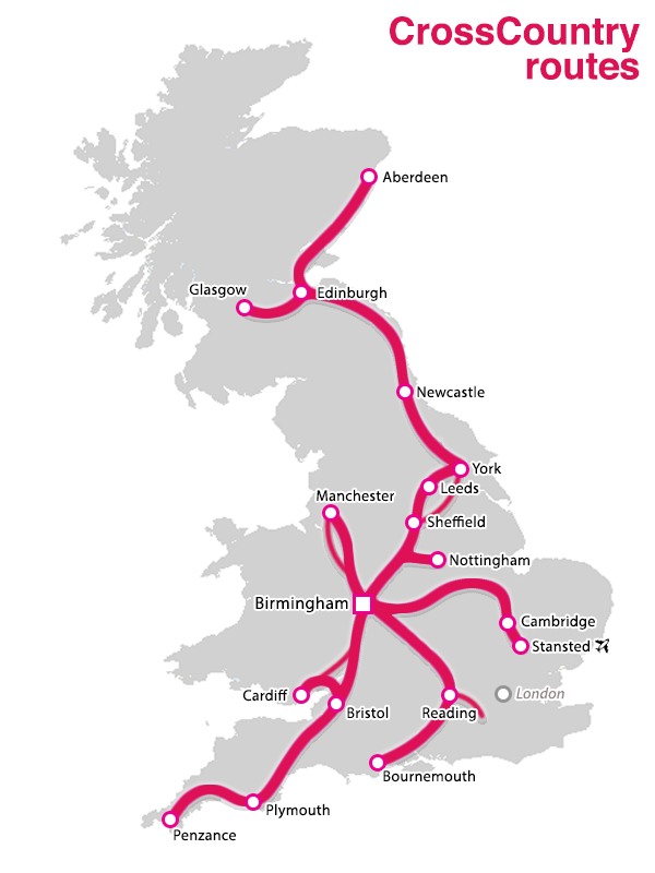 much of the length of Great Britain from Aberdeen to Penzance via Edinburgh, Glasgow, Newcastle, Sheffield, Birmingham, Bristol and Plymouth; from Bournemouth to Manchester via Reading, Oxford, Wolverhampton and Stoke; from Cardiff to Nottingham via Gloucester, Birmingham and Derby; and from Birmingham to Stanstead Airport via Leicester and Cambridge.
The contract will last three years. The Department for Transport will gain the revenues and cover the costs and pay Arriva (owned by Deutsche Bahn) a management fee that is ‘performance related’ – as yet unspecified. This, like the EMAs and then the ERMAs, will remove the risks from Arriva.
Nationalisation in Wales
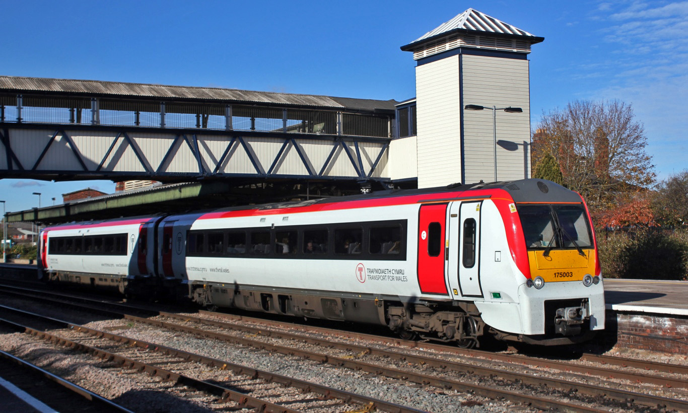 The Welsh government has announced that Transport for Wales will be taken over by a publicly owned company in February 2021. TfW operates many of the routes in Wales and the borders and most of the branch lines in Wales, including the valley commuter lines into Cardiff. It is currently owned by KeolisAmey (a joint company owned 70% by the French company, Keolis (part of SNCF), and 30% by the UK company, Amey), which took over the franchise in 2018 from Arriva. The Welsh government considered that KeolisAmey would collapse if it did not provide support. Ministers decided that nationalisation would give it greater control than simply subsidising KeolisAmey.
James Price, chief executive of the Welsh Government, stated that this allows it:
to reduce the profit we pay to the private sector massively over time, and make sure that when the revenue comes back, it comes back in to the taxpayer.
Under emergency measures, KeolisAmey has already been supported by the Welsh government to the tune of £105 million (£40 million in March and £65 million in June) to continue operating the franchise. Passenger numbers fell by 95% as the pandemic hit.
Is nationalisation a better way forward, or should private train operating companies continue with the government taking on the risks, or should the franchise system be amended with greater support from the government but with the TOCs still bearing risk? The articles below consider these issues.
Articles
- Rail nationalisations may be coming down the track
BBC News, Tom Burridge (17/9/20)
- ONS recognises full nationalisation of the UK railways
Financial Times, Tanya Powley (31/7/20)
- Train services are very efficient for shareholders – less so for customers
The Conversation, Daniel Fisher (22/8/19)
- UK government on standby to nationalise more rail lines
Financial Times, Jim Pickard and Philip Georgiadis (17/9/20)
- British Government Ends Rail Franchising
Railway-News, Josephine Cordero Sapién (21/9/20)
- British government announces end for rail franchise system
Trains, Keith Fender (12/10/20)
- Monday essay: A new era?
Railnews, Sim Harris (19/10/20)
- Arriva secures three-year CrossCountry contract
International railway Journal Kevin Smith (16/10/20)
- New contract signed for Arriva CrossCountry
RTM, Ailsa Cowen (16/10/20)
- Franchising is Dead
Railway-News, Josephine Cordero Sapién and Gareth Davies (16/9/20)
- Transport for Wales rail services to be nationalised
BBC News (23/10/20)
- Transport for Wales to be nationalised
Railnews (22/10/20)
- Why has the Welsh Government nationalised rail’s Wales and Borders franchise?
BusinessLive, Sion Barry (22/10/20)
Questions
- Explain how the franchising system worked (prior to March 2020).
- To what extent could each franchise be described as a ‘contestable monopoly’?
- What incentives were built into the franchising system to deliver improvements in service for passengers?
- What were the weaknesses of the franchising system?
- In the context of post-pandemic rail services, compare the relative merits of nationalisation with those of awarding contracts where the government receives the revenues and bears the costs and pays train operating companies a fee for operating the services where the size of the fee is performance related.
- What are the arguments for subsidising rail transport? What should determine the size of the subsidy?
 Three international agencies, the IMF, the European Commission and the OECD, all publish six-monthly forecasts for a range of countries. As each agency’s forecasts have been published this year, so the forecasts for economic growth and other macroeconomic indicators, such as unemployment, have got more dire.
The IMF was the first to report. Its World Economic Outlook, published on 14 April, forecast that in the UK real GDP would fall by 6.5% in 2020 and rise by 4% in 2021 (not enough to restore GDP to 2019 levels); in the USA it would fall by 5.9% this year and rise by 4.7% next year; in the eurozone it would fall by 7.5% this year and rise by 4.7% next.
The European Commission was next to report. Its AMECO database was published on 6 May. This forecast that UK real GDP would fall by 8.3% this year and rise by 6% next; in the USA it would fall by 6.5% this year and rise by 4.9% next; in the eurozone it would fall by 7.7% this year and rise by 6.3% next.
The latest to report was the OECD on 10 June. The OECD Economic Outlook was the most gloomy. In fact, it produced two sets of forecasts.
The first, more optimistic one (but still more gloomy than the forecasts of the other two agencies) was based on the assumption that lockdowns would continue to be lifted and that there would be no second outbreak later in the year. This ‘single-hit scenario’ forecast that UK real GDP would fall by 11.5% this year and rise by 9% next (a similar picture to France and Italy); in the USA it would fall by 7.3% this year and rise by 4.1% next; in the eurozone it would fall by 9.1% this year and rise by 6.5% next.
The second set of OECD forecasts was based on the assumption that there would be a second wave of the virus and that lockdowns would have to be reinstated. Under this ‘double-hit scenario’, the UK’s GDP is forecast to fall by 14.0% this year and rise by 5.0 per cent next; in the USA it would fall by 8.5% this year and rise by 1.9% next; in the eurozone it would fall by 11.5% this year and rise by 3.5% next.
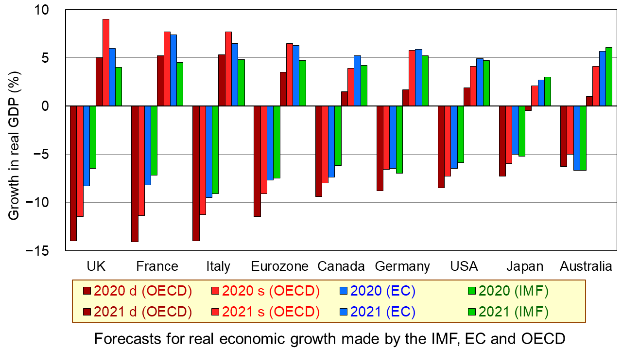
The first chart shows the four sets of forecasts (including two from the OECD) for a range of countries. The first four bars for each country are the forecasts for 2020; the other four bars for each country are for 2021. (Click here for a PowerPoint of the chart.)
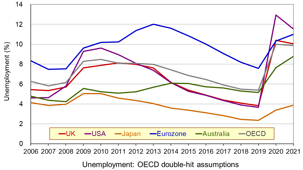
The second chart shows unemployment rates from 2006. The figures for 2020 and 2021 are OECD forecasts based on the double-hit assumption. You can clearly see the dramatic rise in unemployment in all the countries in 2020. In some cases it is forecast that there will be a further rise in 2021. (Click here for a PowerPoint of the chart.)
As the OECD states:
In both scenarios, the recovery, after an initial, rapid resumption of activity, will take a long time to bring output back to pre-pandemic levels, and the crisis will leave long-lasting scars – a fall in living standards, high unemployment and weak investment. Job losses in the most affected sectors, such as tourism, hospitality and entertainment, will particularly hit low-skilled, young, and informal workers.
But why have the forecasts got gloomier? There are both demand- and supply-side reasons.
Aggregate demand has fallen more dramatically than originally anticipated. Lockdowns have lasted longer in many countries than governments had initially thought, with partial lockdowns, which replace them, taking a long time to lift. With less opportunity for people to go out and spend, consumption has fallen and saving has risen. Businesses that have shut, some permanently, have laid off workers or they have been furloughed on reduced incomes. This too has reduced spending. Even when travel restrictions are lifted, many people are reluctant to take holidays at home and abroad and to use public transport for fear of catching the virus. This reluctance has been higher than originally anticipated. Again, spending is lower than before. Even when restaurants, bars and other public venues are reopened, most operate at less than full capacity to allow for social distancing. Uncertainty about the future has discouraged firms from investing, adding to the fall in demand.
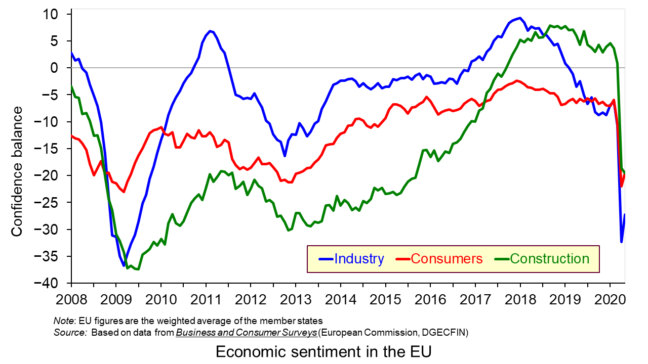
On the supply side, there has been considerable damage to capacity, with firms closing and both new and replacement investment being put on hold. Confidence in many sectors has plummeted as shown in the third chart which looks at business and consumer confidence in the EU. (Click here for a PowerPoint of the above chart.) Lack of confidence directly affects investment with both supply- and demand-side consequences.
Achieving a sustained recovery will require deft political and economic judgements by policymakers. What is more, people are increasingly calling for a different type of economy – one where growth is sustainable with less pollution and degradation of the environment and one where growth is more inclusive, where the benefits are shared more equally. As Angel Gurría, OECD Secretary-General, states in his speech launching the latest OECD Economic Outlook:
The aim should not be to go back to normal – normal was what got us where we are now.
Articles
OECD publications
Questions
- Why has the UK economy been particularly badly it by the Covid-19 pandemic?
- What will determine the size and timing of the ‘bounce back’?
- Why will the pandemic have “dire and long-lasting consequences for people, firms and governments”?
- Why have many people on low incomes faced harsher consequences than those on higher incomes?
- What are the likely environmental impacts of the pandemic and government measures to mitigate the effects?
 The issue of inequality has come into increasing focus over recent years. The impact of the COVID-19 pandemic raises further concerns that these inequalities may be exacerbated further. Here we provide an overview of some of the key patterns in current levels of wealth and income inequality in Britain. They show, for example, the markedly higher degree of inequality in wealth relative to income, the importance of property wealth and private pension wealth in determining levels of wealth, and the considerable variation in average wealth levels of households by age and location.
According to the 6th round of the Wealth and Assets Survey the aggregate wealth of British households was £14.63 trillion in April 2016 to March 2018. This compares with £12.57 trillion in the previous survey which ran from April 2014 to March 2016. This amounts to a 16.3 per cent nominal increase. In real terms, after adjusting for consumer price inflation, the increase was 13.1 per cent. Furthermore, when compared with the first round of the survey in July 2006 to June 2008, there has been a nominal increase in the aggregate wealth of British households of 74 per cent and a real increase of 41 per cent.
What is wealth?
An important question to ask when reflecting on the growth and distribution of wealth across households is what wealth comprises. In fact, it comprises one of four components:
- Net Financial wealth – the value of financial assets (savings and financial investments) less any financial liabilities (loans and arrears)
- Physical wealth – the value of household contents, possessions, valuables and vehicles
- Private pension wealth – the value of private pensions, such as occupational pensions and personal pensions
- Net property wealth – the value of any property owned (including other land/properties owned abroad) less the value of any loans or mortgages secured on these properties.
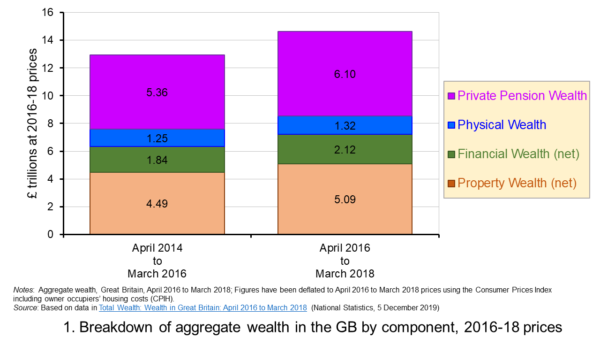 Figure 1 shows the evolution of aggregate wealth over the last two surveys (at constant 2016-18 prices) by the four component parts. Two components dominate the aggregate wealth of British households: property wealth (35 per cent) and private pension wealth (41-42 per cent). Financial wealth is the third largest component (14 per cent), while property wealth is the smallest component (9 to 10 per cent). (Click here for a PowerPoint of the chart.)
Trends in the average wealth of households
To help contextualise the size of wealth and begin to think about its distribution, rather than look at aggregate household wealth we can instead look at the average wealth of British households.
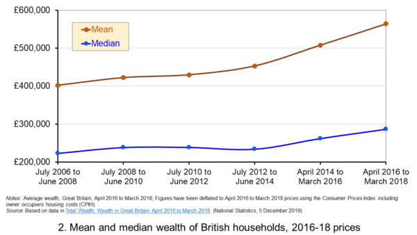 Figure 2 shows the average wealth (at constant 2016-18 prices) as measured by the mean (aggregate divided by the number of households) and the median (the middle household). The mean wealth of households is seen to be greater than their median wealth. In April 2016 to March 2018, average wealth as measured by the mean was £564,300 (an increase of 40.3 per cent over July 2006 to June 2008), whilst the average wealth of each household as measured by the median was £286,600 (an increase of 28.5 per cent over July 2006 to June 2008). (Click here for a PowerPoint of the chart.)
The higher mean value of wealth relative to the median value shows that the distribution of wealth is unequal. Therefore, the mean-to-median ratio is an indicator of inequality. In April 2016 to March 2018 the mean-to-median ratio was 1.97, up from 1.94 in April 2014 to March 2016 and 1.77 in July 2008 to June 2010, and 1.8 in the first survey in July 2006 to June 2008. This metric is therefore consistent with a more unequal distribution of wealth having arisen since the second survey in July 2008 to June 2010, a period during which the UK and global economy was been buffeted by the effects of the financial crisis and the associated economic downturn.
Trends in the average income of households
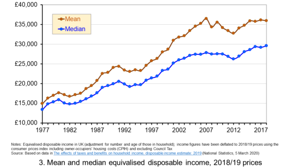 Figure 3 shows the mean and median values of disposable income (adjusted for the number and age of individuals comprising each household). Mean disposable income of UK households in financial year ending (FYE) 2018 was £35,928, a 0.5 per cent real decrease over FYE 2017, whilst median wealth (middle household) was £29,598 in FYE 2018, a 1.5 per cent real increase over FYE 2017. (Click here for a PowerPoint of the chart.)
The higher mean value of disposable income relative to the median value is indicative of inequality in disposable income. In FYE 2018 the mean-to-median ratio for disposable income was 1.21, down from 1.24 in FYE 2017 and a peak of 1.27 in FYE 2014, but higher than the 1.10 in 1978. The longer-term growth in the inequality of income helps to exacerbate existing wealth inequalities.
Comparing the inequality of income and wealth
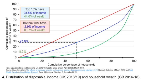 Figure 4 shows starkly the current inequality in wealth as compared to that in income. It does so by plotting their respective Lorenz curves. The curves show the proportion of overall wealth or income attributable to a given proportion of households. For example, 50 per cent of households have close to 28 per cent of total disposable income and a mere 8.5 per cent of aggregate wealth. (Click here for a PowerPoint of the chart.)
The inequality shown by the Lorenz curves is especially startling when we look at the top and bottom deciles. The bottom decile has just 2.9 per cent of income and only 0.07 per cent of wealth. Meanwhile the top 10 per cent of households have 28.5 per cent of income, almost the same as the first 50 percent of households, and some 44.6 per cent of wealth, with the previous 90 per cent of households having 55.4 per cent of wealth.
The Lorenz curves allow for the calculation of the Gini coefficient. It measures the area between the Lorenz curve and the 45 degree line consistent with zero inequality relative to the total area below the 45 degree line. Therefore, the Gini coefficient can take a value of between 0% (no inequality) and 100% (total inequality – where one person has all the wealth). Unsurprisingly whilst the Gini coefficient for disposable income in the UK in FYE 2018 was 34.7 per cent, that for aggregate wealth in Great Britain in April 2016 to March 2018 was significantly higher at 63.3 per cent.
The Gini coefficient for disposable income has risen from 25.5 per cent in 1977 to a peak in FYE 2008 of 38.6 per cent. It has therefore eased during the 2010s, but is nonetheless 13 percentage points higher today than it was four decades ago. Meanwhile, the Gini coefficient for wealth at the time of the first survey from July 2006 to June 2008 was 61 per cent. It has been unchanged at 63 percent over the last three surveys.
Inequality in wealth by component, location and age
It is important to recognise the inequalities in the components of wealth. This has particular importance when we are trying to understand how wealth varies by household characteristics, such as age and location.
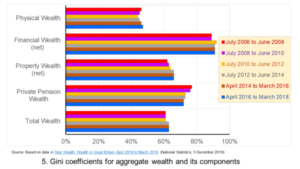 Figure 5 shows that the highest Gini coefficient is for net financial wealth. This stood at 91 per cent in April 2016 to March 2018. This extremely high figure shows the very high levels of inequatity in net financial wealth. This reflects the fact that some households find themselves with negative net financial wealth, such that their debts exceed their assets, whilst, on the other hand, some households can have large sums in financial investments. (Click here for a PowerPoint of the chart.)
We saw at the outset that the largest two components of wealth are property wealth and private pension wealth. The Gini coefficients of these two have in recent times moved in opposite directions by roughly similar magnitudes. This means that their effects on the overall Gini coefficient have offset one another. Perhaps for many people the rise in Gini coeffcient for property from 62 per cent in July 2006 to June 2008 to 66 per cent in April 2016 to March 2018 is the inequality measure that resonates most. This is reflected in regional disparities in wealth.
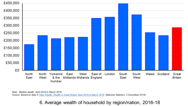 Figure 6 shows the geographical disparity of median household wealth across Britain. The regions with the highest median wealth are the South East, South West, London and the East of England. They have the highest contributions from net property wealth (40.4 per cent, 35.6 per cent, 41.7 per cent and 37.2 per cent respectively). The region with the lowest median total wealth, the North East, has the least total wealth in net property wealth (24.8 per cent). (Click here for a PowerPoint of the chart.)
Property wealth and private pension wealth also contribute to disparities in wealth by the age of the head of the household, also known as the household reference person or HRP. In April 2016 to March 2018 the mean wealth where the HRP is 25-34 was £125,700, rising to £859,200 where the HRP is 55-64 and then falling to £692,300 when the HRP is 65 or over. This is consistent with households accruing wealth over time and the using wealth to help fund retirement.
Where the age of the HRP is 55-64, mean property wealth in April 2016 to March 2018 was £255,800 compared to £53,700 where the HRP is 25-34. Meanwhile, where the age of the HRP is 55-64, mean private pension wealth was £449,100 compared to just £32,300 where the HRP is 25-34. In respect of property wealth, the deterioration in the affordability of owner-occupied housing over many years will impact especially hard on younger households. This will therefore tend to exacerbate inter-generational wealth inequality.
Whilst this briefing provides an overview of recent patterns in income and wealth inequality in Britain, the articles and press releases below consider the impact that the COVID-19 pandemic may have on inequalities.
Articles and Press Releases
- Many better-off households may increase savings as spending on ‘banned’ activities falls. Poorer households spend much more of their income on necessities and will be less resilient to any falls in income
IFS Press Release, Rowena Crawford, Alex Davenport, Robert Joyce and Peter Levell (08/04/20)
- Sector shut-downs during the coronavirus crisis affect the youngest and lowest paid workers, and women, the most
IFS Press Release, Robert Joyce and Xiaowei Xu (06/04/20)
- Coronavirus downturn ‘will exacerbate UK health inequality’
City A.M., James Warrington (09/04/20)
- Coronavirus pandemic exacerbates inequalities for women, UN warns
Guardian, Alexandra Villarreal (11/04/20)
- Inequality doesn’t just make pandemics worse – it could cause them
Guardian, Laura Spinney (12/04/20)
- The Coronavirus Will Be a Catastrophe for the Poor
The Atlantic, Derek Thompson (20/03/20)
- EU-wide inequality is back to pre-crisis levels
Social Europe, Michael Dauderstädt (15/04/20)
- Coronavirus makes inequality a public health issue
World Economic Forum, Alexandre Kalache (President, International Longevity Centre-Brazil) (13/04/20)
- Economist Joseph Stiglitz says coronavirus is ‘exposing’ health inequality in US
- CNBC, Jesse Pound (14/04/20)
ONS Bulletins
Questions
- In what ways can we use statistics to help measure and inform our analysis of inequality?
- In what ways can income inequality impact on wealth inequality?
- How can wealth inequality impact on income inequality?
- What might explain why wealth inequality is greater than income inequality?
- Explain how Lorenz curves help to generate Gini coefficients.
- Why would we expect the wealth of households with a younger household reference person (HRP) to be lower than that of a household with an older HRP? Would we expect this average to rise over all age ranges?
- If you were advising a government on policies to reduce income and wealth inequalities what sort of measures might you suggest?
- What is the difference between original income and disposable income?
- What is the difference between disposable income and equivalised disposable income?
- What role does the housing market play in affecting wealth inequality?
- Why is net financial wealth so unequally distributed?
- What is meant by health inequality? Of what significance is this for income and wealth inequality?
- What is meant by social mobility? Of what significance is this for income and wealth inequality?
 The coronavirus pandemic and the climate emergency have highlighted the weaknesses of free-market capitalism.
  At the same time as the world has been grappling with the pandemic, global warming has contributed to extreme heat and wildfires in various parts of the world, such as western North America, the eastern Mediterranean and Siberia, and major flooding in areas such as western Europe and China. Governments again have intervened by providing support to people whose property and livelihoods have been affected. Also there is a growing urgency to tackle global warming, with some movement, albeit often limited, in implementing policies to achieve net zero carbon emissions by some specified point in the future. Expectations are rising for concerted action to be agreed at the international COP26 climate meeting in Glasgow in November this year.
 Western governments seem more committed to spending on socially desirable projects, such as transport, communications and green energy infrastructure, education, science and health. They are beginning to pursue more active industrial and regional policies. They are also taking measures to tax multinationals (see the blog The G7 agrees on measures to stop corporate tax avoidance). Many governments are publicly recognising the need to tackle inequality and to ‘level up’ society. Active fiscal policy, a central plank of Keynesian economics, has now come back into fashion, with a greater willingness to fund expenditure by borrowing and, over the longer term, to use higher taxes to fund increased government expenditure.
 Introducing the Council for Inclusive Capitalism with the Vatican
 In a series of five podcasts, broadcast on BBC Radio 4 in the first week of January 2021, Amol Rajan and guests examine different aspects of inequality and consider the concept of fairness.
 The management of rail infrastructure, such as track, signalling and stations, was to be separated from the responsibility for running trains. There would be 25 passenger train operating companies (TOCs), each having a franchise lasting between seven and fifteen years. These companies would have few assets, being forced to rent track and lease stations from the infrastructure owner (Railtrack), and to lease trains and rolling stock from three new rolling-stock companies. …In practice, the 25 franchises were operated by just 11 companies (with one, National Express, having nine of the franchises).
 The spread of the coronavirus and the accompanying lockdowns and social distancing saw a plummeting of rail travel. Passenger numbers fell to just 10% of pre-pandemic levels. In March 2020, the UK Government introduced Emergency Measures Agreements (EMAs), which temporarily replaced rail franchise agreements. TOCs were paid a 2% fee (based on pre-Covid costs) to run trains and losses were
  The ERMAs also contain provisions for the replacement of franchises when they come to an end. The precise nature of these will be spelt out in a White Paper, which will respond to the recommendations of the
  The first test of this new approach to contracting with TOCs came this month. Arriva’s franchise for running CrossCountry trains ran out and was replaced by a three-year contract to run the services,
  much of the length of Great Britain from Aberdeen to Penzance via Edinburgh, Glasgow, Newcastle, Sheffield, Birmingham, Bristol and Plymouth; from Bournemouth to Manchester via Reading, Oxford, Wolverhampton and Stoke; from Cardiff to Nottingham via Gloucester, Birmingham and Derby; and from Birmingham to Stanstead Airport via Leicester and Cambridge.
 The Welsh government has announced that Transport for Wales will be taken over by a publicly owned company in February 2021. TfW operates many of the routes in Wales and the borders and most of the branch lines in Wales, including the valley commuter lines into Cardiff. It is currently owned by
  Three international agencies, the IMF, the European Commission and the OECD, all publish six-monthly forecasts for a range of countries. As each agency’s forecasts have been published this year, so the forecasts for economic growth and other macroeconomic indicators, such as unemployment, have got more dire.


 Figure 1 shows the evolution of aggregate wealth over the last two surveys (at constant 2016-18 prices) by the four component parts. Two components dominate the aggregate wealth of British households: property wealth (35 per cent) and private pension wealth (41-42 per cent). Financial wealth is the third largest component (14 per cent), while property wealth is the smallest component (9 to 10 per cent). (Click
  Figure 2 shows the average wealth (at constant 2016-18 prices) as measured by the mean (aggregate divided by the number of households) and the median (the middle household). The mean wealth of households is seen to be greater than their median wealth. In April 2016 to March 2018, average wealth as measured by the mean was £564,300 (an increase of 40.3 per cent over July 2006 to June 2008), whilst the average wealth of each household as measured by the median was £286,600 (an increase of 28.5 per cent over July 2006 to June 2008). (Click
  Figure 3 shows the mean and median values of disposable income (adjusted for the number and age of individuals comprising each household). Mean disposable income of UK households in financial year ending (FYE) 2018 was £35,928, a 0.5 per cent real decrease over FYE 2017, whilst median wealth (middle household) was £29,598 in FYE 2018, a 1.5 per cent real increase over FYE 2017. (Click
  Figure 4 shows starkly the current inequality in wealth as compared to that in income. It does so by plotting their respective Lorenz curves. The curves show the proportion of overall wealth or income attributable to a given proportion of households. For example, 50 per cent of households have close to 28 per cent of total disposable income and a mere 8.5 per cent of aggregate wealth. (Click
  Figure 5 shows that the highest Gini coefficient is for net financial wealth. This stood at 91 per cent in April 2016 to March 2018. This extremely high figure shows the very high levels of inequatity in net financial wealth. This reflects the fact that some households find themselves with negative net financial wealth, such that their debts exceed their assets, whilst, on the other hand, some households can have large sums in financial investments. (Click
  Figure 6 shows the geographical disparity of median household wealth across Britain. The regions with the highest median wealth are the South East, South West, London and the East of England. They have the highest contributions from net property wealth (40.4 per cent, 35.6 per cent, 41.7 per cent and 37.2 per cent respectively). The region with the lowest median total wealth, the North East, has the least total wealth in net property wealth (24.8 per cent). (Click