 The issue of inequality has come into increasing focus over recent years. The impact of the COVID-19 pandemic raises further concerns that these inequalities may be exacerbated further. Here we provide an overview of some of the key patterns in current levels of wealth and income inequality in Britain. They show, for example, the markedly higher degree of inequality in wealth relative to income, the importance of property wealth and private pension wealth in determining levels of wealth, and the considerable variation in average wealth levels of households by age and location.
According to the 6th round of the Wealth and Assets Survey the aggregate wealth of British households was £14.63 trillion in April 2016 to March 2018. This compares with £12.57 trillion in the previous survey which ran from April 2014 to March 2016. This amounts to a 16.3 per cent nominal increase. In real terms, after adjusting for consumer price inflation, the increase was 13.1 per cent. Furthermore, when compared with the first round of the survey in July 2006 to June 2008, there has been a nominal increase in the aggregate wealth of British households of 74 per cent and a real increase of 41 per cent.
What is wealth?
An important question to ask when reflecting on the growth and distribution of wealth across households is what wealth comprises. In fact, it comprises one of four components:
- Net Financial wealth – the value of financial assets (savings and financial investments) less any financial liabilities (loans and arrears)
- Physical wealth – the value of household contents, possessions, valuables and vehicles
- Private pension wealth – the value of private pensions, such as occupational pensions and personal pensions
- Net property wealth – the value of any property owned (including other land/properties owned abroad) less the value of any loans or mortgages secured on these properties.
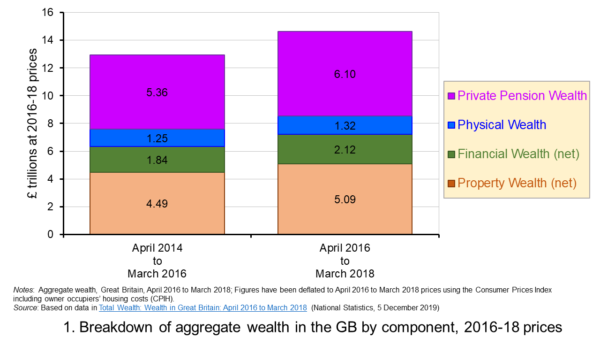 Figure 1 shows the evolution of aggregate wealth over the last two surveys (at constant 2016-18 prices) by the four component parts. Two components dominate the aggregate wealth of British households: property wealth (35 per cent) and private pension wealth (41-42 per cent). Financial wealth is the third largest component (14 per cent), while property wealth is the smallest component (9 to 10 per cent). (Click here for a PowerPoint of the chart.)
Trends in the average wealth of households
To help contextualise the size of wealth and begin to think about its distribution, rather than look at aggregate household wealth we can instead look at the average wealth of British households.
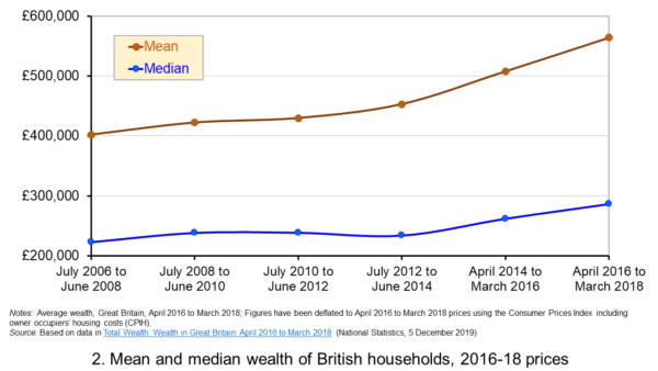 Figure 2 shows the average wealth (at constant 2016-18 prices) as measured by the mean (aggregate divided by the number of households) and the median (the middle household). The mean wealth of households is seen to be greater than their median wealth. In April 2016 to March 2018, average wealth as measured by the mean was £564,300 (an increase of 40.3 per cent over July 2006 to June 2008), whilst the average wealth of each household as measured by the median was £286,600 (an increase of 28.5 per cent over July 2006 to June 2008). (Click here for a PowerPoint of the chart.)
The higher mean value of wealth relative to the median value shows that the distribution of wealth is unequal. Therefore, the mean-to-median ratio is an indicator of inequality. In April 2016 to March 2018 the mean-to-median ratio was 1.97, up from 1.94 in April 2014 to March 2016 and 1.77 in July 2008 to June 2010, and 1.8 in the first survey in July 2006 to June 2008. This metric is therefore consistent with a more unequal distribution of wealth having arisen since the second survey in July 2008 to June 2010, a period during which the UK and global economy was been buffeted by the effects of the financial crisis and the associated economic downturn.
Trends in the average income of households
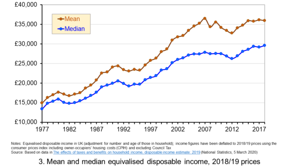 Figure 3 shows the mean and median values of disposable income (adjusted for the number and age of individuals comprising each household). Mean disposable income of UK households in financial year ending (FYE) 2018 was £35,928, a 0.5 per cent real decrease over FYE 2017, whilst median wealth (middle household) was £29,598 in FYE 2018, a 1.5 per cent real increase over FYE 2017. (Click here for a PowerPoint of the chart.)
The higher mean value of disposable income relative to the median value is indicative of inequality in disposable income. In FYE 2018 the mean-to-median ratio for disposable income was 1.21, down from 1.24 in FYE 2017 and a peak of 1.27 in FYE 2014, but higher than the 1.10 in 1978. The longer-term growth in the inequality of income helps to exacerbate existing wealth inequalities.
Comparing the inequality of income and wealth
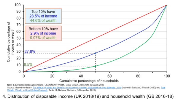 Figure 4 shows starkly the current inequality in wealth as compared to that in income. It does so by plotting their respective Lorenz curves. The curves show the proportion of overall wealth or income attributable to a given proportion of households. For example, 50 per cent of households have close to 28 per cent of total disposable income and a mere 8.5 per cent of aggregate wealth. (Click here for a PowerPoint of the chart.)
The inequality shown by the Lorenz curves is especially startling when we look at the top and bottom deciles. The bottom decile has just 2.9 per cent of income and only 0.07 per cent of wealth. Meanwhile the top 10 per cent of households have 28.5 per cent of income, almost the same as the first 50 percent of households, and some 44.6 per cent of wealth, with the previous 90 per cent of households having 55.4 per cent of wealth.
The Lorenz curves allow for the calculation of the Gini coefficient. It measures the area between the Lorenz curve and the 45 degree line consistent with zero inequality relative to the total area below the 45 degree line. Therefore, the Gini coefficient can take a value of between 0% (no inequality) and 100% (total inequality – where one person has all the wealth). Unsurprisingly whilst the Gini coefficient for disposable income in the UK in FYE 2018 was 34.7 per cent, that for aggregate wealth in Great Britain in April 2016 to March 2018 was significantly higher at 63.3 per cent.
The Gini coefficient for disposable income has risen from 25.5 per cent in 1977 to a peak in FYE 2008 of 38.6 per cent. It has therefore eased during the 2010s, but is nonetheless 13 percentage points higher today than it was four decades ago. Meanwhile, the Gini coefficient for wealth at the time of the first survey from July 2006 to June 2008 was 61 per cent. It has been unchanged at 63 percent over the last three surveys.
Inequality in wealth by component, location and age
It is important to recognise the inequalities in the components of wealth. This has particular importance when we are trying to understand how wealth varies by household characteristics, such as age and location.
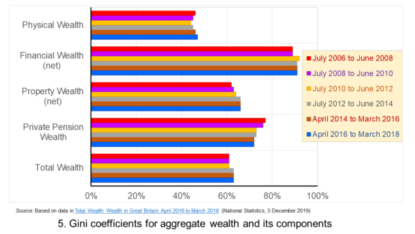 Figure 5 shows that the highest Gini coefficient is for net financial wealth. This stood at 91 per cent in April 2016 to March 2018. This extremely high figure shows the very high levels of inequatity in net financial wealth. This reflects the fact that some households find themselves with negative net financial wealth, such that their debts exceed their assets, whilst, on the other hand, some households can have large sums in financial investments. (Click here for a PowerPoint of the chart.)
We saw at the outset that the largest two components of wealth are property wealth and private pension wealth. The Gini coefficients of these two have in recent times moved in opposite directions by roughly similar magnitudes. This means that their effects on the overall Gini coefficient have offset one another. Perhaps for many people the rise in Gini coeffcient for property from 62 per cent in July 2006 to June 2008 to 66 per cent in April 2016 to March 2018 is the inequality measure that resonates most. This is reflected in regional disparities in wealth.
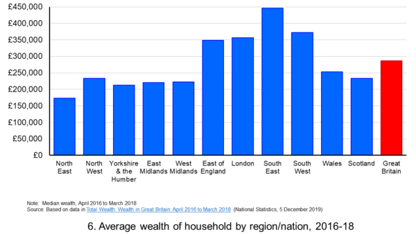 Figure 6 shows the geographical disparity of median household wealth across Britain. The regions with the highest median wealth are the South East, South West, London and the East of England. They have the highest contributions from net property wealth (40.4 per cent, 35.6 per cent, 41.7 per cent and 37.2 per cent respectively). The region with the lowest median total wealth, the North East, has the least total wealth in net property wealth (24.8 per cent). (Click here for a PowerPoint of the chart.)
Property wealth and private pension wealth also contribute to disparities in wealth by the age of the head of the household, also known as the household reference person or HRP. In April 2016 to March 2018 the mean wealth where the HRP is 25-34 was £125,700, rising to £859,200 where the HRP is 55-64 and then falling to £692,300 when the HRP is 65 or over. This is consistent with households accruing wealth over time and the using wealth to help fund retirement.
Where the age of the HRP is 55-64, mean property wealth in April 2016 to March 2018 was £255,800 compared to £53,700 where the HRP is 25-34. Meanwhile, where the age of the HRP is 55-64, mean private pension wealth was £449,100 compared to just £32,300 where the HRP is 25-34. In respect of property wealth, the deterioration in the affordability of owner-occupied housing over many years will impact especially hard on younger households. This will therefore tend to exacerbate inter-generational wealth inequality.
Whilst this briefing provides an overview of recent patterns in income and wealth inequality in Britain, the articles and press releases below consider the impact that the COVID-19 pandemic may have on inequalities.
Articles and Press Releases
- Many better-off households may increase savings as spending on ‘banned’ activities falls. Poorer households spend much more of their income on necessities and will be less resilient to any falls in income
IFS Press Release, Rowena Crawford, Alex Davenport, Robert Joyce and Peter Levell (08/04/20)
- Sector shut-downs during the coronavirus crisis affect the youngest and lowest paid workers, and women, the most
IFS Press Release, Robert Joyce and Xiaowei Xu (06/04/20)
- Coronavirus downturn ‘will exacerbate UK health inequality’
City A.M., James Warrington (09/04/20)
- Coronavirus pandemic exacerbates inequalities for women, UN warns
Guardian, Alexandra Villarreal (11/04/20)
- Inequality doesn’t just make pandemics worse – it could cause them
Guardian, Laura Spinney (12/04/20)
- The Coronavirus Will Be a Catastrophe for the Poor
The Atlantic, Derek Thompson (20/03/20)
- EU-wide inequality is back to pre-crisis levels
Social Europe, Michael Dauderstädt (15/04/20)
- Coronavirus makes inequality a public health issue
World Economic Forum, Alexandre Kalache (President, International Longevity Centre-Brazil) (13/04/20)
- Economist Joseph Stiglitz says coronavirus is ‘exposing’ health inequality in US
- CNBC, Jesse Pound (14/04/20)
ONS Bulletins
Questions
- In what ways can we use statistics to help measure and inform our analysis of inequality?
- In what ways can income inequality impact on wealth inequality?
- How can wealth inequality impact on income inequality?
- What might explain why wealth inequality is greater than income inequality?
- Explain how Lorenz curves help to generate Gini coefficients.
- Why would we expect the wealth of households with a younger household reference person (HRP) to be lower than that of a household with an older HRP? Would we expect this average to rise over all age ranges?
- If you were advising a government on policies to reduce income and wealth inequalities what sort of measures might you suggest?
- What is the difference between original income and disposable income?
- What is the difference between disposable income and equivalised disposable income?
- What role does the housing market play in affecting wealth inequality?
- Why is net financial wealth so unequally distributed?
- What is meant by health inequality? Of what significance is this for income and wealth inequality?
- What is meant by social mobility? Of what significance is this for income and wealth inequality?
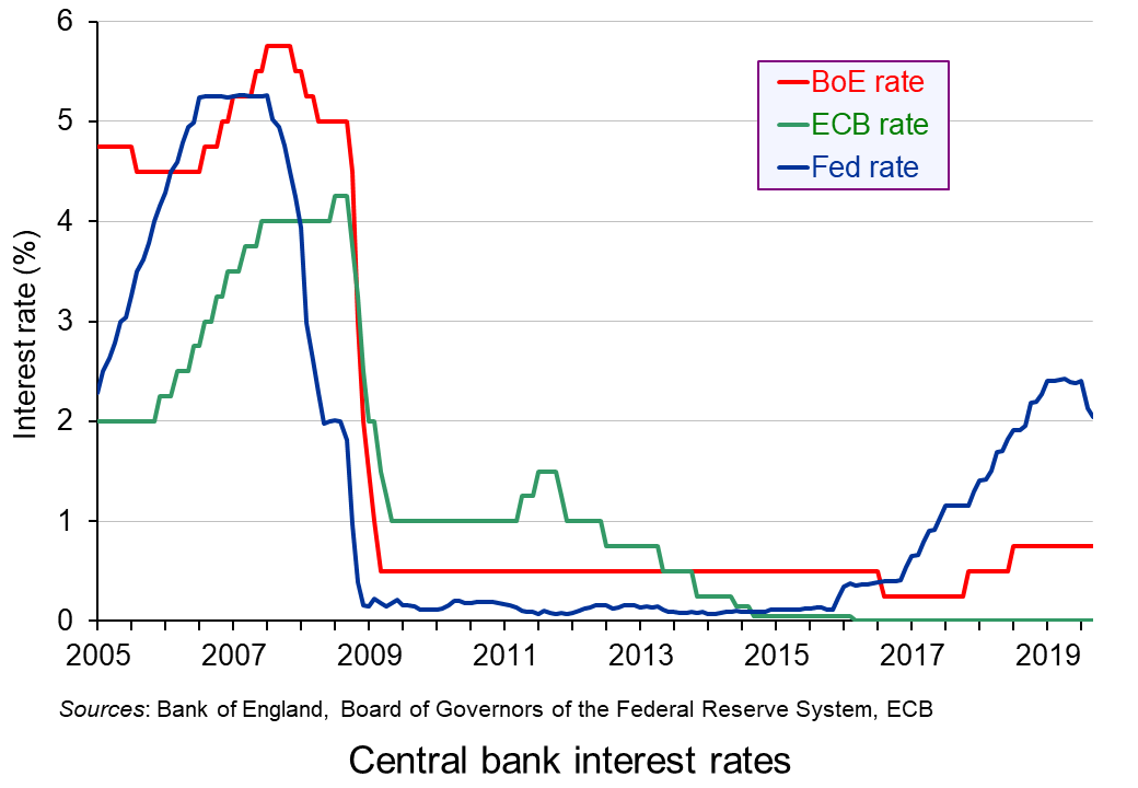
 With the prospects of weaker global economic growth and continuing worries about trade wars, central banks have been loosening monetary policy. The US central bank, the Federal Reserve, lowered its target Federal Funds rate in both July and September. Each time it reduced the rate by a quarter of a percentage point, so that it now stands at between 1.75% and 2%.
The ECB has also cut rates. In September it reduced the overnight deposit rate for banks from –0.4% to –0.5%, leaving the main rate at 0%. It also introduced a further round of quantitative easing, with asset purchases of €20 billion per month from 1 November and lasting until the ECB starts raising interest rates.
The Australian Reserve Bank has cut its ‘cash rate‘ three times this year and it now stands at an historically low level of 0.75%. Analysts are predicting that it may be forced to introduce quantitative easing if lower interest rates fail to stimulate growth.
Japan continues with its programme of quantitative easing (QE) and other central banks are considering lowering interest rates and/or (further) QE.
 But there are two key issues with looser monetary policy.
The first is whether it will be sufficient to provide the desired stimulus. With interest rates already at or near historic lows (although slightly above in the case of the USA), there is little scope for further reductions. QE may help, but without a rise in confidence, the main effect of the extra money may simply be a rise in the price of assets, such as property and shares. It may result in very little extra spending on consumption and investment – in other words, very little extra aggregate demand.
The second is the effect on inequality. By inflating asset prices, QE rewards asset owners. The wealthier people are, the more they will gain.
Many economists and commentators are thus calling for the looser monetary policy to be backed up by expansionary fiscal policy. The boost to aggregate demand, they argue, should come from higher public spending, with governments able to borrow at very low interest rates because of the loose monetary policy. Targeted spending on infrastructure would have a supply-side benefit as well as a demand-side one.
Articles
- European Central Bank cuts its deposit rate, launches new bond-buying program
CNBC, Elliot Smith (12/9/19)
- Can monetary policies help prevent a global recession?
Investment Week, Martin Gilbert (7/10/19)
- Draghi’s Utmost Is Still Not Enough
Bloomberg, John Authers (13/9/19)
- Draghi puts heat on politicians to boost fiscal stimulus with his ECB swan song
MarketWatch, William Watts (12/9/19)
- To infinity and beyond: ECB’s quantitative easing
EJ Insight, Raphael Olszyna-Marzys (2/10/19)
- The dangers of negative interest rates
Money Week, Merryn Somerset Webb (7/10/19)
- Schwarzman: Europe could enter Japan-style stagnation if governments don’t start spending
CNBC, Elliot Smith (7/10/19)
- US Fed cuts interest rates for second time since 2008
BBC News, Andrew Walker (18/9/19)
- Current Federal Reserve Interest Rates and Why They Change
The Balance, Kimberly Amadeo (19/9/19)
- Federal Reserve Interest Rate Cuts Alone Can’t Prevent a Recession
Barron’s, Al Root (4/10/19)
- Why is the Fed pumping money into the banking system?
BBC News, Natalie Sherman (19/9/19)
- Top of Lagarde’s ECB to-do list: stop QE and democratise monetary policy
Social Europe, Jens van’t Klooster (25/9/19)
- Economists warn Reserve Bank could be forced to print money if rate cuts fail to deliver
The Guardian, Martin Farrer (2/10/19)
- A very large gamble: evidence on Quantitative Easing in the US and UK
Institute for Policy Research. Policy Brief, Chris Martin and Costas Milas
- The verdict on 10 years of quantitative easing
The Guardian, Richard Partington (8/3/19)
ECB Press Conference
Questions
- Explain what is meant by quantitative easing.
- What determines the effectiveness of quantitative easing?
- Why is President Trump keen for the Federal Reserve to pursue more aggressive interest rate cuts?
- What is the Bank of England’s current attitude towards changing interest rates and/or further quantitative easing?
- What are the current advantages and disadvantages of governments pursuing a more expansionary fiscal policy?
- Compare the relative merits of quantitative easing through asset purchases and the use of ‘helicopter money’.
 The IFS has launched a major five-year review into all aspects of inequality. The review is led by Sir Angus Deaton, the Scottish-born Professor of Economics and International Affairs at Princeton University. In 2015, he was awarded the Nobel Prize in Economic Sciences for his analysis of consumption, poverty, and welfare. The review will cover all aspects of inequality, including inequality of income, wealth, health, life-span, education, social mobility, housing, opportunity and political access, and by gender, age, ethnicity, family and geography. It will look at trends in and causes of inequality, the impacts of globalisation and political change, barriers to tackling inequality and poverty, and at various policy measures.
Although the published Gini coefficient in England and Wales has not changed much over the past 15 years, largely because of support given to the poor by tax credits, it did rise from 31.7 to 33.2 from 2015/16 to 2017/18 (the latest year for which figures are available). Other measures of inequality, however, have changed more dramatically. There is huge geographical inequality in income in the UK, reflected in inequality in health.  Average weekly earnings in London are 66% higher than in the north east of England. And, according to the IFS, ‘Men in the most affluent areas can expect to live nearly 10 years longer than those in the most deprived areas, and this gap is widening’.
The UK has the greatest inequality of income of developed countries, with the exception of the USA. The IFS warns that the UK could follow the USA:
…where wages for non-college-educated men have not risen for five decades, and where rising mortality for less-educated white men and women in middle age has caused average life expectancy in America to fall for the last three years – something that has not happened for a century. We have not experienced anything similar in the UK but we have now had a decade of stagnant wages and there is recent evidence that ‘deaths of despair’ – deaths from suicide and drug and alcohol abuse – are now rising among middle-aged Britons. Sir Angus will go on to say:
‘I think that people getting rich is a good thing, especially when it brings prosperity to others. But the other kind of getting rich, “taking” rather than “making”, rent-seeking rather than creating, enriching the few at the expense of the many, taking the free out of free markets, is making a mockery of democracy. In that world, inequality and misery are intimate companions.’
The initial report, which introduces the IFS Deaton Review, points to some possible causes of growing inequality, including the dramatic decline in union membership, which now stands at just 13% of private-sector employees, with more flexible labour markets with growing numbers of workers on temporary or zero-hour contracts. Other causes include growing globalisation, rapid technological change making some skills redundant, the power of large companies and their shareholders, large pay rises given to senior executives, growing inequality of access to education and changing family environments with more single parents.
About one in six children in the UK are born to single parents – a phenomenon that is heavily concentrated in low-income and low-educated families, and is significantly less prevalent in continental Europe.
Then there is the huge growth in housing inequality as house prices and rents have risen faster than incomes. Home ownership has increasingly become beyond the reach of many young people, while many older people live in relative housing wealth. Generational inequality is another major factor that the Deaton Review will consider.
Inequalities in different dimensions – income, work, mental and physical health, families and relationships – are likely to reinforce one another. They may result in, and stem from, other inequalities in wealth, cultural capital, social networks and political voice. Inequality cannot be reduced to any one dimension: it is the culmination of myriad forms of privilege and disadvantage.
The review will consider policy alternatives to tackle the various aspects of inequality, from changes to the tax and benefit system, to legislation on corporate behaviour, to investment in various structural resources, such as health and education. As the summary to the initial report states:
The Deaton Review will identify policy responses to the inequalities we face today. It will assess the relative merits of available policy options – taxes and benefits, labour market policies, education, competition policy, ownership structures and regulations – and consider how policies in different spheres can be designed to complement each other and minimise adverse effects. We aim not just to further our understanding of inequalities in the twenty-first century, but to equip policymakers with the knowledge and tools to tackle those inequalities.
Articles
IFS Deaton Review
Questions
- Identify different aspects of inequality. Choose two or three aspects and examine how they are related.
- Why has inequality widened in most developed countries over the past 20 years?
- What is meant by ‘rent seeking’? Why may it be seen as undesirable? Can it be justified and, if so, on what grounds?
- What policies could be adopted to tackle poverty?
- What trade-offs might there be between greater equality and faster economic growth?
- What policies could be adopted that would both reduce inequality and boost long-term economic growth?
 The Economist is probably not the kind of newspaper that you will read more than once per issue – certainly not two years after its publication date. That is because, by definition, financial news articles are ephemeral: they have greater value, the more recent they are – especially in the modern financial world, where change can be strikingly fast. To my surprise, however, I found myself reading again an article on inequality that I had first read two years ago – and it is (of course) still relevant today.
The title of the article was ‘You may be higher in the global wealth pyramid than you think’ and it discusses exactly that: how much wealth does it take for someone to be considered ‘rich’? The answer to this question is of course, ‘it depends’. And it does depend on which group you compare yourself against. Although this may feel obvious, some of the statistics that are presented in this article may surprise you.
According to the article
If you had $2200 to your name (adding together your bank deposits, financial investments and property holdings, and subtracting your debts) you might not think yourself terribly fortunate. But you would be wealthier than half the world’s population, according to this year’s Global Wealth Report by the Crédit Suisse Research Institute. If you had $71 560 or more, you would be in the top tenth. If you were lucky enough to own over $744 400 you could count yourself a member of the global 1% that voters everywhere are rebelling against.
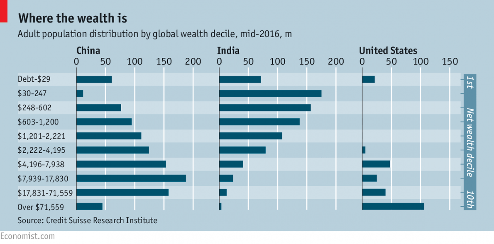
For many (including yours truly) these numbers may come as a surprise when you first see them. $2200 in today’s exchange rate is about £1640. And this is wealth, not income – including all earthly possessions (net of debt). £1640 of wealth is enough to put you ahead of half of the planet’s population. Have a $774 400 (£556 174 – about the average price of a two-bedroom flat in London) and – congratulations! You are part of the global richest 1% everyone is complaining about…
Such comparisons are certainly thought provoking. They show how unevenly wealth is distributed across countries. They also show that countries which are more open to trade are more likely to have benefited the most from it. Take a closer look at the statistics and you will realise that you are more likely to be rich (compared to the global average) if you live in one of these countries.
 Of course, wealth inequality does not happen only across countries – it happens also within countries. You can own a two-bedroom flat in London (and be, therefore, part of the 1% global elite), but having to live on a very modest budget because your income (which is a flow variable, as opposed to wealth, which is a stock variable) has not grown fast enough in relation to other parts of the national population.
Would you be better off if there were less trade? Certainly not – you would probably be even poorer, as trade theories (and most of the empirical evidence I am aware of) assert. Why do we then talk so much about trade wars and trade restrictions recently? Why do we elect politicians who advocate such restrictions? It is probably easier to answer these questions using political than economic theory (although game theory may have some interesting insights to offer – have you heard of the ‘Chicken game‘?). But as I am neither political scientists nor a game theorist, I will just continue to wonder about it.
Articles and information
Questions
- Were you surprised by the statistics mentioned in this report? Explain why.
- Do you think that income inequality is a natural consequence of economic growth? Are there pro-growth policies that can be used to tackle it?
- Identify three ways in which widening income inequality can hurt economies (and societies).
 Each January, world political and business leaders gather at the ski resort of Davos in Switzerland for the World Economic Forum. They discuss a range of economic and political issues with the hope of guiding policy.
This year, leaders meet at a time when the global political context has and is changing rapidly. This year the focus is on ‘Creating a Shared Future in a Fractured World’. As the Forum’s website states:
The global context has changed dramatically: geostrategic fissures have re-emerged on multiple fronts with wide-ranging political, economic and social consequences. Realpolitik is no longer just a relic of the Cold War. Economic prosperity and social cohesion are not one and the same. The global commons cannot protect or heal itself.
 One of the main ‘fissures’ which threatens social cohesion is the widening gap between the very rich and the rest of the world. Indeed, inequality and poverty is one of the main agenda items at the Davos meeting and the Forum website includes an article titled, ‘We have built an unequal world. Here’s how we can change it’ (see second link in the Articles below). The article shows how the top 1% captured 27% of GDP growth between 1980 and 2016.
The first Guardian article below identifies seven different policy options to tackle the problem of inequality of income and wealth and asks you to say, using a drop-down menu, which one you think is most important. Perhaps it’s something you would like to do.
Articles
Project Davos: what’s the single best way to close the world’s wealth gap? The Guardian, Aidan Mac Guill (19/1/18)
We have built an unequal world. Here’s how we can change it World Economic Forum, Winnie Byanyima (22/1/18)
Oxfam highlights sharp inequality as Davos elite gathers ABC news, Pan Pylas (21/1/18)
Inequality gap widens as 42 people hold same wealth as 3.7bn poorest The Guardian, Larry Elliott (22/1/18)
There’s a huge gender component to income inequality that we’re ignoring Business Insider, Pedro Nicolaci da Costa (22/1/18)
Ahead of Davos, even the 1 percent worry about inequality Washington Post, Heather Long (22/1/18)
“Fractures, Fears and Failures:” World’s Ruling Elites Stare into the Abyss GlobalResearch, Bill Van Auken (18/1/18)
Why the world isn’t getting a pay raise CNN Money, Patrick Gillespie and Ivana Kottasová (1/11/17)
WEF archive
Articles on Inequality World Economic Forum
Questions
- Distinguish between income and wealth. In global terms, which is distributed more unequally?
- Why has global inequality of both income and wealth grown?
- Explain which of the seven policy options identified by the Guardian you would choose/did choose?
- Go through each one of the seven policy options and identify what costs would be associated with pursuing it.
- Identify any other policy options for tackling the problem.
 The issue of inequality has come into increasing focus over recent years. The impact of the COVID-19 pandemic raises further concerns that these inequalities may be exacerbated further. Here we provide an overview of some of the key patterns in current levels of wealth and income inequality in Britain. They show, for example, the markedly higher degree of inequality in wealth relative to income, the importance of property wealth and private pension wealth in determining levels of wealth, and the considerable variation in average wealth levels of households by age and location.
 Figure 1 shows the evolution of aggregate wealth over the last two surveys (at constant 2016-18 prices) by the four component parts. Two components dominate the aggregate wealth of British households: property wealth (35 per cent) and private pension wealth (41-42 per cent). Financial wealth is the third largest component (14 per cent), while property wealth is the smallest component (9 to 10 per cent). (Click here for a PowerPoint of the chart.)
 Figure 2 shows the average wealth (at constant 2016-18 prices) as measured by the mean (aggregate divided by the number of households) and the median (the middle household). The mean wealth of households is seen to be greater than their median wealth. In April 2016 to March 2018, average wealth as measured by the mean was £564,300 (an increase of 40.3 per cent over July 2006 to June 2008), whilst the average wealth of each household as measured by the median was £286,600 (an increase of 28.5 per cent over July 2006 to June 2008). (Click here for a PowerPoint of the chart.)
 Figure 3 shows the mean and median values of disposable income (adjusted for the number and age of individuals comprising each household). Mean disposable income of UK households in financial year ending (FYE) 2018 was £35,928, a 0.5 per cent real decrease over FYE 2017, whilst median wealth (middle household) was £29,598 in FYE 2018, a 1.5 per cent real increase over FYE 2017. (Click here for a PowerPoint of the chart.)
 Figure 4 shows starkly the current inequality in wealth as compared to that in income. It does so by plotting their respective Lorenz curves. The curves show the proportion of overall wealth or income attributable to a given proportion of households. For example, 50 per cent of households have close to 28 per cent of total disposable income and a mere 8.5 per cent of aggregate wealth. (Click here for a PowerPoint of the chart.)
 Figure 5 shows that the highest Gini coefficient is for net financial wealth. This stood at 91 per cent in April 2016 to March 2018. This extremely high figure shows the very high levels of inequatity in net financial wealth. This reflects the fact that some households find themselves with negative net financial wealth, such that their debts exceed their assets, whilst, on the other hand, some households can have large sums in financial investments. (Click here for a PowerPoint of the chart.)
  Figure 6 shows the geographical disparity of median household wealth across Britain. The regions with the highest median wealth are the South East, South West, London and the East of England. They have the highest contributions from net property wealth (40.4 per cent, 35.6 per cent, 41.7 per cent and 37.2 per cent respectively). The region with the lowest median total wealth, the North East, has the least total wealth in net property wealth (24.8 per cent). (Click here for a PowerPoint of the chart.)
  With the prospects of weaker global economic growth and continuing worries about trade wars, central banks have been loosening monetary policy. The US central bank, the Federal Reserve,
  But there are two key issues with looser monetary policy.
 The IFS has launched a major
 The Economist is probably not the kind of newspaper that you will read more than once per issue – certainly not two years after its publication date. That is because, by definition, financial news articles are ephemeral: they have greater value, the more recent they are – especially in the modern financial world, where change can be strikingly fast. To my surprise, however, I found myself reading again an article on inequality that I had first read two years ago – and it is (of course) still relevant today.
 Of course, wealth inequality does not happen only across countries – it happens also within countries. You can own a two-bedroom flat in London (and be, therefore, part of the 1% global elite), but having to live on a very modest budget because your income (which is a flow variable, as opposed to wealth, which is a stock variable) has not grown fast enough in relation to other parts of the national population.
