 In a recent post, we looked at the rising number of people being paid less than the (voluntary) living wage. The Living Wage Foundation has just published the latest annual update to the living wage. This brings it to £9.40 per hour in London and £8.25 outside London – well above the statutory National Minimum Wage of £6.70 for those aged 21 and over. Even when employers are required to pay at least the so-called National Living Wage (NLW) of £7.20 per hour from April 2016 to those aged 25 and over, the NLW will still be well below the living wage.
Read the earlier post and then answer the questions in the light of the new living wage rates and the new linked articles.
Articles
Living wage rate increased by 40p an hour BBC News (2/11/15)
London ‘living wage’ rises to £9.40 an hour Financial Times, Sarah O’Connor (2/11/15)
Living Wage now £8.25 across the UK and £9.40 in London Independent, Jon Stone (2/11/15)
Special report: The Living Wage and its impact on workers and businesses Manchester Evening News, Adam Jupp (2/11/15)
Living Wage: Number Of Employers Paying It Doubles In A Year, While Six Million Workers Still Go Without Huffington Post, Jack Sommers (2/11/15)
Living wage rate increases announced as campaigners call for more businesses to go beyond legal minimums Living Wage Foundation (30/10/15)
Data and Reports
Estimates of employee jobs paid less than the living wage in London and other parts of the UK ONS (12/10/15)
Annual Survey of Hours and Earnings ONS
Living wage rates: the calculation Living Wage Foundation
National Minimum Wage rates GOV.UK
Questions
- By referring to the Living Wage Foundation site, explain how the living wage is calculated. If you were defining the living wage, would you define it in this way? Explain.
- Distinguish between low pay and poverty. Does pay give a good indication of poverty?
- For what reasons has the number of jobs paying below the living wage increased? Does marginal productivty theory provide an explanation?
- Is it best to base statutory minimum wages on median earnings, mean earnings or the cost of living? Explain.
- If more 6 million jobs pay below the living wage, does this mean that 6 million people, more than 6 million people or fewer than 6 million people receive average hourly wages below the living wage? Explain.
- For what reasons might firms volunteer to pay the living wage to their employees? Is doing so consistent with the aim of profit maximisation?
- Why are more women than men paid wage rates below the living wage?
- Why does the proportion of people being paid the living wage vary from one part of the UK to another? Is this likely to be purely a reflection of differences in the cost of living?
 In 2014, 19% of jobs in London and 23% of jobs outside London paid less than the living wage. This is according to figures just published by the Office for National Statistics. The figures compare with 17% and 22% respectively in 2013. The problem is that while the living wage rises with the cost of living, median wages have not kept pace with prices: in other words, in real terms median wages have fallen.
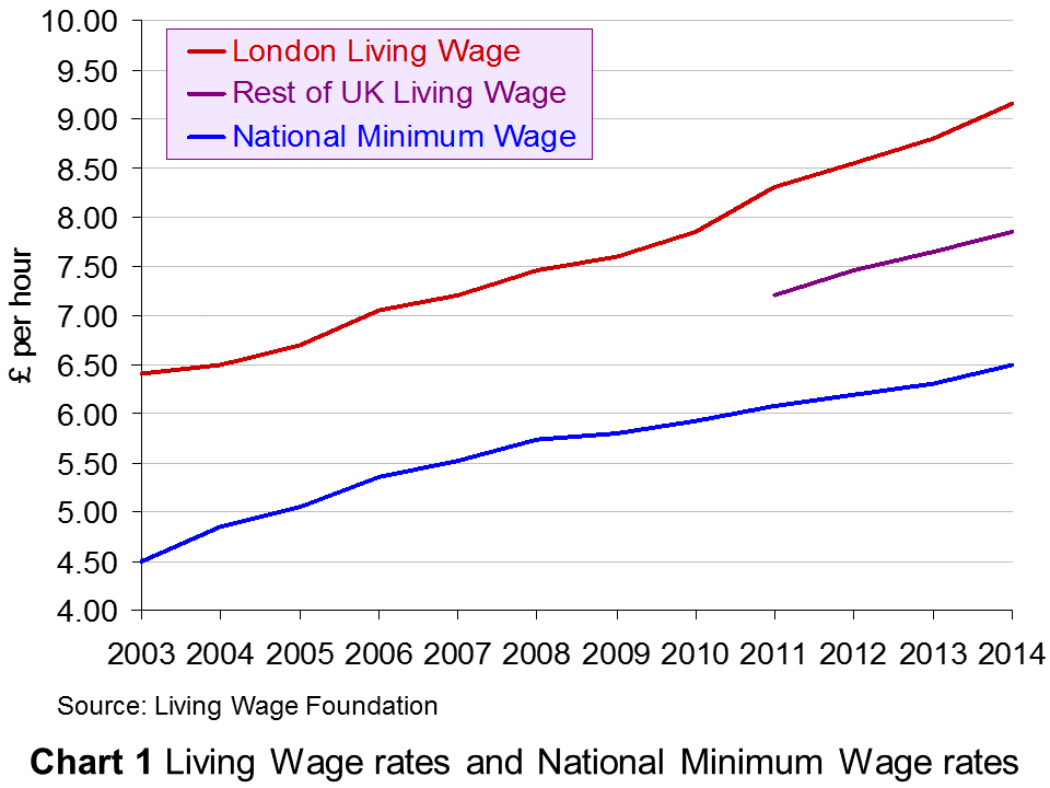
The living wage has been calculated annually since 2003 for London by the London Mayor’s Office and since 2011 for the rest of the UK by the Centre for Research in Social Policy (CRSP) at Loughborough University for the Living Wage Foundation.
According to the London Mayor’s Office:
The London Living Wage is an hourly rate of pay, calculated according to a combination of the costs of living in London and 60% of the median wage. This gives the wage rate needed to give a worker in London enough to provide their family with the essentials of life, including a cushion against unforeseen events. Unlike the compulsory national minimum wage, the London Living Wage is a voluntary commitment made by employers, who can become accredited with the Living Wage Foundation.
As the Chart 1 illustrates, the living wage is above the National Minimum Wage.  Since November 2014, the living wage in London has been £9.15 in London and £7.85 in the rest of the UK. It is due to be uprated at the beginning of November 2015. From 1 October 2014 to 30 September 2015, the National Minimum Wage (for people aged 21 and over) was £6.50. It rose to £6.70 on 1 October 2015.
Note that the (voluntary) living wage is different from the compulsory ‘National Living Wage’ announced by the Chancellor in his July 2015 Budget, which will come into effect in April 2016 as a top-up to the National Minimum Wage (NLW) for those aged 25 and over. This will be only 50p above the National Minimum Wage and thus considerably below the living wage,  although the Chancellor has pledged to increase the NLW to 60% of median wage rates for those aged 25 and over by 2020. According to the Office for Budget Responsibility, “the NLW will rise from £7.20 in April 2016 (equivalent to around 55 per cent of estimated median hourly earnings for employees aged 25 and over) to around £9.35 in April 2020 (reaching 60 per cent of expected median hourly earnings for that group) in steps that imply the rise relative to median hourly earnings is a straight line.”
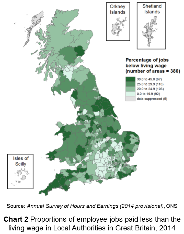
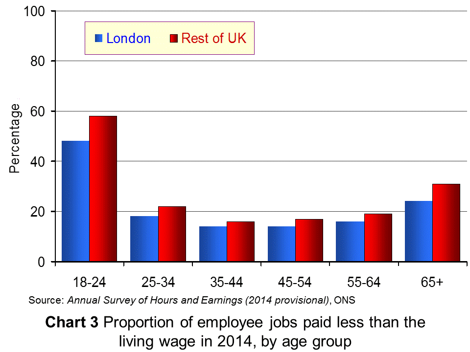
The percentage of people being paid below the living wage varies by occupation, location of jobs (see map in Chart 2 – click to enlarge), sex and age and whether the job is full or part time. For example, in accommodation and food services, in retail and in sales and customer services, more than half the jobs paid less than the living wage. A greater percentage of women than men were paid below the living wage (29% and 18% respectively outside London). As far as young people are concerned, 48% of 18–24 year olds were paid less than the living wage in London and 58% outside London  (see Chart 3). In London 45% of part-time jobs paid less than the living wage; in the rest of the UK the figure was 43%.
As The Guardian article linked below reports:
A spokesman for the Living Wage Foundation, which sets the figure each year, said despite ‘significant progress’ in many sectors, more jobs than ever were below the voluntary rates.
“These figures demonstrate that while the economy may be recovering as a whole, there is a real problem with ensuring everyone benefits, and low pay is still prevalent in Britain today,” he said.
The following articles look at the evidence presented by the ONS and examine the incidence of low pay in the UK.
Articles
More jobs paying below living wage BBC News (12/10/15)
A fifth of UK jobs pay less than living wage – ONS Financial Times (12/10/15)
The proportion of workers not being paid the living wage is rising Independent, Jon Stone (12/10/15)
Almost 30 per cent of women are paid below the living wage Independent, Jon Stone (12/10/15)
More UK jobs fail to pay a living wage The Guardian, Hilary Osborne and Damien Gayle (12/10/15)
Six million jobs pay below the living wage Full Fact, Laura O’Brien (19/10/15)
Data and Reports
Estimates of employee jobs paid less than the living wage in London and other parts of the UK ONS (12/10/15)
Annual Survey of Hours and Earnings ONS
Living wage rates: the calculation Living Wage Foundation
National Minimum Wage rates GOV.UK
Questions
- By referring to the Living Wage Foundation site, explain how the living wage is calculated. If you were defining the living wage, would you define it in this way? Explain.
- Distinguish between low pay and poverty. Does pay give a good indication of poverty?
- For what reasons has the number of jobs paying below the living wage increased? Does marginal productivty theory provide an explanation?
- Is it best to base statutory minimum wages on median earnings, mean earnings or the cost of living? Explain.
- If 6 million jobs pay below the living wage, does this mean that 6 million people, more than 6 million people or fewer than 6 million people receive average hourly wages below the living wage? Explain.
- For what reasons might firms volunteer to pay the living wage to their employees? Is doing so consistent with the aim of profit maximisation?
- Why are more women than men paid wage rates below the living wage?
- Why does the proportion of people being paid the living wage vary from one part of the UK to another? Is this likely to be purely a reflection of differences in the cost of living?
 The rate of inflation in the UK is measured using the Consumer Prices Index (CPI). This is made up of a basket of goods and the ONS updates this ‘basket’ each year to ensure it is representative of what the average UK household buys. The basket contains 703 items, with 110,000 individual prices collected each month.
In past years, items such as lip gloss have been added to the basket of goods, together with tablet computers and teenage fiction. In the recent update by the ONS, e-cigarettes have been added, together with specialist ‘craft’ beers and music streaming. On the other hand, other items have been removed, as the world changes. For example, during the recession, champagne was removed as an item that the representative household was no longer buying. In other cases, items are removed as they become outdated or obsolete with technology changing. This is the case with satellite navigation systems. As people turn to using their smartphones to navigate their way from A to B, satellite navigation systems are no longer seen as an item bought by the representative household.
The UK inflation rate is at an all-time low of 0.3% and there have been concerns that it may become negative, meaning we enter the world of deflation. However, if this does occur, many suggest that it is not bad deflation, as it is being driven by the extremely low oil prices. No matter what the inflation rate, the ONS will always continue to update the basket of goods that calculates inflation. It is therefore essential that these changes are made each year, as consumer buying habits do fluctuate considerably, as income changes, technology changes and general tastes change. The following articles consider what’s in and what’s out.
From craft beer to e-cigarettes, inflation basket reflects Britain’s changing shopping habits The Guardian, Katie Allen (17/3/15)
Inflation-measuring basket of goods adds protein powder, e-cigarettes The Grocer, Andrew Don (17/3/15)
E-cigareets and craft beers in updated inflation basket BBC News (17/3/15)
E-cigs added to inflation basket Mail Online (17/3/15)
Craft beer, e-cigarettes and protein shakes dded to price basket used to calculate inflation Independent, Hazel Sheffield (17/3/15)
U.K. hipsters and gym junkies win approval in new price basket Bloomberg, Tom Beardsworth (17/3/15)
Spotify in and sat navs out: take a look at the new inflation basket The Telegraph, Szu Ping Chan (17/3/15)
E-cigarettes, craft beer and Spotify enter UK inflation basket Reuters, Toby Melville (17/3/15)
Craft beer and e-cigarettes added to CPI basket Financial Times (17/3/15)
Questions
- What is the difference between the CPI and RPI? Which is usually higher? Explain your answer.
- Explain why champagne was removed from the basket of goods during the recession. What is sensible?
- How is the CPI calculated and hence how is inflation measured?
- Why has there been a movement towards chilled pizzas and away from frozen pizzas? Is the change likely to affect their relative price? Use a diagram to support your answer.
- What impact has technological progress had on the basket of goods that the representative household purchases? Do you think that technological progress make it more or less important for the basket of goods to be reviewed annually?
- Do you think products such as the iPad and e-cigarettes should be included in the CPI? Are they truly representative?
- In the BBC News article, you can access a list of the products that are ‘in and out’. Is there anything on there that you think should be in or that should be out? Be sure to justify your answer!
 Many people are attracted to work in the private sector, with expectations of greater opportunities for promotion, more variation in work and higher salaries. However, according to the Office for National Statistics, it may be that the oft-talked-of pay differential is actually in the opposite direction. Data from the ONS suggests that public sector workers are paid 14.5% more on average than those working in the private sector.
As is the case with the price of a good, the price of labour (that is, the wage rate) is determined by the forces of demand and supply. Many factors influence the wages that individuals are paid and traditional theory leads us to expect higher wages in sectors where there are many firms competing for labour. With the government acting as a monopsony employer, it has the power to force down wages below what we would expect to see in a perfectly competitive labour market. However, the ONS data suggests the opposite. What factors can explain this wage differential?
Jobs in the public sector, on average, require a higher degree of skills. There tend to be entry qualifications, such as possessing a university degree. While this is the case for many private-sector jobs as well, on average it is a greater requirement in the public sector. The skills required therefore help to push up the wages that public-sector workers can demand. Another explanation could be the size of public-sector employers, which allows them to offer higher wages. When the skills, location, job specifications etc. were taken into account, the 14.5% average hourly earnings differential declined to between just 2.2% and 3.1%, still in favour of public-sector workers. It then reversed to give private-sector workers the pay edge, once the size of the employer was taken out.
Further analysis of the data also showed that, while it may pay to be in the public sector when you’re starting out on your career, it pays to be in the private sector as you move up the career ladder. Workers in the bottom 5% of earners will do better in the public sector, while those in the top 5% of earners benefit from private-sector employment. The ONS said:
Looking at the top 5%, in the public sector earnings are greater than £31.49 per hour, while in the private sector, the top 5% earn more than £33.63 per hour… The top 1% of earners in the private sector, at more than £60.21 per hour, earns considerably more than the top 1% of earners in the public sector, at more than £49.65 per hour.
The data from the ONS thus suggest a reversal in the trend of average public-sector pay being higher than private sector pay, once all the relevant factors are taken into account.
This will naturally add to debates about living standards, which are likely to take on a stronger political slant as the next election approaches. It is obviously partly down to the public-sector pay freeze that we saw in 2010 and also to a reversal, at least in part, of the previous trend from 2008, where public-sector pay  had been growing faster than private-sector pay. However, depending on the paper you read or the person you listen to, they will offer very different views as to who gets paid more. All you need to do in this case is look at the titles of the newspaper articles written by the Independent and The Telegraph! Whatever the explanation, these new data provide a wealth of information about relative prospects for pay for everyone.
Data
Public and Private Sector Earnings Office for National Statistics (March 2014)
Annual Survey of Hours and Earnings, 2013 Provisional Results Office for National Statistics (December 2013)
Articles
Austerity bites as private sector pay rises above the public sector for the first time since 2010 Independent, Ben Chu (10/3/14)
Public sector workers still better paid despite the cuts The Telegraph, John Bingham (10/3/14)
Public sector hourly pay outstrips private sector pay BBC News (10/3/14)
Public sector workers are biggest losers in UK’s post-recession earnings squeeze The Guardian, Larry Elliott (11/3/14)
New figures go against right-wing claims that public sector workers are grossly overpaid Independent, Ben Chu (10/3/14)
Public sector pay sees biggest shrink on 2010, figures suggest LocalGov, Thomas Bridge (11/3/14)
Public sector staff £2.12 an hour better off The Scotsman, David Maddox (11/3/14)
Questions
- Illustrate the way in which wages are determined in a perfectly competitive labour market.
- Why does monopsony power tend to push wages down?
- Why does working for a large company suggest that you will earn a higher wage on average?
- Using the concept of marginal revenue product of labour, explain the way in which higher skills help to push up wages.
- How significant are public-sector pay freezes in explaining the differential between public- and private-sector pay?
- Why is there a difference between the bottom and top 5% of earners? How does this impact on whether it is more profitable to work in the public or private sector?
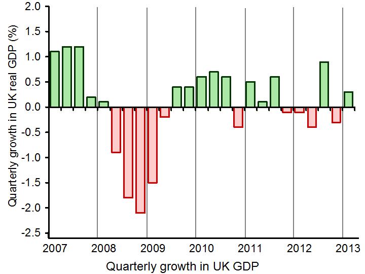
 In the blog The global economy we considered the economic performance of countries across the globe, including the UK. In the first estimate of UK economic growth for the first quarter of 2013, the economy grew at 0.3%, thus avoiding a triple-dip recession. This first estimate is always subject to change, but in this case, the data was confirmed.
The April 2013 figure provided by the ONS of 0.3% growth has been confirmed, once again indicating the slow recovery of the UK economy. Despite these more positive signs for the economy, the IMF has raised concerns of the weak performance of the UK and has urged the government to invest more in projects to stimulate growth. Although the economy has started to grow, economic growth has continued to remain weak since the onset of the financial crisis and recession. Martin Beck, an economist at Capital Economics said:
With employment and average earnings both dropping in the first quarter on their level in the previous quarter, the foundations for a sustained recovery, even one driven by consumers, still look pretty rickety.
 Initial estimates by the ONS are always updated and there is still time for the 0.3% growth figure to be changed, as more data becomes available. (Click here for a PowerPoint of the chart.) This latest figure, although unchanged, has given a more concrete indication of where the UK economy is continuing to struggle. Consumer spending increased by only 0.1%, investment and exports declined, but in further signs of a weak economy, the building up of stocks by companies was a big contributor to the UK economic growth – a contribution of 0.4 percentage points. The service sector continued to growth with a 0.6 percentage point contribution to GDP.
So, what does the future look like for the UK? Although the estimate of 0.3% figure did prevent a triple-dip recession and the IMF did comment on the ‘improving health’ of the economy, signs of recovery remain weak.
 Crucial to the recovery will be government spending, but more than this, the government spending must be in key growth industries. Data suggests that the UK invests less than other G8 countries as a percentage of GDP and this is perhaps one of the key factors that has prevented the UK recovery from gathering pace. The future of the UK economy remains uncertain and government policy will be crucial in determining this future course. The following articles consider the latest growth data.
Signs of weakness mar UK economic growth Reuters, Olesya Dmitracova and William Schomberg (23/5/13)
UK first quarter growth unchanged BBC News (23/5/13)
Concerns over underlying health of UK economy as 0.3% growth confirmed The Guardian, Philip Inman (23/5/13)
Statisticians confirm 0.3% UK growth for first quarter of 2013 Financial Times, Claire Jones and Sarah O’Connor (23/5/13)
UK GDP: concerns about underlying economy as 0.3pc growth confirmed The Telegraph, Philip Aldrick (23/5/13)
Britsh economy returns to growth in first quarter The Economic Times (23/5/13)
U.K. households not loosening purse strings Wall Street Journal, Ainsley Thomson and Ilona Bllington (23/5/13)
 IMF: UK should push for economic growth BBC News (22/5/13)
Questions
- Why are numerous estimates of GDP made by the ONS?
- How is GDP measured? Is it an accurate measure of economic growth? What about economic development?
- Why does 0.3% growth in the first quarter of GDP not necessarily imply that the UK economy is recovering?
- Why have certain aspects of the UK economy performed better or worse than others?
- What areas should the government invest in, according to the IMF?
- Why would government spending in investment create economic growth? Is this likely to be short term or long term?
 In a recent post, we looked at the rising number of people being paid less than the (voluntary) living wage. The Living Wage Foundation has just published the latest annual update to the living wage. This brings it to £9.40 per hour in London and £8.25 outside London – well above the statutory National Minimum Wage of £6.70 for those aged 21 and over. Even when employers are required to pay at least the so-called National Living Wage (NLW) of £7.20 per hour from April 2016 to those aged 25 and over, the NLW will still be well below the living wage.