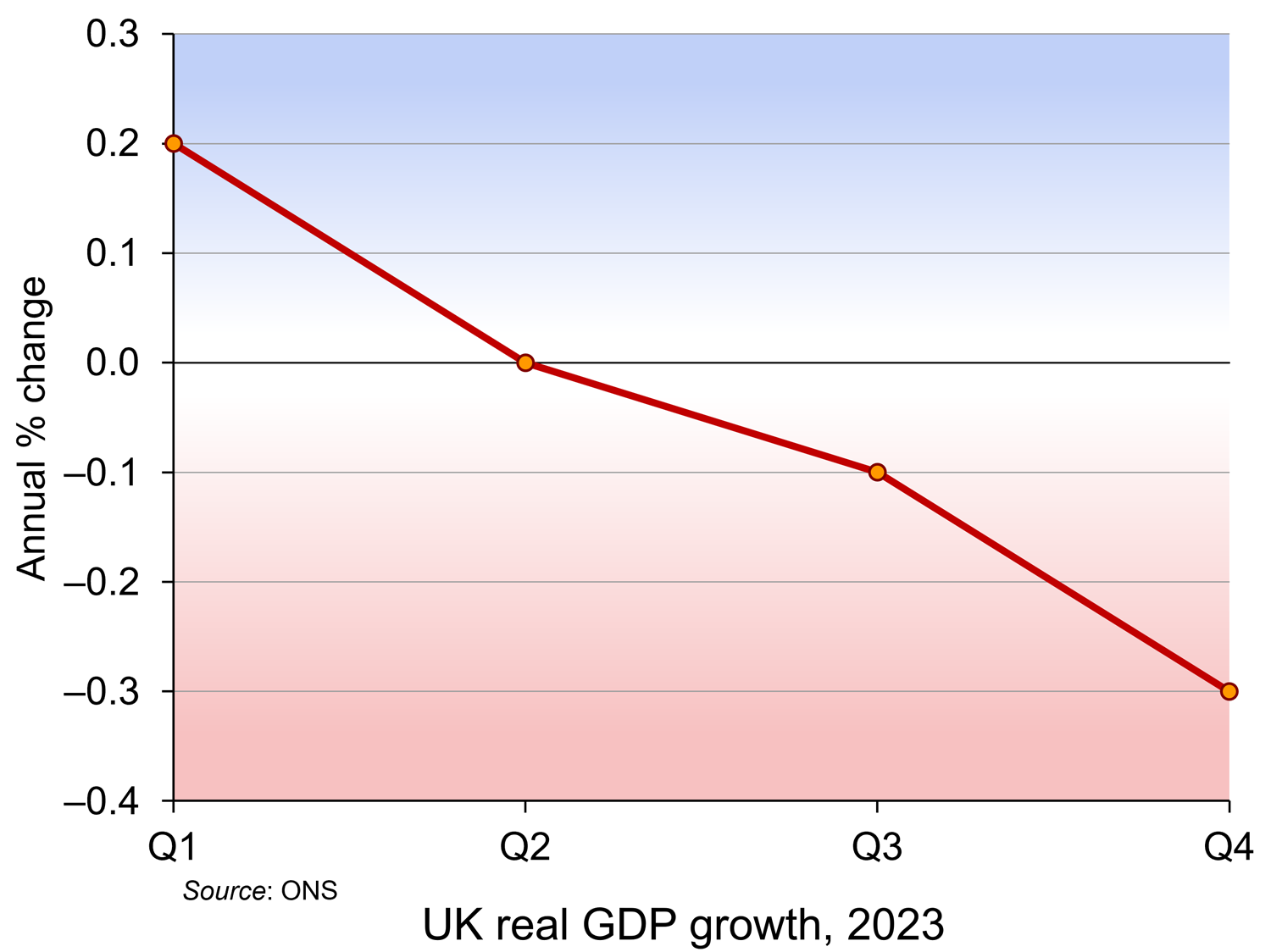
 Latest figures from the Office for National Statistics show that the UK was in recession at the end of 2023. The normal definition of recession is two quarters of falling real GDP. This is what happened to the UK in the last two quarters of 2023, with GDP falling by 0.1% in Q3 and 0.3% in Q4. In Q4, output of the service industries fell by 0.2%, production industries by 1.0% and construction by 1.3%.
But how bad is this? What are the implications for living standards? In some respects, the news is not as bad as the term ‘recession’ might suggest. In other respects, it’s worse than the headline figures might imply.
The good news (or not such bad news)
The first thing to note is that other countries too experienced a recession or slowdown in the second half of 2023. So, relative to these countries, the UK is not performing that badly. Japan, for example, also experienced a mild recession; Germany just missed one. These poor economic growth rates were caused largely by higher global energy and food prices and by higher central bank interest rates in response. The good news is that such cost pressures are already easing.
The second piece of good news is that GDP is expected to start growing again (modestly) in 2024. This will be helped by the Bank of England cutting interest rates. The Monetary Policy Committee is expected to do this at its May, June or August meetings provided that inflation falls. Annual CPI inflation was 4% in January – the same as in December. But it is expected to fall quite rapidly over the coming months provided that there are no serious supply-side shocks (e.g. from world political factors).
The third is that the recession is relatively modest compared with ones in the past. In the recession following the financial crisis, real GDP fell by 5.3% in 2009; during the pandemic, GDP fell by 10.7% in 2020. For this reason, some commentators have said that the last two quarters of 2023 represent a mere ‘technical recession’, with the economy expected to grow again in 2024.
Why things may be worse than the headline figures suggest
Real GDP per head
So far we have considered real GDP (i.e. GDP adjusted for inflation). But if changes in GDP are to reflect changes in living standards, we need to consider real GDP per head. Population is rising. This means that the rate of growth in real GDP per head is lower than the rate of growth in real GDP
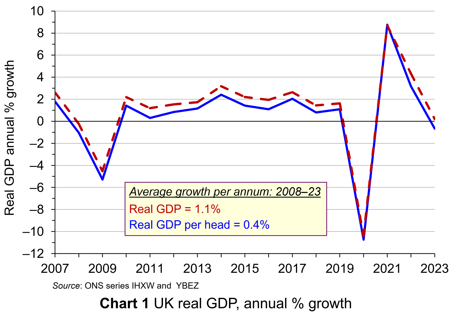 For 2023 as a whole, while real GDP rose by 0.20%, real GDP per head fell by 0.67%. In the last two quarters of 2023, while real GDP fell by 0.1% and 0.3% respectively, real GDP per head fell by 0.4% and 0.6%, respectively, having already fallen in each of the previous five quarters. Chart 1 shows real GDP growth and real GDP growth per head from 2007 to 2023 (click here for a PowerPoint). As you can see, given population growth, real GDP per head has consistently grown slower than real GDP.
Long-term trends.
If we are assessing the UK’s potential for growth in GDP, rather than the immediate past, it is useful to look at GDP growth over a longer period. Looking at past trend growth rates and explaining them can give us an indication of the likely future path of the growth in GDP – at least in the absence of a significant change in underlying economic factors. Since 2007, the average annual rate of growth of real GDP has been only 1.1% and that of real GDP per head a mere 0.4%.
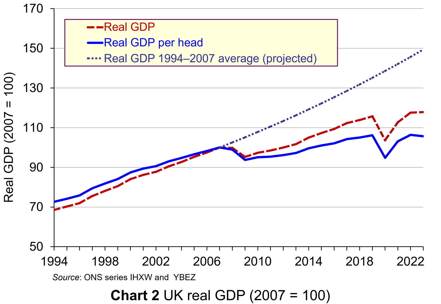 This compares unfavourably with the period from 1994 to 2007, when the average annual rate of growth of real GDP was 3.0% and that of real GDP per head was 2.5%.
This is illustrated in Chart 2 (click here for a PowerPoint). The chart also projects the growth rate in GDP per head of 2.5% forward from 2007 to 2023. Had this growth rate been achieved since 2007, GDP per head in 2023 would have been 41.4% higher than it actually was.
It is not only the UK that has seen low growth over the past 15 years compared to previous years. It has achieved a similar average annual growth rate over the period to Germany (1.1%), lower rates than the USA (1.8%) and Canada (1.6%), but higher than France (0.9%) and Japan (0.4%).
Low investment
A key determinant of economic growth is investment. Since 2008, the UK has invested an average of 17.3% of GDP. This is the lowest of the G7 countries and compares with 24.9% in Japan, 23.7% in Canada, 23.5% in France, 21.3% in Germany, 20.4% in the USA and 19.1% in Italy. If UK growth is to recover strongly over the longer term, the rate of investment needs to increase, both private and public. Of course, investment has to be productive, as the key underlying determinant of economic growth is the growth in productivity.
Low productivity growth
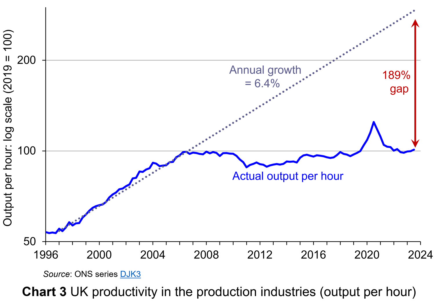 This is a key issue for the government – how to encourage a growth in productivity. The UK’s record of productivity growth has been poor since 2008. The period from 1996 to 2006 saw an average annual growth in labour productivity of 6.4%. Since then, however, labour productivity has grown by an average annual rate of only 0.3%. This is illustrated in Chart 3 (click here for a PowerPoint). If the pre-2007 rate had continued to the end of 2023, labour productivity would be 189% higher. This would have made GDP per head today substantially higher. If GDP per head is to grow faster, then the underlying issue of a poor growth in labour productivity will need to be addressed.
Inequality and poverty
Then there is the issue of the distribution of national income. The UK has a high level of income inequality. In 2022 (the latest data available), the disposable income of the poorest 20% of households was £13 218; that for the richest 20% was £83 687.  The top 1% of income earners’ share of disposable income is just under 9.0%. (Note that disposable income is after income taxes have been deducted and includes cash benefits and is thus more equally distributed than original income.)
The poorest 20% have been hit badly by the cost-of-living crisis, with many having to turn to food banks and not being able to afford to heat their homes adequately. They are also particularly badly affected by the housing crisis, with soaring and increasingly unaffordable rents. Many are facing eviction and others live in poor quality accommodation. Simple growth rates in real GDP do not capture such issues.
Limited scope for growth policies
Fiscal policy has an important role in stimulating growth. Conservatives stress tax cuts as a means of incentivising entrepreneurs and workers. Labour stresses the importance of public investment in infrastructure, health, education and training. Either way, such stimulus policy requires financing.
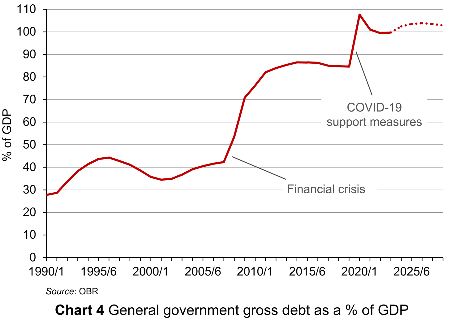 But, public finances have been under pressure in recent years, especially from COVID support measures. General government gross debt has risen from 27.7% of GDP in 1990/91 to 99.4% in 2022/23. This is illustrated in Chart 4 (click here for a PowerPoint). Although it has fallen from the peak of 107.6% of GDP in 2020/21 (during the COVID pandemic), according to the Office for Budget Responsibility it is set to rise again, peaking at 103.8% in 2026/27. There is thus pressure on the government to reduce public-sector borrowing, not increase it. This makes it difficult to finance public investment or tax cuts.
Measuring living standards
Questions about real GDP have huge political significance. Is the economy in recession? What will happen to growth in GDP over the coming months. Why has growth been sluggish in recent years? The implication is that if GDP rises, living standards will rise; if GDP falls, living standards will fall. But changes in GDP, even if expressed in terms of real GDP and even if the distribution of GDP is taken into account, are only a proxy for living standards. GDP measures the market value of the output of goods and services and, as such, may not necessarily be a good indicator of living standards, let alone well-being.
Produced goods and services that are not part of GDP
 The output of some goods and services goes unrecorded. As we note in Economics, 11e (section 15.2), “If you employ a decorator to paint your living room, this will be recorded in the GDP statistics. If, however, you paint the room yourself, it will not. Similarly, if a childminder is employed by parents to look after their children, this childcare will form part of GDP. If, however, a parent stays at home to look after the children, it will not.
The exclusion of these ‘do-it-yourself’ and other home-based activities means that the GDP statistics understate the true level of production in the economy. If over time there is an increase in the amount of do-it-yourself activities that people perform, the figures will also understate the rate of growth of national output.” With many people struggling with the cost of living, such a scenario is quite likely.
There are also activities that go unrecorded in the ‘underground’ or ‘shadow’ economy: unemployed people doing casual jobs for cash in hand that they do not declare to avoid losing benefits; people doing extra work outside their normal job and not declaring the income to evade taxes; builders doing work for cash to save the customer paying VAT.
Externalities
 Large amounts of production and consumption involve external costs to the environment and to other people. These externalities are not included in the calculation of GDP.
If external costs increase faster than GDP, then GDP growth will overstate the rise in living standards. If external costs rise more slowly than GDP (or even fall), then GDP growth will understate the rise in living standards. We assume here that living standards include social and environmental benefits and are reduced by social and environmental costs.
Human costs of production
If production increases as a result of people having to work harder or longer hours, its net benefit will be less. Leisure is a desirable good, and so too are pleasant working conditions, but these items are not included in the GDP figures.
The production of certain ‘bads’ leads to an increase in GDP
 Some of the undesirable effects of growth may in fact increase GDP! Take the examples of crime, stress-related illness and environmental damage. Faster growth may lead to more of all three. But increased crime leads to more expenditure on security; increased stress leads to more expenditure on health care; and increased environmental damage leads to more expenditure on environmental clean-up. These expenditures add to GDP. Thus, rather than reducing GDP, crime, stress and environmental damage actually increase it.
Alternative approaches to measuring production and income
There have been various attempts to adjust GDP (actual or potential) to make it a better indicator of total production or income or, more generally, of living standards.
Index of Sustainable Economic Welfare (ISEW)
As Case Study 9.20 in the Essentials of Economics (9e) website explains, ISEW starts with consumption, as measured in GDP, and then makes various adjustments to account for factors that GDP ignores. These include:
- Inequality: the greater the inequality, the more the figure for consumption is reduced. This is based on the assumption of a diminishing marginal utility of income, such that an additional pound is worth less to a rich person than to a poor person.
- Household production (such as childcare, care for the elderly or infirm, housework and various do-it-yourself activities). These ‘services of household labour’ add to welfare and are thus entered as a positive figure.
- Defensive expenditures. This is spending to offset the adverse environmental effects of economic growth (e.g. asthma treatment for sufferers whose condition arises from air pollution). Such expenditures are taken out of the calculations.
- ‘Bads’ (such as commuting costs). The monetary expense entailed is entered as a negative figure (to cancel out its measurement in GDP as a positive figure) and then an additional negative element is included for the stress incurred.
- Environmental costs. Pollution is entered as a negative figure.
- Resource depletion and damage. This too is given a negative figure, in just the same way that depreciation of capital is given a negative figure when working out net national income.
Productive Capacities Index (PCI)
In 2023, the United Nations Conference on Trade and Development (UNCTAD) launched a new index to provide a better measure of countries’ economic potential. What the index focuses on is not actual GDP but potential output: in other words, ‘countries’ abilities to produce goods and deliver services’.
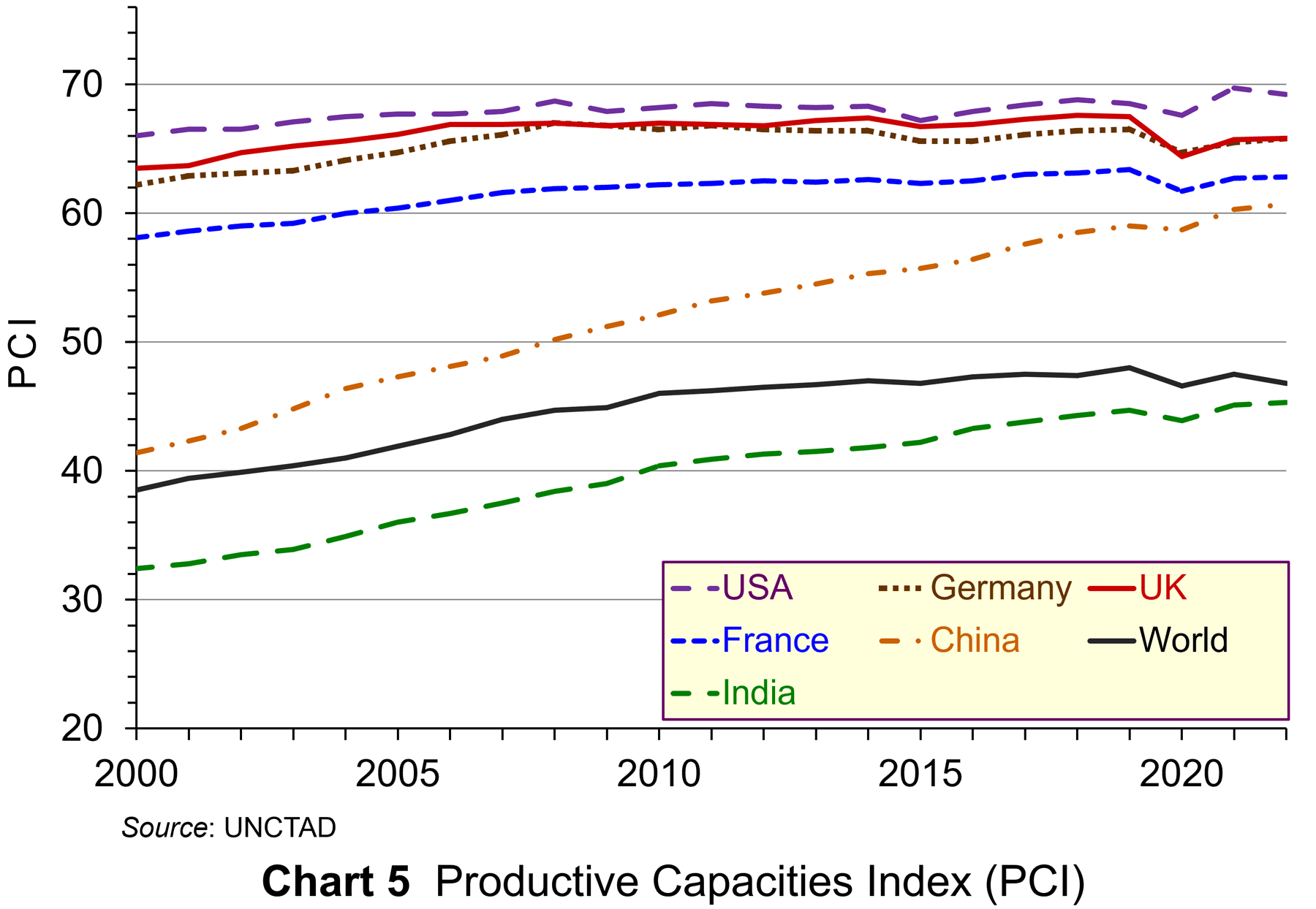 The PCI comprises 42 indicators under eight headings: human capital, natural capital, information and communication technology (ICT), structural change (the movement of labour and other productive resources from low-productivity to high-productivity economic activities), transport infrastructure, institutions (political, legal and financial) and the private sector (ease of starting businesses, availability of credit, ease of cross-border trade, etc.). It covers 194 economies since 2000 (currently to 2022). As UNCTAD states, ‘The PCI can help diagnose the areas where countries may be leading or falling behind, spotlighting where policies are working and where corrective efforts are needed.’ Chart 5 shows the PCI for various economies from 2000 to 2022 (click here for a PowerPoint).
The UK, with a PCI of 65.8 in 2022, compares relatively favourably with other developed countries. The USA’s PCI is somewhat higher (69.2), as is The Netherlands’ (69.8); Germany’s is the same (65.8); France’s is somewhat lower (62.8). The world average is 46.8. For developing countries, China is relatively high (60.7); India’s (45.3) is close to the developing country average of 43.4.
Looked at over a longer time period, the UK’s performance is relatively weak. The PCI in 2022 (65.8) was below that in 2006 (66.9) and below the peak of 67.6 in 2018.
GDP and well-being
GDP is often used as a proxy for well-being. If real GDP per head increases, then it is assumed that well-being will increase. In practice, people’s well-being depends on many factors, not just their income, although income is one important element.
The UK Measuring National Well-being (MNW) programme
 The MNW programme was established in 2010. This has resulted in Office for National Statistics developing new measures of national well-being. The ONS produces statistical bulletins and datasets with its latest results.
The aim of the programme is to provide a ‘fuller picture’ of how society is doing beyond traditional economic indicators. There are currently 44 indicators. These are designed to describe ‘how we are doing as individuals, as communities and as a nation, and how sustainable this is for the future’. The measures fall within a number of categories, including: personal well-being, relationships, health, what we do, where we live, personal finance, the economy, education and skills, governance and the natural environment.
Conclusions
In the light of the limitations of GDP as a measure of living standards, what can we make of the news that the UK entered recession in the last half of 2023? It does show that the economy is sluggish and that the production of goods and services that are included in the GDP measure declined.
But to get a fuller assessment of the economy, it is important to take a number of other factors into account. If we are to go further and ask what has happened to living standards or to well-being, then we have to look at a range of other factors. If we are to ask what the latest figures tell us about what is likely to happen in the future to production, living standards and well-being, then we will need to look further still.
Articles
- Britain falls into recession, with worst GDP performance in 2023 in years
CNN, Hanna Ziady (15/2/24)
- UK economy slipped into recession in 2023
Financial Times, Valentina Romei and George Parker (15/2/24)
- UK economy fell into recession after people cut spending
BBC News, Dearbail Jordan & Faisal Islam (15/2/24)
- Should we care that the UK is in recession?
BBC News, Faisal Islam (15/2/24)
- UK tips into recession in blow to Rishi Sunak
The Guardian, Richard Partington (15/2/24)
- Britain is in recession… and huge immigration has been masking how much poorer we’re getting
MSN, James Tapsfield (15/2/24)
- This isn’t a “mild” recession
The New Statesman, Duncan Weldon (15/2/24)
- UK middle classes ‘struggling despite incomes of up to £60,000 a year’
The Guardian, Larry Elliott (20/2/24)
- What is GDP and how is it measured?
BBC News (15/2/24)
 World at One (from 7’00” to 25’14”)
BBC Sounds, Torsten Bell and Norman Lamont (15/2/24)
- Does High GDP Mean Economic Prosperity?
Investopedia, Lisa Smith (29/9/23)
- A critical assessment of GDP as a measure of economic performance and social progress
Carnegie UK, Cressida Gaukroger (June 2023)
- When it comes to measuring economic welfare, GDP doesn’t cut it
Marketplace, Kai Ryssdal and Maria Hollenhorst (1/9/23)
- UNCTAD launches new index for countries to better measure economic potential
UNCTAD News (20/6/23)
- Redefining Economic Growth for a Climate-Conscious World
Forbes, Judah Taub (28/9/23)
- Bobby Kennedy on GDP: ‘measures everything except that which is worthwhile’
The Guardian, Simon Rogers (24/5/12)
- A guide to the UK National Accounts: Satellite Accounts
ONS (6/3/20)
Data and Analysis
- GDP first quarterly estimate, UK: October to December 2023
ONS (15/2/24)
- GDP (Average) per head, q-on-q4 growth rate CVM SA % (series N3Y8)
ONS
- Gross domestic product (Average) per head, CVM market prices: SA (series IHXW)
ONS
- GDP per capita, current prices (UK)
IMF
- Productive capacities index, annual, 2000-2022
UNCTAD
- The Scale of Economic Inequality in the UK
The Equality Trust (2023)
- Living standards, poverty and inequality in the UK: 2023
IFS, Sam Ray-Chaudhuri, Tom Waters, Thomas Wernham and Xiaowei Xu (July 2023)
- Quarterly personal well-being estimates – seasonally adjusted
ONS
Questions
- Using GDP and other data, summarise the outlook for the UK economy.
- Why is GDP so widely used as an indicator of living standards?
- Explain the three methods of measuring GDP?
- What key contributors to living standards are omitted from GDP?
- What are the ONS Satellite Accounts? Are they useful for measuring living standards?
- Assess the UK’s economic potential against each of the eight category indices in the Productive Capacities Index.
- What is the difference between ‘living standards’ and ‘well-being’?
 The issue of inequality has come into increasing focus over recent years. The impact of the COVID-19 pandemic raises further concerns that these inequalities may be exacerbated further. Here we provide an overview of some of the key patterns in current levels of wealth and income inequality in Britain. They show, for example, the markedly higher degree of inequality in wealth relative to income, the importance of property wealth and private pension wealth in determining levels of wealth, and the considerable variation in average wealth levels of households by age and location.
According to the 6th round of the Wealth and Assets Survey the aggregate wealth of British households was £14.63 trillion in April 2016 to March 2018. This compares with £12.57 trillion in the previous survey which ran from April 2014 to March 2016. This amounts to a 16.3 per cent nominal increase. In real terms, after adjusting for consumer price inflation, the increase was 13.1 per cent. Furthermore, when compared with the first round of the survey in July 2006 to June 2008, there has been a nominal increase in the aggregate wealth of British households of 74 per cent and a real increase of 41 per cent.
What is wealth?
An important question to ask when reflecting on the growth and distribution of wealth across households is what wealth comprises. In fact, it comprises one of four components:
- Net Financial wealth – the value of financial assets (savings and financial investments) less any financial liabilities (loans and arrears)
- Physical wealth – the value of household contents, possessions, valuables and vehicles
- Private pension wealth – the value of private pensions, such as occupational pensions and personal pensions
- Net property wealth – the value of any property owned (including other land/properties owned abroad) less the value of any loans or mortgages secured on these properties.
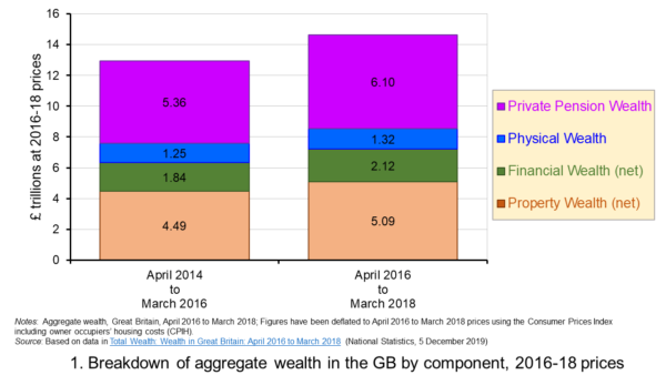 Figure 1 shows the evolution of aggregate wealth over the last two surveys (at constant 2016-18 prices) by the four component parts. Two components dominate the aggregate wealth of British households: property wealth (35 per cent) and private pension wealth (41-42 per cent). Financial wealth is the third largest component (14 per cent), while property wealth is the smallest component (9 to 10 per cent). (Click here for a PowerPoint of the chart.)
Trends in the average wealth of households
To help contextualise the size of wealth and begin to think about its distribution, rather than look at aggregate household wealth we can instead look at the average wealth of British households.
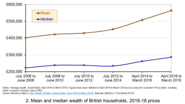 Figure 2 shows the average wealth (at constant 2016-18 prices) as measured by the mean (aggregate divided by the number of households) and the median (the middle household). The mean wealth of households is seen to be greater than their median wealth. In April 2016 to March 2018, average wealth as measured by the mean was £564,300 (an increase of 40.3 per cent over July 2006 to June 2008), whilst the average wealth of each household as measured by the median was £286,600 (an increase of 28.5 per cent over July 2006 to June 2008). (Click here for a PowerPoint of the chart.)
The higher mean value of wealth relative to the median value shows that the distribution of wealth is unequal. Therefore, the mean-to-median ratio is an indicator of inequality. In April 2016 to March 2018 the mean-to-median ratio was 1.97, up from 1.94 in April 2014 to March 2016 and 1.77 in July 2008 to June 2010, and 1.8 in the first survey in July 2006 to June 2008. This metric is therefore consistent with a more unequal distribution of wealth having arisen since the second survey in July 2008 to June 2010, a period during which the UK and global economy was been buffeted by the effects of the financial crisis and the associated economic downturn.
Trends in the average income of households
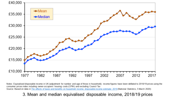 Figure 3 shows the mean and median values of disposable income (adjusted for the number and age of individuals comprising each household). Mean disposable income of UK households in financial year ending (FYE) 2018 was £35,928, a 0.5 per cent real decrease over FYE 2017, whilst median wealth (middle household) was £29,598 in FYE 2018, a 1.5 per cent real increase over FYE 2017. (Click here for a PowerPoint of the chart.)
The higher mean value of disposable income relative to the median value is indicative of inequality in disposable income. In FYE 2018 the mean-to-median ratio for disposable income was 1.21, down from 1.24 in FYE 2017 and a peak of 1.27 in FYE 2014, but higher than the 1.10 in 1978. The longer-term growth in the inequality of income helps to exacerbate existing wealth inequalities.
Comparing the inequality of income and wealth
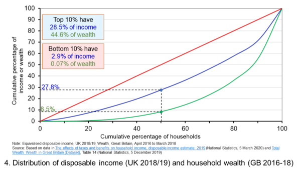 Figure 4 shows starkly the current inequality in wealth as compared to that in income. It does so by plotting their respective Lorenz curves. The curves show the proportion of overall wealth or income attributable to a given proportion of households. For example, 50 per cent of households have close to 28 per cent of total disposable income and a mere 8.5 per cent of aggregate wealth. (Click here for a PowerPoint of the chart.)
The inequality shown by the Lorenz curves is especially startling when we look at the top and bottom deciles. The bottom decile has just 2.9 per cent of income and only 0.07 per cent of wealth. Meanwhile the top 10 per cent of households have 28.5 per cent of income, almost the same as the first 50 percent of households, and some 44.6 per cent of wealth, with the previous 90 per cent of households having 55.4 per cent of wealth.
The Lorenz curves allow for the calculation of the Gini coefficient. It measures the area between the Lorenz curve and the 45 degree line consistent with zero inequality relative to the total area below the 45 degree line. Therefore, the Gini coefficient can take a value of between 0% (no inequality) and 100% (total inequality – where one person has all the wealth). Unsurprisingly whilst the Gini coefficient for disposable income in the UK in FYE 2018 was 34.7 per cent, that for aggregate wealth in Great Britain in April 2016 to March 2018 was significantly higher at 63.3 per cent.
The Gini coefficient for disposable income has risen from 25.5 per cent in 1977 to a peak in FYE 2008 of 38.6 per cent. It has therefore eased during the 2010s, but is nonetheless 13 percentage points higher today than it was four decades ago. Meanwhile, the Gini coefficient for wealth at the time of the first survey from July 2006 to June 2008 was 61 per cent. It has been unchanged at 63 percent over the last three surveys.
Inequality in wealth by component, location and age
It is important to recognise the inequalities in the components of wealth. This has particular importance when we are trying to understand how wealth varies by household characteristics, such as age and location.
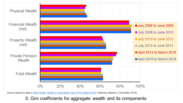 Figure 5 shows that the highest Gini coefficient is for net financial wealth. This stood at 91 per cent in April 2016 to March 2018. This extremely high figure shows the very high levels of inequatity in net financial wealth. This reflects the fact that some households find themselves with negative net financial wealth, such that their debts exceed their assets, whilst, on the other hand, some households can have large sums in financial investments. (Click here for a PowerPoint of the chart.)
We saw at the outset that the largest two components of wealth are property wealth and private pension wealth. The Gini coefficients of these two have in recent times moved in opposite directions by roughly similar magnitudes. This means that their effects on the overall Gini coefficient have offset one another. Perhaps for many people the rise in Gini coeffcient for property from 62 per cent in July 2006 to June 2008 to 66 per cent in April 2016 to March 2018 is the inequality measure that resonates most. This is reflected in regional disparities in wealth.
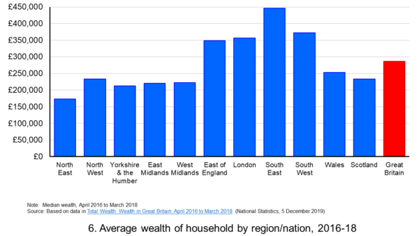 Figure 6 shows the geographical disparity of median household wealth across Britain. The regions with the highest median wealth are the South East, South West, London and the East of England. They have the highest contributions from net property wealth (40.4 per cent, 35.6 per cent, 41.7 per cent and 37.2 per cent respectively). The region with the lowest median total wealth, the North East, has the least total wealth in net property wealth (24.8 per cent). (Click here for a PowerPoint of the chart.)
Property wealth and private pension wealth also contribute to disparities in wealth by the age of the head of the household, also known as the household reference person or HRP. In April 2016 to March 2018 the mean wealth where the HRP is 25-34 was £125,700, rising to £859,200 where the HRP is 55-64 and then falling to £692,300 when the HRP is 65 or over. This is consistent with households accruing wealth over time and the using wealth to help fund retirement.
Where the age of the HRP is 55-64, mean property wealth in April 2016 to March 2018 was £255,800 compared to £53,700 where the HRP is 25-34. Meanwhile, where the age of the HRP is 55-64, mean private pension wealth was £449,100 compared to just £32,300 where the HRP is 25-34. In respect of property wealth, the deterioration in the affordability of owner-occupied housing over many years will impact especially hard on younger households. This will therefore tend to exacerbate inter-generational wealth inequality.
Whilst this briefing provides an overview of recent patterns in income and wealth inequality in Britain, the articles and press releases below consider the impact that the COVID-19 pandemic may have on inequalities.
Articles and Press Releases
- Many better-off households may increase savings as spending on ‘banned’ activities falls. Poorer households spend much more of their income on necessities and will be less resilient to any falls in income
IFS Press Release, Rowena Crawford, Alex Davenport, Robert Joyce and Peter Levell (08/04/20)
- Sector shut-downs during the coronavirus crisis affect the youngest and lowest paid workers, and women, the most
IFS Press Release, Robert Joyce and Xiaowei Xu (06/04/20)
- Coronavirus downturn ‘will exacerbate UK health inequality’
City A.M., James Warrington (09/04/20)
- Coronavirus pandemic exacerbates inequalities for women, UN warns
Guardian, Alexandra Villarreal (11/04/20)
- Inequality doesn’t just make pandemics worse – it could cause them
Guardian, Laura Spinney (12/04/20)
- The Coronavirus Will Be a Catastrophe for the Poor
The Atlantic, Derek Thompson (20/03/20)
- EU-wide inequality is back to pre-crisis levels
Social Europe, Michael Dauderstädt (15/04/20)
- Coronavirus makes inequality a public health issue
World Economic Forum, Alexandre Kalache (President, International Longevity Centre-Brazil) (13/04/20)
- Economist Joseph Stiglitz says coronavirus is ‘exposing’ health inequality in US
- CNBC, Jesse Pound (14/04/20)
ONS Bulletins
Questions
- In what ways can we use statistics to help measure and inform our analysis of inequality?
- In what ways can income inequality impact on wealth inequality?
- How can wealth inequality impact on income inequality?
- What might explain why wealth inequality is greater than income inequality?
- Explain how Lorenz curves help to generate Gini coefficients.
- Why would we expect the wealth of households with a younger household reference person (HRP) to be lower than that of a household with an older HRP? Would we expect this average to rise over all age ranges?
- If you were advising a government on policies to reduce income and wealth inequalities what sort of measures might you suggest?
- What is the difference between original income and disposable income?
- What is the difference between disposable income and equivalised disposable income?
- What role does the housing market play in affecting wealth inequality?
- Why is net financial wealth so unequally distributed?
- What is meant by health inequality? Of what significance is this for income and wealth inequality?
- What is meant by social mobility? Of what significance is this for income and wealth inequality?
 Workers in the UK and USA work much longer hours per year than those in France and Germany. This has partly to do with the number of days paid holiday per year, partly with the number of hours worked per day and partly with the number of days worked per week.
According to the latest OECD figures, in 2017 average hours worked per year ranged from 2257 in Mexico (the OECD’s highest) to 1780 in the USA, 1710 in Japan, 1681 in the UK, 1514 in France, 1408 in Denmark and 1356 in Germany (the OECD’s lowest). 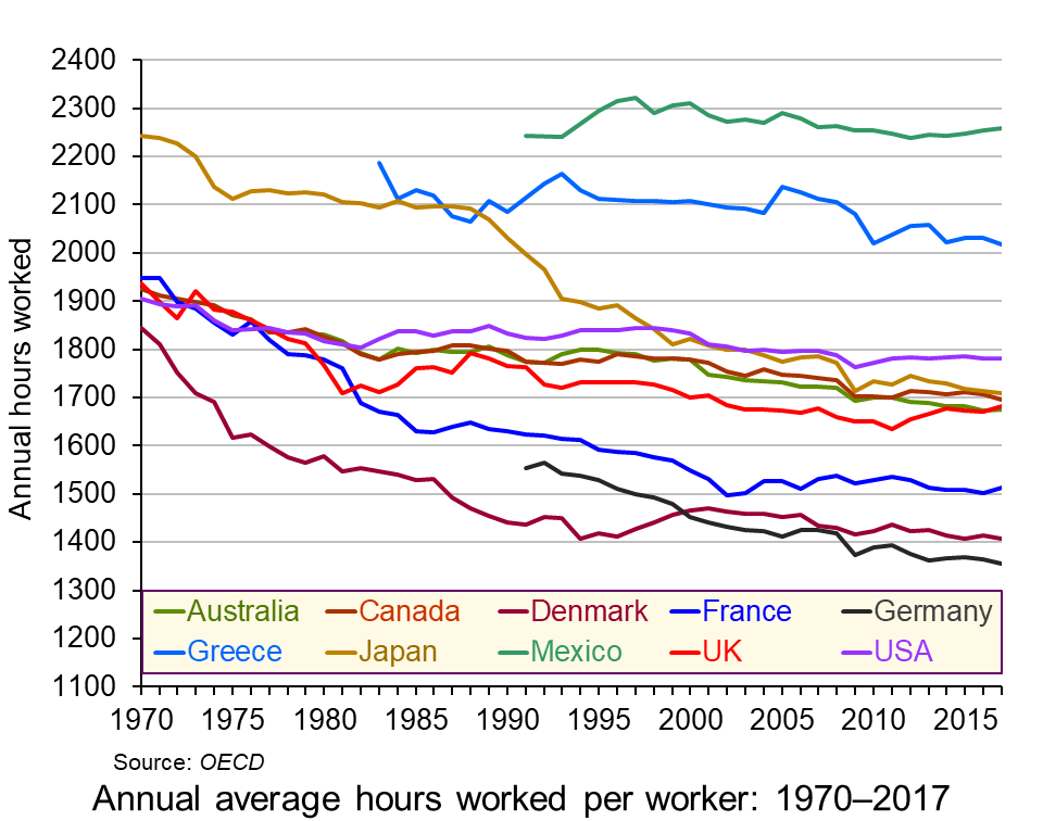 Annual working hours have been falling in most countries across the decades, as the chart shows. However, in most countries the process has slowed in recent years and in the UK, the USA and France working hours have begun to rise. (Click here for a PowerPoint of the chart.)
But why do working hours differ so much from country to country? How do they relate to productivity? How do they relate to human happiness and welfare more generally?
Causes of the differences
There are various reasons for the differences in hours worked between countries.
In a situation where individual workers can choose how many hours to work, they have to decide the best trade off for them between income and leisure. As wages rise over time, there will be substitution and income effects of these extra hourly wages. Higher wages make work more valuable in terms of what people can buy from an extra hour’s work. There is thus an incentive to substitute work for leisure and hence work longer. This is the substitution effect. On the other hand, higher wages allow people to work fewer hours for a given income. This is the income effect.
As incomes rise, generally the substitution effect will tend to decline relative to the income effect. This is because of the diminishing marginal utility of income. Richer people will tend to value a given rise in income less than poorer people and therefore will value the income from extra work less than poorer people. Richer people will prefer to work fewer hours than poorer people. Generally workers in richer OECD countries work fewer hours than those in poorer OECD countries.
But this does not explain why people in the USA, Canada, Japan and the UK work longer hours than people in Germany, Denmark, Norway, The Netherlands and France.
One possible explanation for these differences is the role of trade unions. These tend to be stronger in countries with lower working hours. Reducing the working week or obtaining longer holidays is one of the key objectives of unions.
Another is income distribution. The USA, despite its high average (mean) income, has a relatively unequal distribution of income compared with Germany or France. The post-tax-and-benefits Gini coefficient in the USA is around 0.39, whereas in Germany it is 0.29, meaning that Germany has a more equal distribution of disposable income than the USA. In fact, rises in real incomes in the USA over the past 10 years have gone almost exclusively to the top 10 per cent of earners, leaving the median income little changed. In fact median household income only rose above its 2007 (pre-recession) level in 2016.
 Social and cultural explanations may also be important. People in countries with higher working hours relative to hourly wages may put a greater store on consumption relative to leisure. The desire to shop may be very strong. The ‘Anglo-Saxon’ economic model pursued by right-of-centre governments in English-speaking countries, such as the USA, Canada, Australia and the UK puts emphasis on low taxes, low regulation, low public expenditure and self-advancement. Such a model encourages a more individualistic approach to work, with more emphasis on earning money.
Then there is the attitude to hours worked generally. There is a saying that in the UK the last one to leave the office is seen as the hardest working, whereas in Germany the last one to leave is seen as the least efficient. Social pressures, from colleagues, family, friends and society more generally can have a major effect on people’s choices between work and leisure.
Productivity
Productivity, in terms of output per hour worked, tends to decline as workers work longer hours. People get tired and possibly bored and demotivated towards the end of a long day or week. If workers are paid by the output they produce and if productivity declines towards the end of the day, then the hourly wage would fall as the day progresses. This would act as a disincentive to work long hours. In practice, most workers are normally paid a constant rate per hour for normal-time working. For overtime, they may even be paid a higher rate, despite their likely lower productivity. This encourages them to work longer hours than if they were paid according to their marginal productivity.
Linking pay more closely to productivity could encourage people to opt for fewer hours (if they had the choice). Indeed some companies are now encouraging workers to choose their hours – which may mean fewer hours as people seek a better work–life balance. (See the BBC article below about PwC’s employment strategy.) 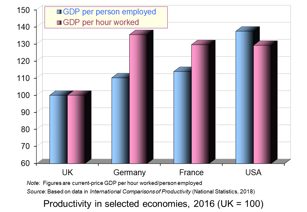 Alternatively, some other employers adopt the system of giving workers a set amount of work to do and then they can leave work when it is finished. This acts as an incentive to work more efficiently.
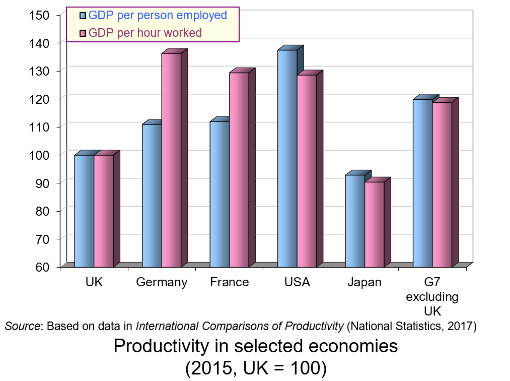
It is interesting that countries where workers work more hours per year tend to have a lower output per hour worked relative to output per worker than countries where workers work fewer hours. This is illustrated in the chart opposite. The USA, with its longer working hours, has higher output per person employed than France and Germany but very similar output per hour worked.
Hours and happiness
So are people who choose to work longer hours and take home more money likely to be happier than those who choose to work fewer hours and take home less money? If people were rational and had perfect knowledge, then they would choose the balance between work and leisure that best suited them.
In practice, labour markets are highly imperfect. People often do not have choices about the amount they work; they work the hours they are told. Even if they do have a choice, they are unlikely to have perfect knowledge about the impact of long hours on their health and happiness over their lifetime. They may not even be good judges of the shorter-term effects of more work and more pay. They may believe that more money will buy them more happiness only to find soon afterwards that they are wrong.
Articles
Data
Questions
- What factors are likely to encourage workers to work longer hours?
- Give some examples of jobs where workers have flexibility in the amount of hours they work per week and jobs where the working week is of a fixed length.
- For what reasons are annual working hours longer in the USA than in Germany?
- Would it be in employers’ interests if the government legislated so as to reduce the maximum permitted working week? Explain.
- What is meant by ‘efficiency wages’? How relevant is the concept to the issue of the average number of hours worked per year from country to country?
- Explain why people in poorer countries tend to work more hours per year than people in richer countries.
- If workers’ wages equalled their marginal revenue product, why might some workers choose to work more and others choose to work less (assuming they had a choice)?
- Are jobs in the gig economy and zero-hour contract jobs in the interests of workers?
- Is South Korea wise to cut its work limit from 68 hours a week to 52?
 According to a new report, Time for Change published by the Institute for Public Policy Research (IPPR), ‘The British economic model needs fundamental reform.’
It is no longer generating rising earnings for a majority of the population, and young people today are set to be poorer than their parents. Beneath its headlines figures, the economy is suffering from deep and longstanding weaknesses, which make it unfit to face the challenges of the 2020s.
The report by the IPPR’s Commission on Economic Justice is an interim one, with the final report due in the latter part of next year. The commission was set up in 2016 and includes business leaders, such as the heads of John Lewis and Siemens, the TUC General Secretary, the Archbishop of Canterbury and other leading figures.
Commenting on the interim report, Justin Welby, the Archbishop of Canterbury said
Our economic model is broken. Britain stands at a watershed moment where we need to make fundamental choices about the sort of economy we need. We are failing those who will grow up into a world where the gap between the richest and poorest parts of the country is significant and destabilising
The report found that wages have stagnated for the majority of the population since the financial crisis of 2007/8. Wage income has fallen as a proportion of national income, while the proportions going to income from profits and property have risen. Young people are poorer than previous generations of young people.
Despite low unemployment, many people are on zero-hour contracts, part-time contracts or employed on a casual basis. For many, their jobs are insecure and they have no bargaining power.
 The UK for many years has had a lower rate of investment that other developed economies and productivity, in terms of output per hour, is the lowest of its major competitors. Productivity in Germany is 36% higher than in the UK; in France and the USA it is 29% higher. Although there are some internationally competitive UK firms with high productivity, the country has:
a longer ‘tail’ of low-productivity businesses, in which weak management and poor use of skills leads to ‘bad jobs’ and low wages.
There are many other challenges, including an ageing population, uncertainties from Brexit, a large current account deficit, increased competition from abroad and growth once more in private-sector debt, which means that consumption may cease to be the main driver of economic growth as people seek to curb their borrowing.
The report is also critical of fiscal policy, which with record low interest rates could have been used to finance infrastructure projects as well as supporting public services.
The report recommends three approaches:
The first is institutional reform to support investment.
The second is making the economy more competitive through a coherent industrial strategy, reform of the financial sector to support long-term investment, reform of corporate governance to promote business success and tackling the market dominance of companies such as Amazon and Google.
The third is to bring greater social justice and equality through encouraging more secure and better-paid jobs, strengthening trades unions and reforming the tax system to make it fairer and smarter.
Not surprisingly the government has defended its record of reducing debt, presiding over falling unemployment and reduced inequality as measured by a reduced Gini coefficient. However, there has only been a modest fall in the Gini coefficient, from 0.333 in 2009/10 to 0.315 in 2016/7, and this has largely been the result of the very rich seeing a decline in income from assets.
Articles
Britain’s economy is broken and failing to tackle inequality, says major new report Independent, Ben Chu (6/9/17)
UK’s economic model is broken, says Archbishop of Canterbury The Guardian, Phillip Inman (5/9/17)
Tax wealth or see the UK tear itself apart, Cable will warn Bloomberg, Alex Morales and Thomas Penny (6/9/17)
Archbishop of Canterbury calls for radical economic reform BBC News (5/9/17)
Archbishop warns economy is “broken” as report reveals longest period of wage stagnation for 150 years Huffington Post, Rachel Wearmouth (6/9/17)
Britain’s economy is broken. We desperately need new ideas The Guardian, Tom Kibasi (4/6/17)
Carney: Britain is in the ‘first lost decade since the 1860s’, Business Insider, Oscar Williams-Grut (6/12/16)
Our broken economy, in one simple chart New York Times, David Leonhardt (7/8/16)
Report
Time for Change: A new Vision for the British Economy IPPR Commission on Economic Justice (6/9/17)
Questions
- Why have wages for the majority of the UK population stagnated for the past 10 years?
- Why is productivity in the UK lower than in most other developed economies?
- Is it possible for poor people to become poorer and yet for the Gini coefficient to fall?
- What institutional reforms would you suggest to encourage greater investment?
- Explain the possible advantages and disadvantages of abandoning ‘austerity policy’ and adopting a more expansionist fiscal stance?
- Does it matter that Amazon and Google are dominant players in their respective markets? Explain.
 In two recent speeches, the Governor of the Bank of England, Mark Carney, and the Bank’s Chief Economist, Andy Haldane, have reflected on the growing inequality in the UK and other countries. They have also answered criticisms that monetary policy has exacerbated the problem. As, Andy Haldane puts it:
It is clear monetary policy has played a material role in lifting all boats since the financial crisis broke. …[But] even if monetary policy has lifted all boats, and could plausibly do so again if needed, that does not mean it has done so equally. In particular, concerns have been expressed about the potential distributional effects of monetary policy.
Jan Vlieghe [member of the Monetary Policy Committee] has recently looked at how monetary policy may have affected the fortunes of, among others, savers, pension funds and pensioners. The empirical evidence does not suggest these cohorts have been disadvantaged to any significant degree by the monetary policy stance. For most members in each cohort, the boost to their asset portfolios and the improved wages and profits due to a stronger economy more than offset the direct loss of income from lower rates [of interest on savings accounts].
Andy Haldane’s speech focused largely on regional inequality. He argued that productivity has grown much more rapidly in the more prosperous regions, such as London and the South East. This has resulted in rising inequality in wages between different parts of the UK. Policies that focus on raising productivity in the less prosperous regions could play a major role in reducing income inequality.
Mark Carney’s speech echoed a lot of what Andy Haldane was saying. He argued that expansionary monetary policy has, according to Bank of England modelling, “raised the level of GDP by around 8% relative to trend and lowered unemployment by 4 percentage points at their peak”. And the benefits have been felt by virtually everyone. Even savers have generally gained:
That’s in part because, to a large extent, the thrifty saver and the rich asset holder are often one and the same. Just 2% of households have deposit holdings in excess of £5000, few other financial assets and don’t own a home.
But some people still gained more from monetary policy than others – enough to contribute to widening inequality.
Losers from the lost decade
 Mark Carney looked beyond monetary policy and argued that the UK has experienced a ‘lost decade’, where real incomes today are little higher than 10 years ago – the first time this has happened for 150 years. This stalling of average real incomes has been accompanied by widening inequality between various groups, where a few have got a lot richer, especially the top 1%, and many have got poorer. Although the Gini coefficient has remained relatively constant in recent years, there has been a widening gap between the generations.
For both income and wealth, some of the most significant shifts have happened across generations. A typical millennial earned £8000 less during their twenties than their predecessors. Since 2007, those over 60 have seen their incomes rise at five times the rate of the population as a whole. Moreover, rising real house prices between the mid-1990s and the late 2000s have created a growing disparity between older home owners and younger renters.
This pattern has been repeated around the developed world and has led to disillusionment with globalisation and a rise in populism.  Globalisation has been “associated with low wages, insecure employment, stateless corporations and striking inequalities”. (Click here for a PowerPoint of the chart.)
And populism has been reflected in the crisis in Greece, the Brexit vote, Donald Trump’s election, the rise of the National Front in France, the No vote in the Italian referendum on reforming the constitution and the rise in anti-establishment parties and sentiment generally. Mainstream parties are beginning to realise that concerns over globalisation, inequality and a sense of disempowerment must be addressed.
Solutions to inequality
As far as solutions are concerned, central must be a rise in general productivity that increases potential real income.
Boosting the determinants of long-run prosperity is the job of government’s structural, or supply-side policies. These government policies influence the economy’s investment in education and skills; its capacity for research and development; the quality of its core institutions, such as the rule of law; the effectiveness of its regulatory environment; the flexibility of its labour market; the intensity of competition; and its openness to trade and investment.
But will this supply-side approach be enough to bring both greater prosperity and greater equality? Will an openness to trade be accepted by populist politicians who blame globalisation and the unequal gains from international trade for the plight of the poor? Carney recognises the problem and argues that:
For the societies of free-trading, networked countries to prosper, they must first re-distribute some of the gains from trade and technology, and then re-skill and reconnect all of their citizens. By doing so, they can put individuals back in control.
For free trade to benefit all requires some redistribution. There are limits, of course, because of fiscal constraints at the macro level and the need to maintain incentives at the micro level. Fostering dependency on the state is no way to increase human agency, even though a safety net is needed to cushion shocks and smooth adjustment.
Redistribution and fairness also means turning back the tide of stateless corporations.
… Because technology and trade are constantly evolving and can lead to rapid shifts in production, the commitment to reskilling all workers must be continual.
In a job market subject to frequent, radical changes, people’s prospects depend on direct and creative engagement with global markets. Lifelong learning, ever-greening skills and cooperative training will become more important than ever.
But whether these prescriptions will be accepted by people across the developed world who feel that the capitalist system has failed them and who look to more radical solutions, whether from the left or the right, remains to be seen. And whether they will be adopted by governments is another question!
Webcast
 Roscoe Lecture Bank of England on YouTube, Mark Carney (5/12/16)
Speeches
One Car, Two Car, Red Car, Blue Car Bank of England, Andrew Haldane (2/12/16)
The Spectre of Monetarism: Roscoe Lecture, Liverpool John Moores University Bank of England, Mark Carney (5/12/16)
Articles: Andrew Haldane speech
Bank of England chief economist says monetary stimulus stopped ‘left behind’ from drowning Independent, Ben Chu (2/12/16)
BoE’s Andrew Haldane warns of regional growth inequality BBC News (2/12/16)
‘Regions would have faced contraction’ without rate cuts and money printing Belfast Telegraph (2/12/16)
Bank of England chief: UK can be transformed if it copies progress on Teesside Gazette Live, Mike Hughes (2/12/16)
Articles: Mark Carney speech
Governor’s ‘dynamite’ warning on wages and globalisation Sky News, Ed Conway (6/12/16)
Mark Carney warns Britain is suffering first lost decade since 1860 as people across Europe lose trust in globalisation The Telegraph, Szu Ping Chan and Peter Foster (5/12/16)
Mark Carney: we must tackle isolation and detachment caused by globalisation The Guardian, Katie Allen (6/12/16)
Bank of England’s Carney warns of strains from globalization Reuters, William Schomberg and David Milliken (6/12/16)
CARNEY: Britain is in ‘the first lost decade since the 1860s’ Business Insider UK, Oscar Williams-Grut (7/12/16)
Carney warns about popular disillusion with capitalism BBC News (5/12/16)
Some fresh ideas to tackle social insecurity Guardian letters (7/12/16)
Report
Monitoring poverty and social exclusion 2016 (MPSE) Joseph Rowntree Foundation, Adam Tinson, Carla Ayrton, Karen Barker, Theo Barry Born, Hannah Aldridge and Peter Kenway (7/12/16)
Data
OECD Income Distribution Database (IDD): Gini, poverty, income, Methods and Concepts OECD
The effects of taxes and benefits on household income Statistical bulletins ONS
Questions
- Has monetary policy aggravated the problem of inequality? Explain.
- Comment on Charts 11a and 11b on page 19 of the Haldane speech.
- Does the process of globalisation help to reduce inequality or does it make it worse?
- If countries specialise in the production of goods in which they have a comparative advantage, does this encourage them to use more or less of relatively cheap factors of production? How does this impact on factor prices? How does this affect income distribution?
- How might smaller-scale firms “by-pass big corporates and engage in a form of artisanal globalisation; a revolution that could bring cottage industry full circle”?
- Why has regional inequality increased in the UK?
- What types of supply-side policy would help to reduce inequality?
- Explain the following statement from Mark Carney’s speech: “For free trade to benefit all requires some redistribution. There are limits, of course, because of fiscal constraints at the macro level and the need to maintain incentives at the micro level”.
- Mark Carney stated that “redistribution and fairness also means turning back the tide of stateless corporations”. How might this be done?
 Latest figures from the Office for National Statistics show that the UK was in recession at the end of 2023. The normal definition of recession is two quarters of falling real GDP. This is what happened to the UK in the last two quarters of 2023, with GDP falling by 0.1% in Q3 and 0.3% in Q4. In Q4, output of the service industries fell by 0.2%, production industries by 1.0% and construction by 1.3%.
 For 2023 as a whole, while real GDP rose by 0.20%, real GDP per head fell by 0.67%. In the last two quarters of 2023, while real GDP fell by 0.1% and 0.3% respectively, real GDP per head fell by 0.4% and 0.6%, respectively, having already fallen in each of the previous five quarters. Chart 1 shows real GDP growth and real GDP growth per head from 2007 to 2023 (click here for a PowerPoint). As you can see, given population growth, real GDP per head has consistently grown slower than real GDP.
 This compares unfavourably with the period from 1994 to 2007, when the average annual rate of growth of real GDP was 3.0% and that of real GDP per head was 2.5%.
 This is a key issue for the government – how to encourage a growth in productivity. The UK’s record of productivity growth has been poor since 2008. The period from 1996 to 2006 saw an average annual growth in labour productivity of 6.4%. Since then, however, labour productivity has grown by an average annual rate of only 0.3%. This is illustrated in Chart 3 (click here for a PowerPoint). If the pre-2007 rate had continued to the end of 2023, labour productivity would be 189% higher. This would have made GDP per head today substantially higher. If GDP per head is to grow faster, then the underlying issue of a poor growth in labour productivity will need to be addressed.
 The top 1% of income earners’ share of disposable income is just under 9.0%. (Note that disposable income is after income taxes have been deducted and includes cash benefits and is thus more equally distributed than original income.)
 But, public finances have been under pressure in recent years, especially from COVID support measures. General government gross debt has risen from 27.7% of GDP in 1990/91 to 99.4% in 2022/23. This is illustrated in Chart 4 (click here for a PowerPoint). Although it has fallen from the peak of 107.6% of GDP in 2020/21 (during the COVID pandemic), according to the Office for Budget Responsibility it is set to rise again, peaking at 103.8% in 2026/27. There is thus pressure on the government to reduce public-sector borrowing, not increase it. This makes it difficult to finance public investment or tax cuts.
 The output of some goods and services goes unrecorded. As we note in Economics, 11e (section 15.2), “If you employ a decorator to paint your living room, this will be recorded in the GDP statistics. If, however, you paint the room yourself, it will not. Similarly, if a childminder is employed by parents to look after their children, this childcare will form part of GDP. If, however, a parent stays at home to look after the children, it will not.
 Large amounts of production and consumption involve external costs to the environment and to other people. These externalities are not included in the calculation of GDP.
 Some of the undesirable effects of growth may in fact increase GDP! Take the examples of crime, stress-related illness and environmental damage. Faster growth may lead to more of all three. But increased crime leads to more expenditure on security; increased stress leads to more expenditure on health care; and increased environmental damage leads to more expenditure on environmental clean-up. These expenditures add to GDP. Thus, rather than reducing GDP, crime, stress and environmental damage actually increase it.
 The PCI comprises 42 indicators under eight headings: human capital, natural capital, information and communication technology (ICT), structural change (the movement of labour and other productive resources from low-productivity to high-productivity economic activities), transport infrastructure, institutions (political, legal and financial) and the private sector (ease of starting businesses, availability of credit, ease of cross-border trade, etc.). It covers 194 economies since 2000 (currently to 2022). As UNCTAD states, ‘The PCI can help diagnose the areas where countries may be leading or falling behind, spotlighting where policies are working and where corrective efforts are needed.’ Chart 5 shows the PCI for various economies from 2000 to 2022 (click here for a PowerPoint).
 The MNW programme was established in 2010. This has resulted in Office for National Statistics developing new measures of national well-being. The ONS produces statistical bulletins and datasets with its latest results.
 World at One (from 7’00” to 25’14”)
 The issue of inequality has come into increasing focus over recent years. The impact of the COVID-19 pandemic raises further concerns that these inequalities may be exacerbated further. Here we provide an overview of some of the key patterns in current levels of wealth and income inequality in Britain. They show, for example, the markedly higher degree of inequality in wealth relative to income, the importance of property wealth and private pension wealth in determining levels of wealth, and the considerable variation in average wealth levels of households by age and location.
 Figure 1 shows the evolution of aggregate wealth over the last two surveys (at constant 2016-18 prices) by the four component parts. Two components dominate the aggregate wealth of British households: property wealth (35 per cent) and private pension wealth (41-42 per cent). Financial wealth is the third largest component (14 per cent), while property wealth is the smallest component (9 to 10 per cent). (Click
  Figure 2 shows the average wealth (at constant 2016-18 prices) as measured by the mean (aggregate divided by the number of households) and the median (the middle household). The mean wealth of households is seen to be greater than their median wealth. In April 2016 to March 2018, average wealth as measured by the mean was £564,300 (an increase of 40.3 per cent over July 2006 to June 2008), whilst the average wealth of each household as measured by the median was £286,600 (an increase of 28.5 per cent over July 2006 to June 2008). (Click
  Figure 3 shows the mean and median values of disposable income (adjusted for the number and age of individuals comprising each household). Mean disposable income of UK households in financial year ending (FYE) 2018 was £35,928, a 0.5 per cent real decrease over FYE 2017, whilst median wealth (middle household) was £29,598 in FYE 2018, a 1.5 per cent real increase over FYE 2017. (Click
  Figure 4 shows starkly the current inequality in wealth as compared to that in income. It does so by plotting their respective Lorenz curves. The curves show the proportion of overall wealth or income attributable to a given proportion of households. For example, 50 per cent of households have close to 28 per cent of total disposable income and a mere 8.5 per cent of aggregate wealth. (Click
  Figure 5 shows that the highest Gini coefficient is for net financial wealth. This stood at 91 per cent in April 2016 to March 2018. This extremely high figure shows the very high levels of inequatity in net financial wealth. This reflects the fact that some households find themselves with negative net financial wealth, such that their debts exceed their assets, whilst, on the other hand, some households can have large sums in financial investments. (Click
  Figure 6 shows the geographical disparity of median household wealth across Britain. The regions with the highest median wealth are the South East, South West, London and the East of England. They have the highest contributions from net property wealth (40.4 per cent, 35.6 per cent, 41.7 per cent and 37.2 per cent respectively). The region with the lowest median total wealth, the North East, has the least total wealth in net property wealth (24.8 per cent). (Click
  Workers in the UK and USA work much longer hours per year than those in France and Germany. This has partly to do with the number of days paid holiday per year, partly with the number of hours worked per day and partly with the number of days worked per week.
 Annual working hours have been falling in most countries across the decades, as the chart shows. However, in most countries the process has slowed in recent years and in the UK, the USA and France working hours have begun to rise. (Click
  Social and cultural explanations may also be important. People in countries with higher working hours relative to hourly wages may put a greater store on consumption relative to leisure. The desire to shop may be very strong. The
  Alternatively, some other employers adopt the system of giving workers a set amount of work to do and then they can leave work when it is finished. This acts as an incentive to work more efficiently.
